Redesign Amazon Application Interface
System usability scale rating increased from grade F (awful) to grade B (good) for the new design
UX designer
User research and interviews, User journey map, Competitor analysis, Low-fidelity wireframe, High-fidelity prototype, Usability testing
Amazon (School project)
Figma, Miro
UX/UI Designers
Amazon was founded on July 1994, with a mission to strive to offer our customers the lowest possible prices, the best available selection, and the utmost convenience, and a vision to be Earth's most customer-centric company, where customers can find and discover anything they might want to buy online.
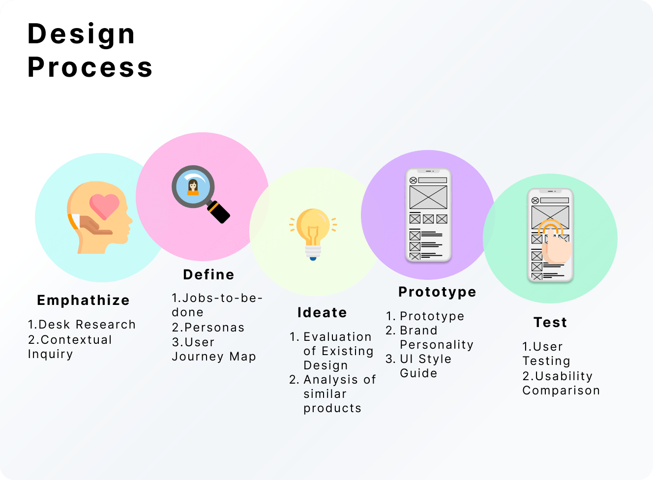
Design Process for Amazon Mobile App
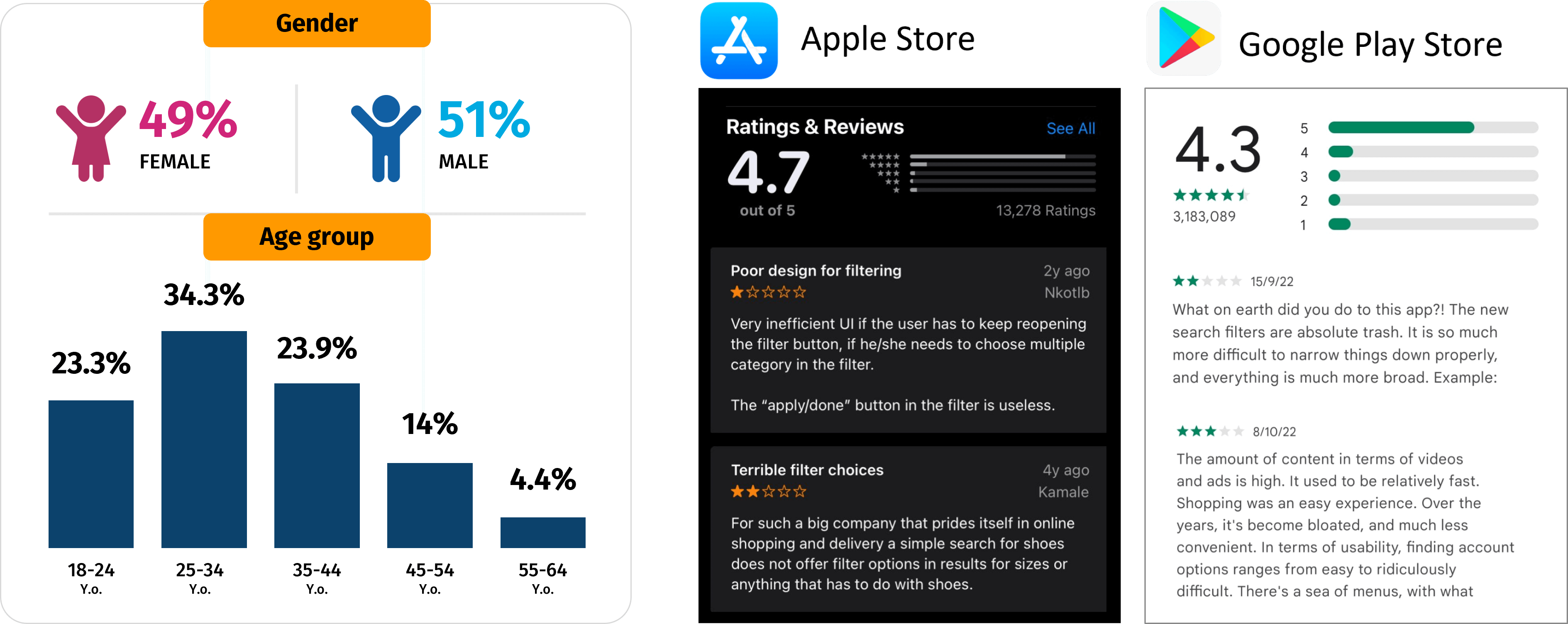
According to Janio Asia (2019), the profile of Singapore's online shoppers is mostly working adults in the range between 25 and 34 years old, with a slight majority towards men (51%). An analysis was also done on the different mobile playstores (Apple Store and Google Play Store), and some common problems found were:
Desk Research Data
During the contextual inquiry, a System Usability Scale (SUS) assessment was also done to find out how usable the users found the current app. The users were asked 10 different questions and were asked to choose between a Likert scale of 5, with 1 being "strongly disagree" and 5 being "strongly agree". The answers were then input into a formula to tabulate the overall SUS score for each individual interviewee. The average was tabulated to have a better overview of the overall SUS score of the 5 interviewees on the current app. The 10 questions in the SUS survey are:
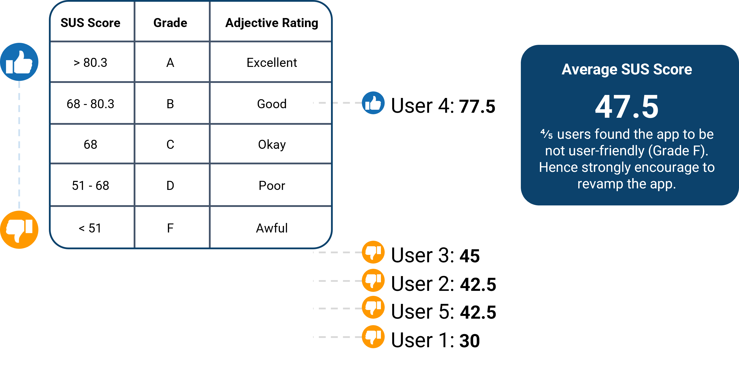
SUS Average Score Result
The issues were then grouped into four different categories using affinity diagramming, namely, homepage, categories, filters, and vouchers. The main problem that is identified is that users have difficulties navigating, searching, and applying the information they find.
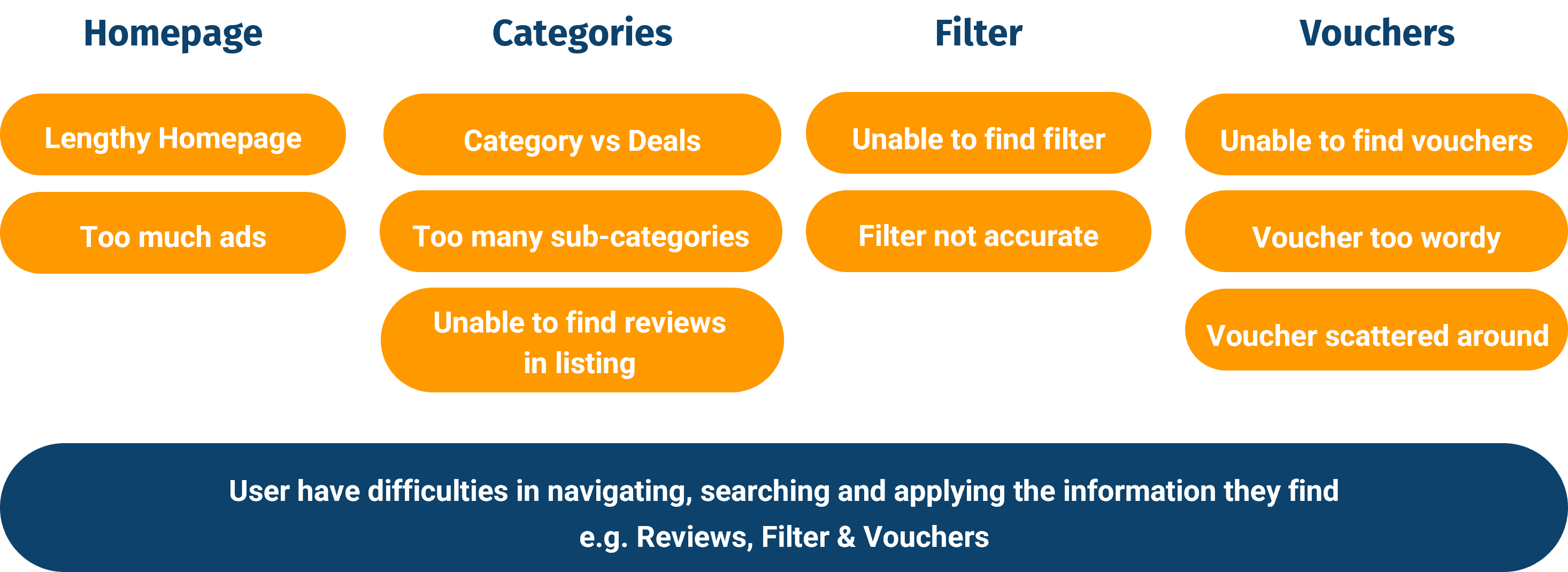
Main Problem with Current App
To make the problem statement more user-focused (goals user want to achieve through using Amazon app), it is being reframed as "jobs-to-be-done".
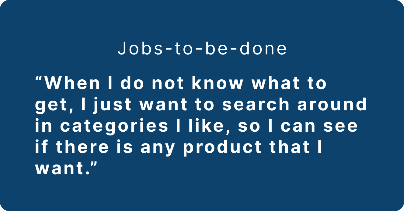
Jobs-to-be-done
Based on the data (4 out of 5 users have such usage pattern) and assumptions, a persona that reflects a "wandering customer" has been created. She is someone who likes to randomly browse around on an ecommerce app from time to time during her spare time and loves to see new products or brands, but she keeps meeting roadblocks while doing so on the Amazon shopping app.
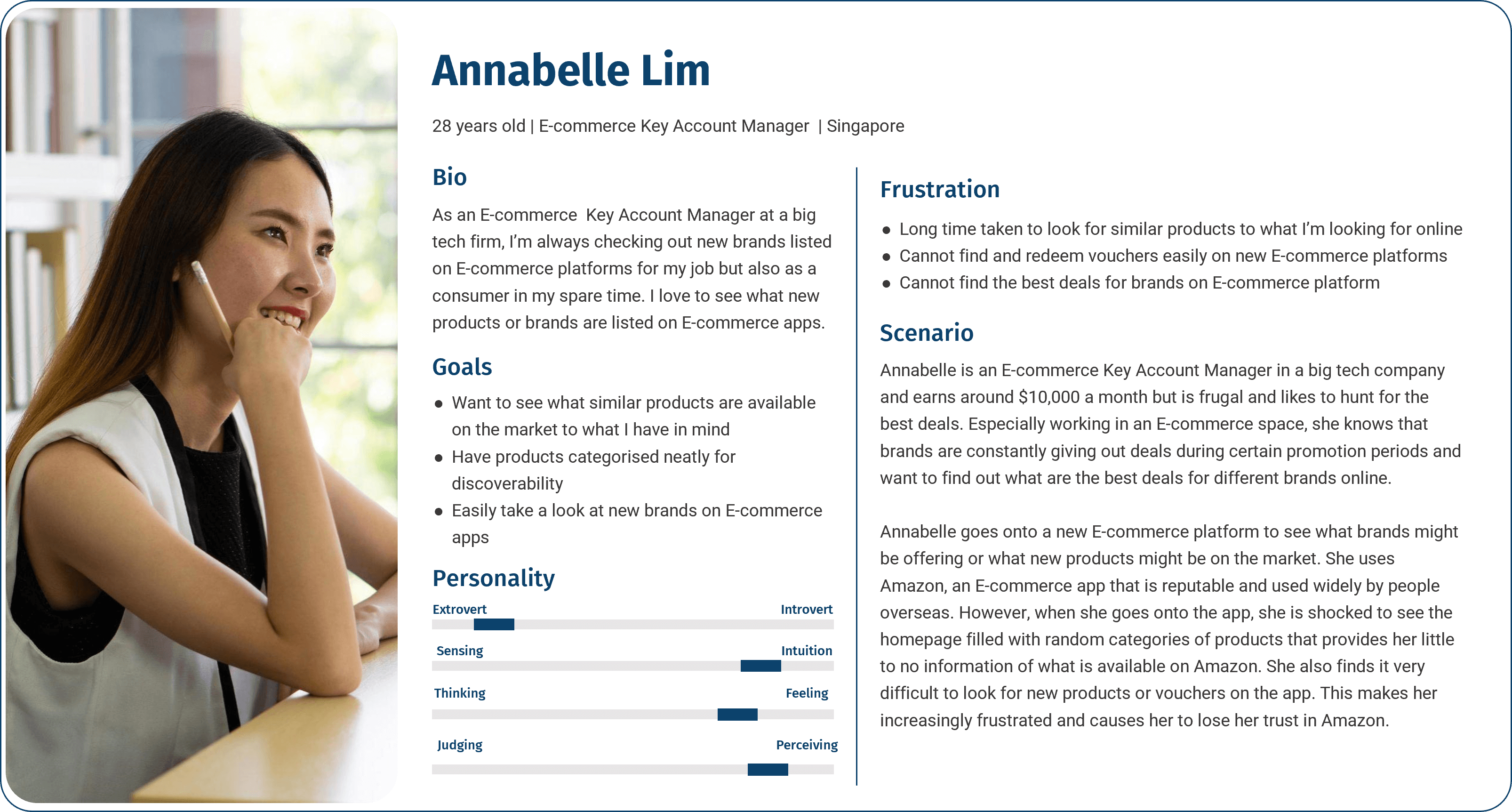
Persona - Annabelle
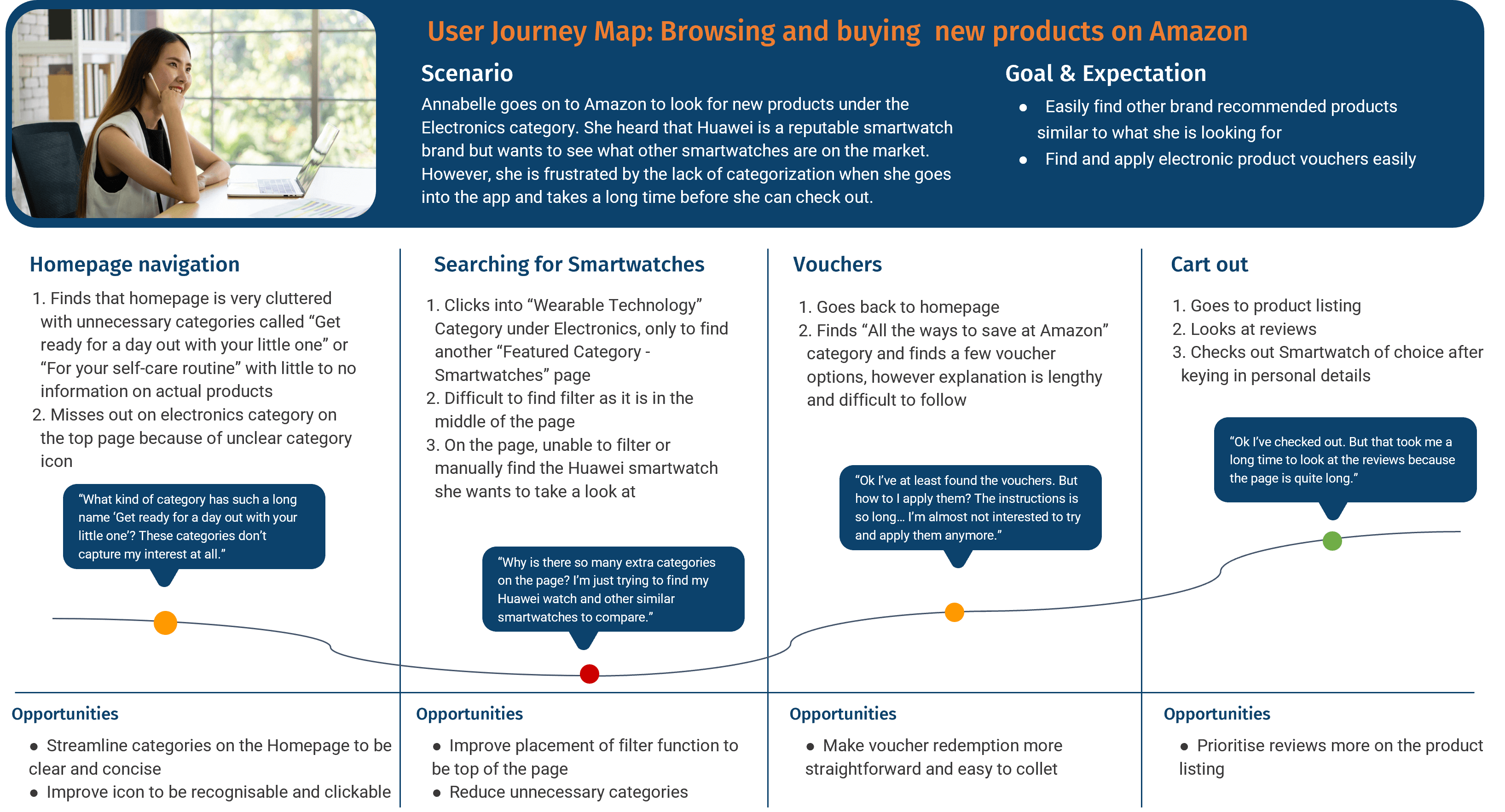
User Journey Map - Annabelle
After analysing Singapore's top-two e-commerce application, some components and arrangements could be applied back to the Amazon shopping app, as users would be more familiar with how the different things are arranged, categorized, and look.
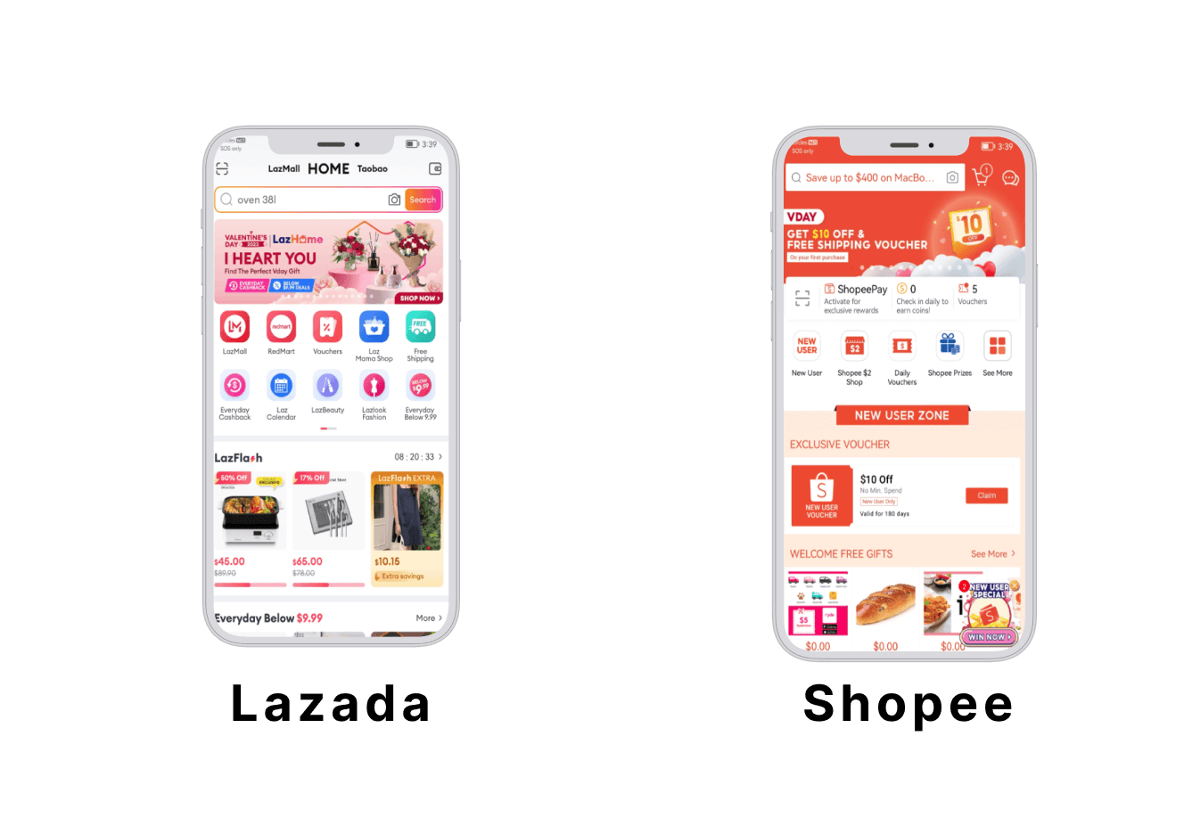
Lazada and Shopee App
Different pages that appear in the user journey have been scrutinized and broken down into smaller components for analysis (as each page is filled with numerous different components).
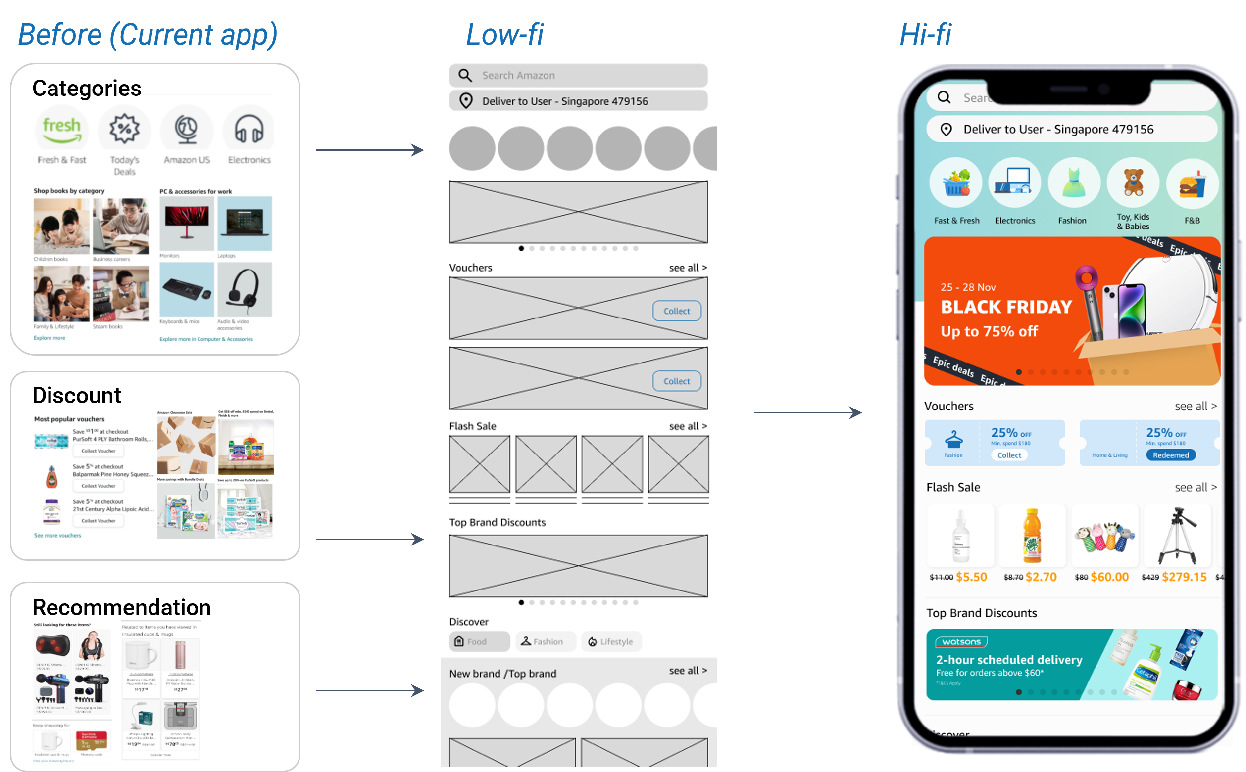
Two main issue to address on home page:
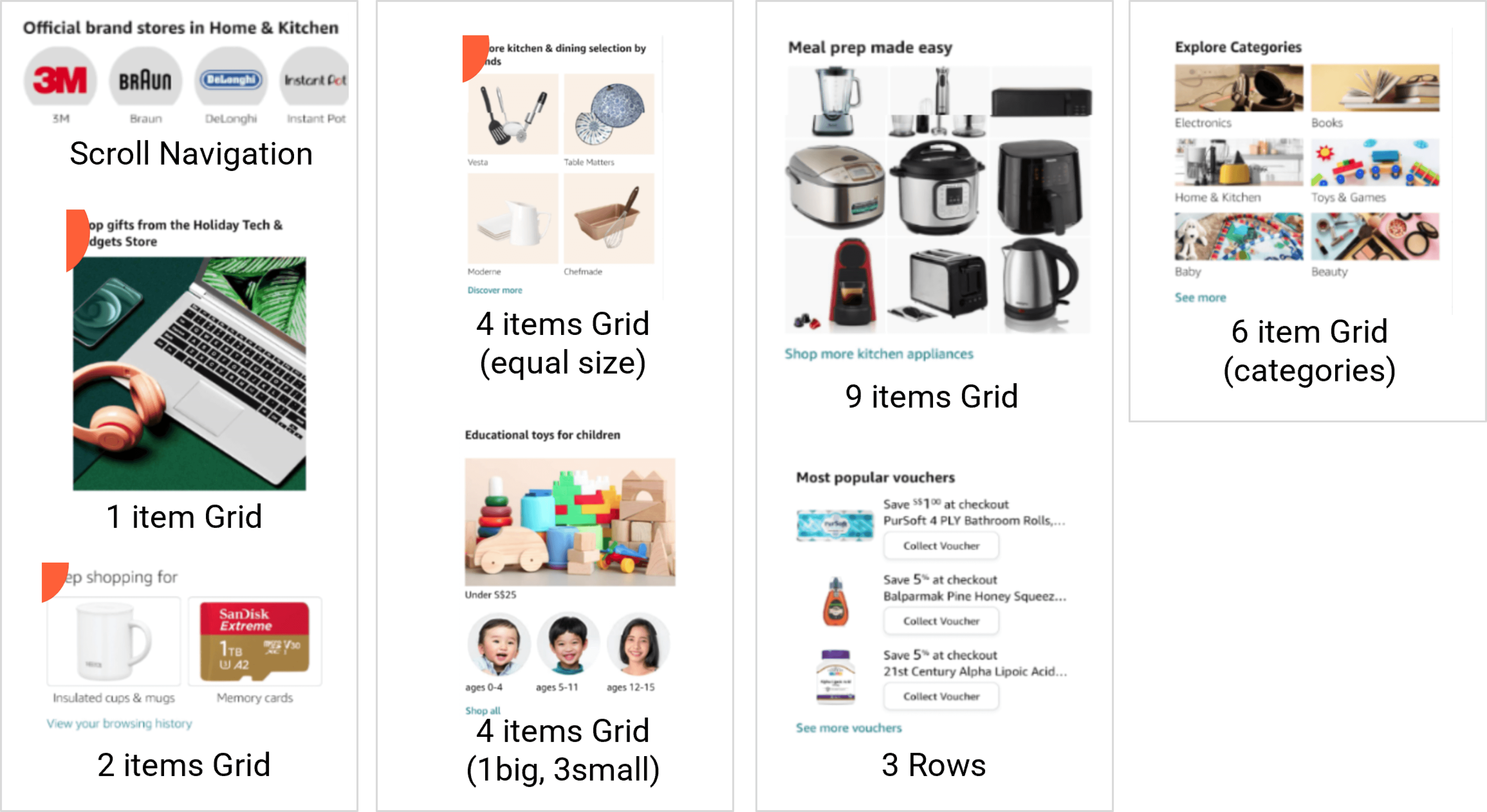
Different Groupings in Home page
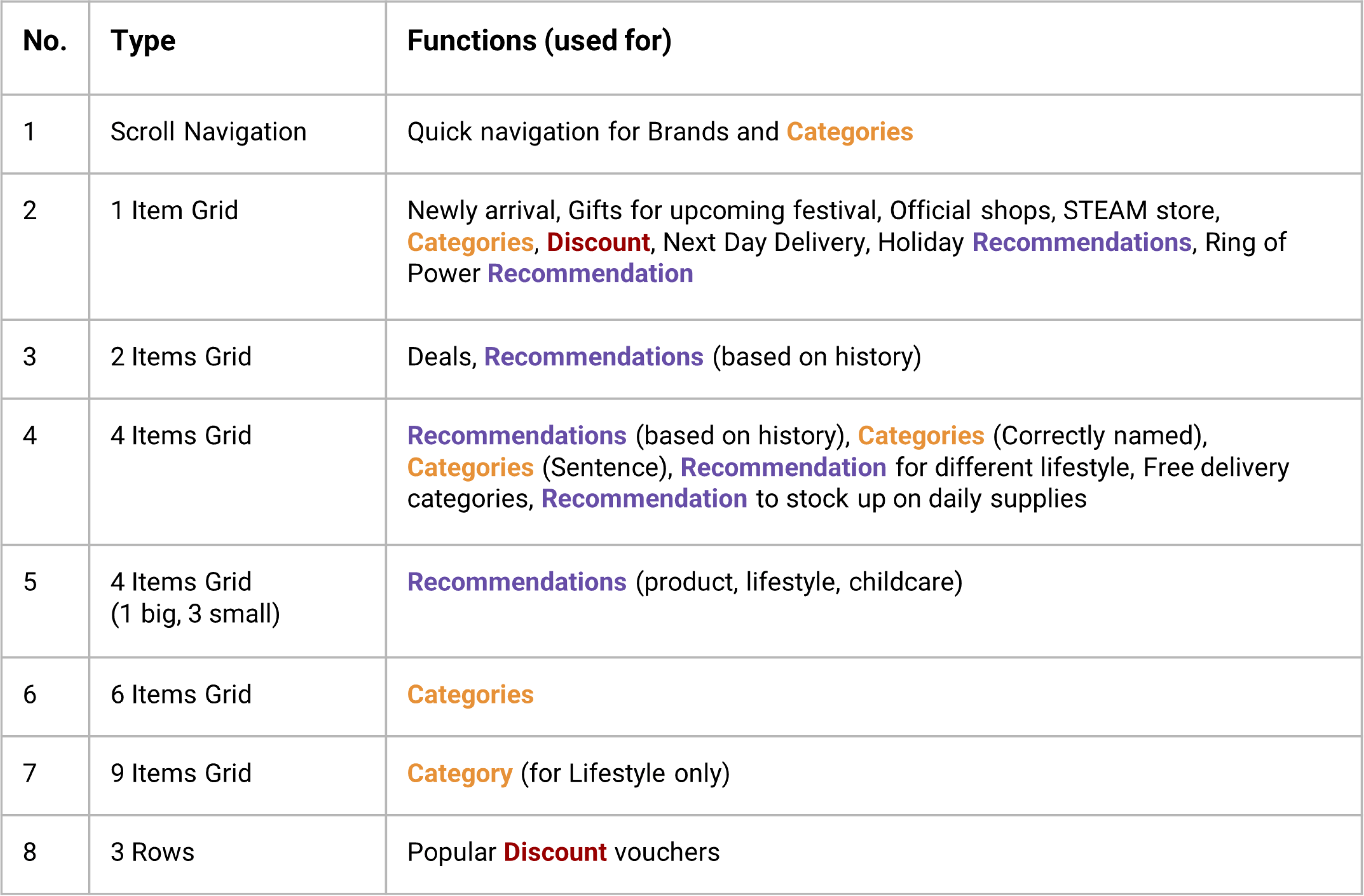
Functions for the Different Grouping
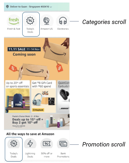
Horizontal Scroll Navigation in Current App
Similar to home page, category page also have the issue of too many repeated functions throughout the same page.
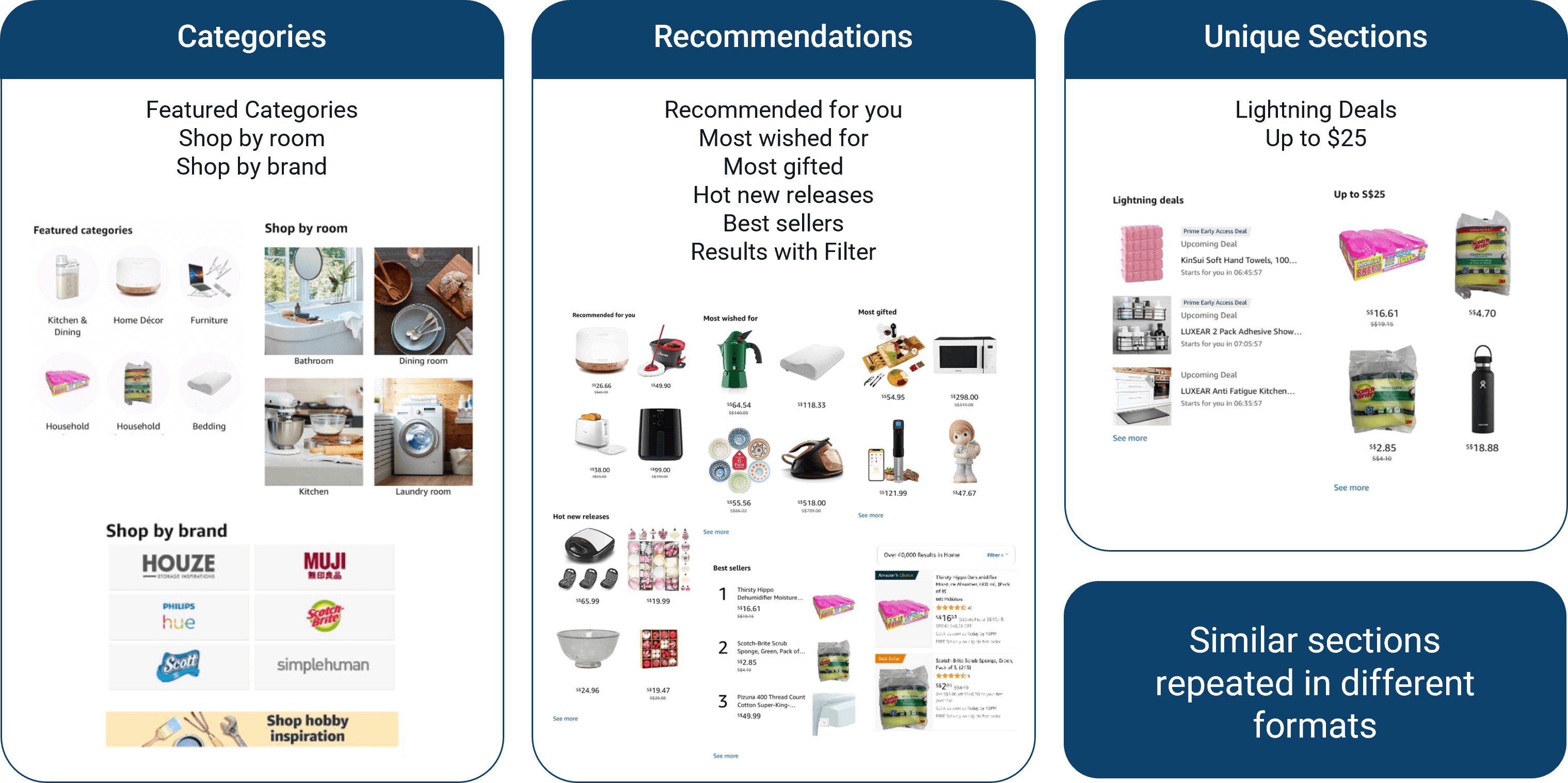
Repeated Functions in Category page
There are two main issue to address on product page:
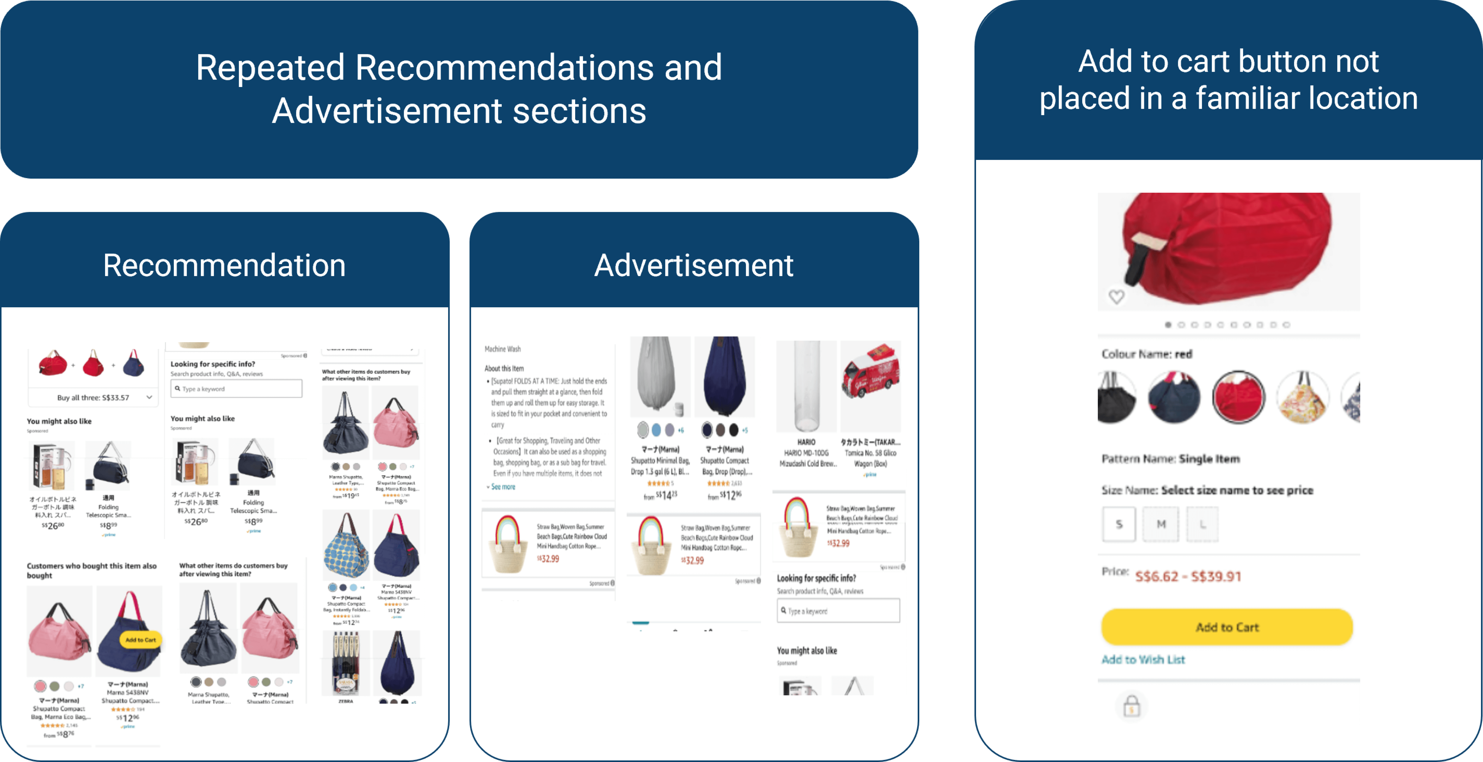
Repeated Functions and 'Add to Cart' Button in Product page
In the redesign of the brand personality, the brand colours were kept, as the colours still help with instilling the personality that the company should portray, which is being trustworthy, inviting, organised, and modern. Below are some additional changes made to the new design to further enhance those personality qualities:
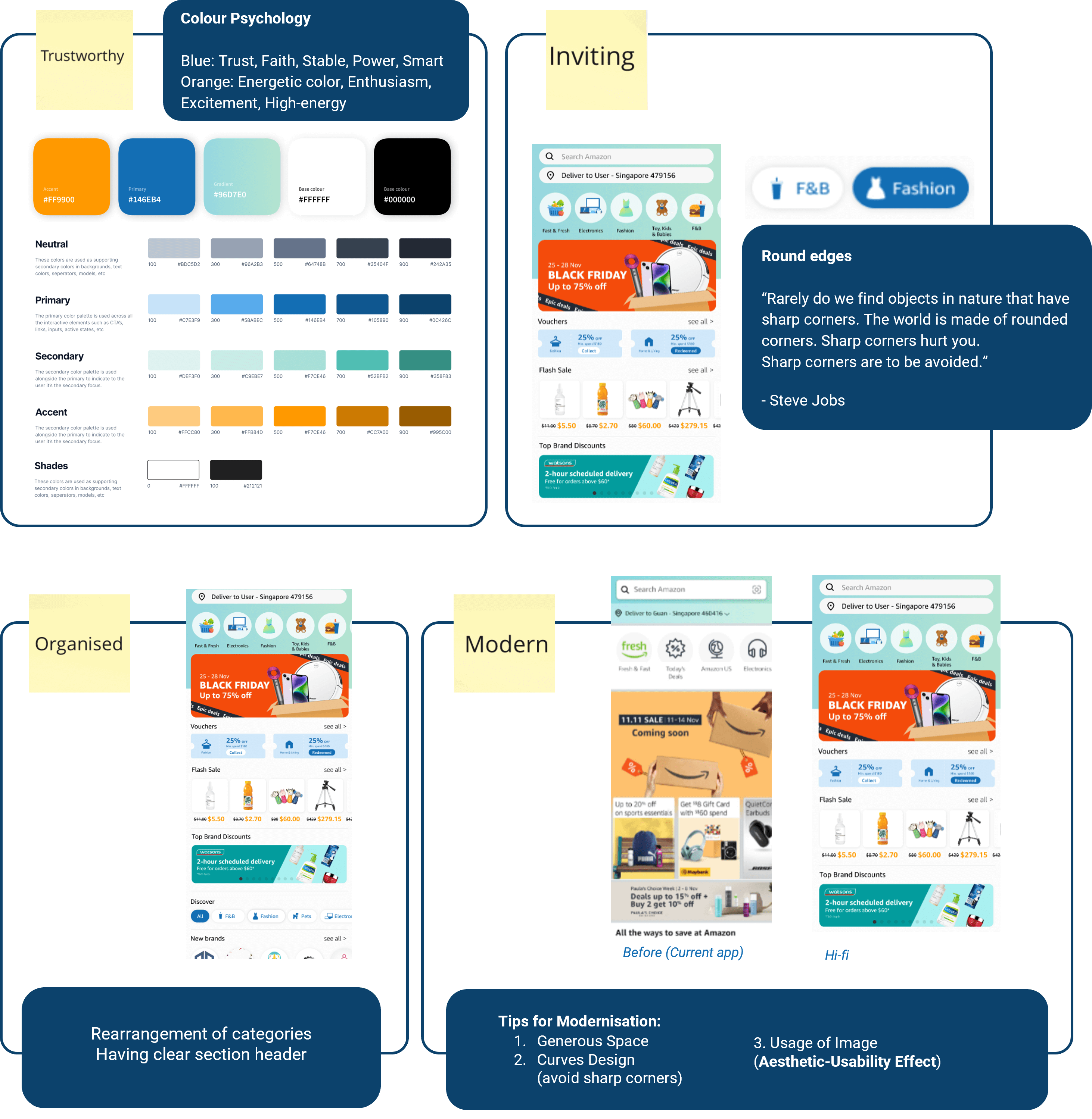
Trustworthy and Inviting Design Consideration
To ensure familiarity with the app, the typeface and colour palette have been kept the same. The two things that were done differently were:
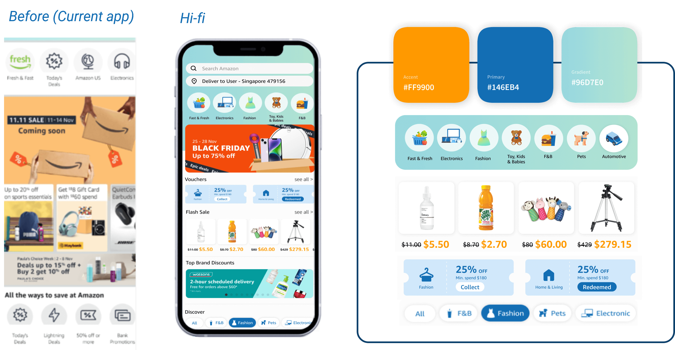
Before and After Branding Colours Applied more Widely
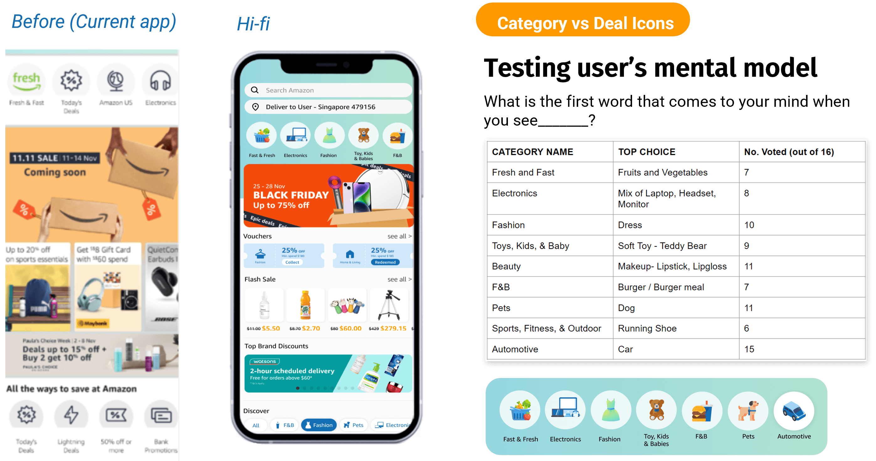
New Icons Design
There are seven different issues that the prototype aims to solve, namely
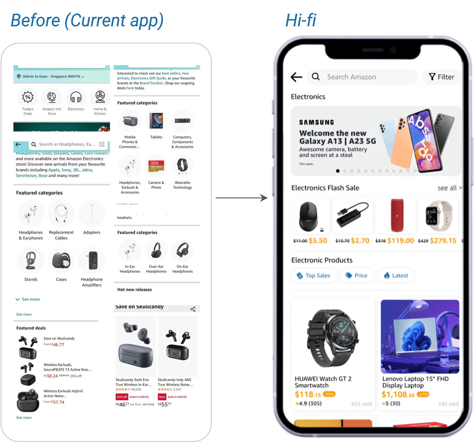
According to Hick's law, the increased number of options increases the time taken for the user to make a decision. Hence, the solution is to reduce the number of similar functions on the page, which will reduce the number of options and also reduce the page length. Below is a summary of the reduced sections:
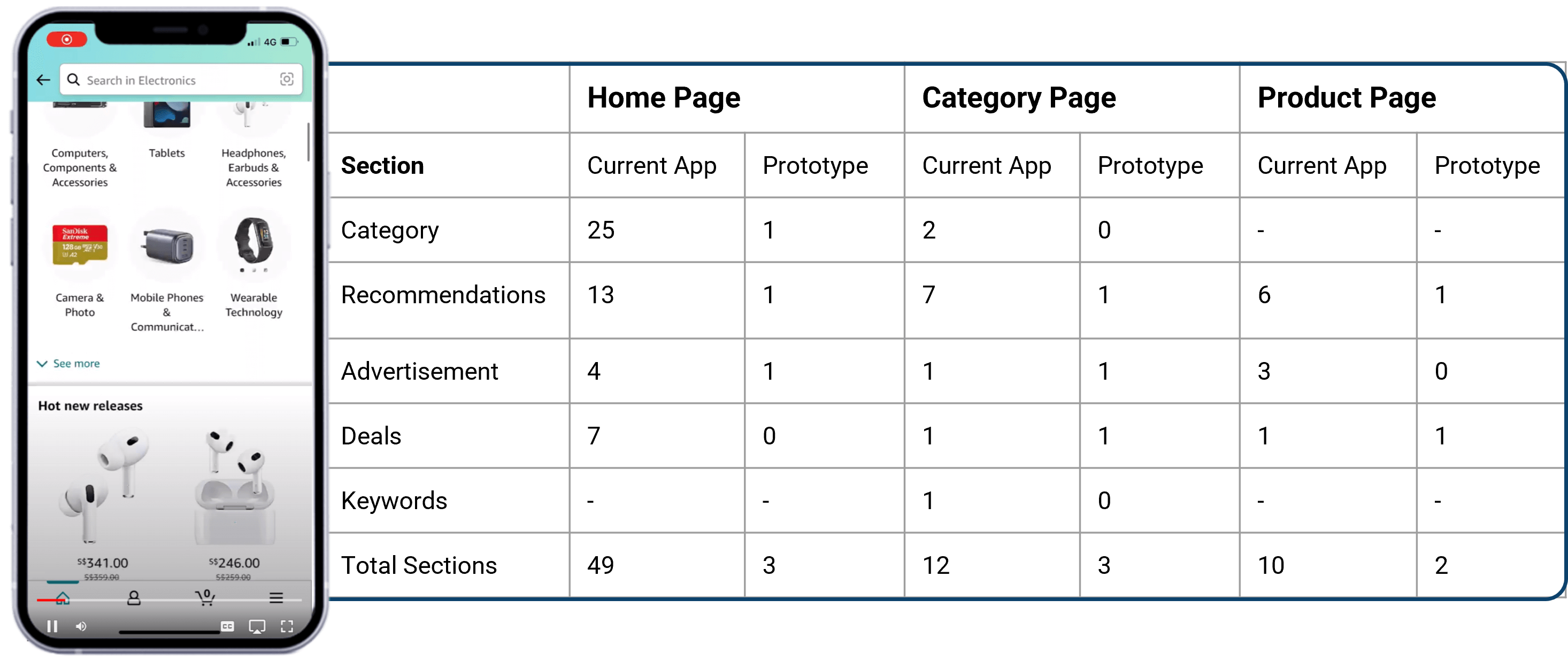
Overview of Reduced Sections on the 3 Pages
Before and After Section Reduction (Home page)
Due to the unobtrusive icon, lengthy instructions for claiming, and dispersed nature of the vouchers in the current design, the voucher is difficult to find and use.The solution is to put the vouchers at a location that the user is already familiar with (took inspiration from Lazada and Shopee).
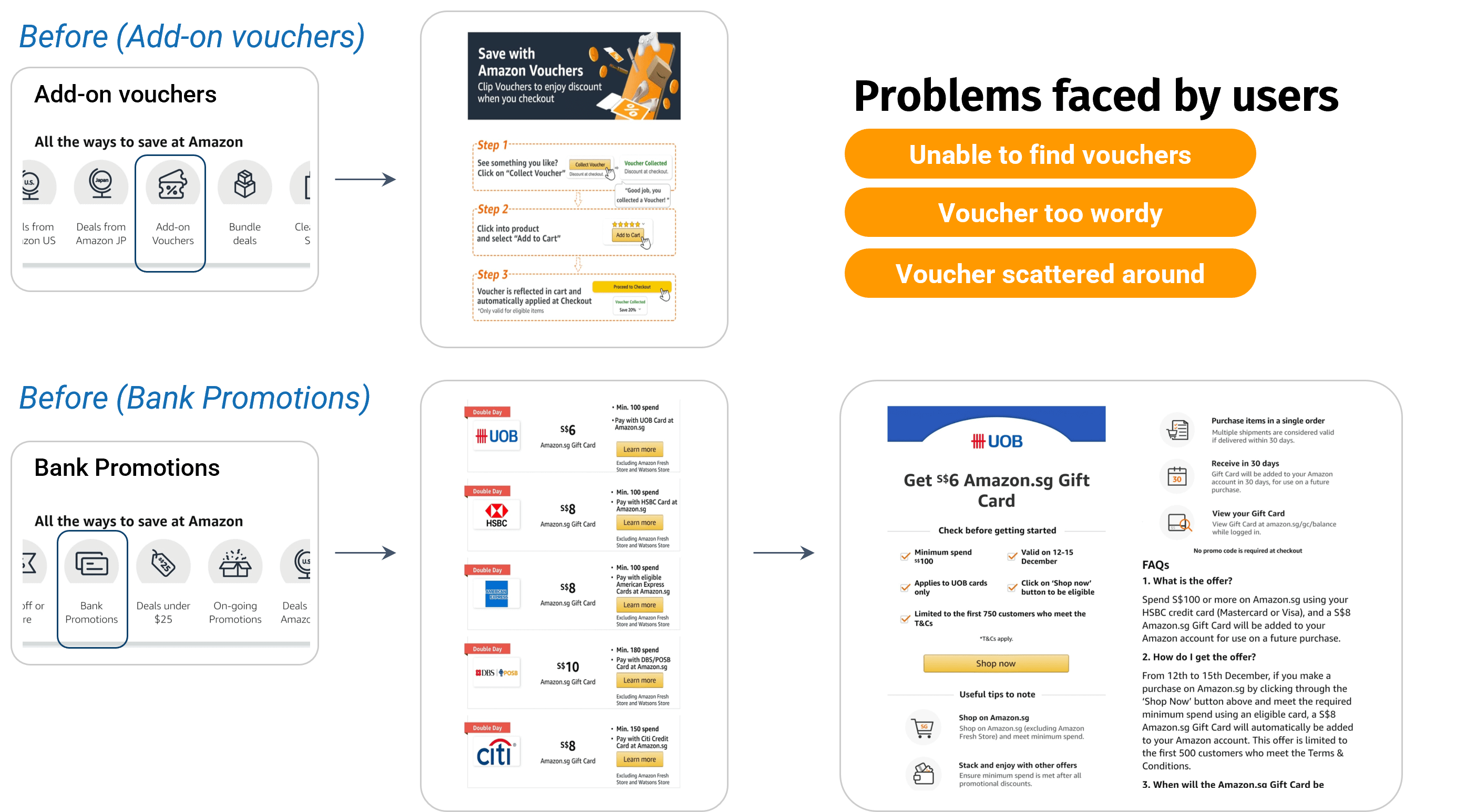
Vouchers Design on Current App
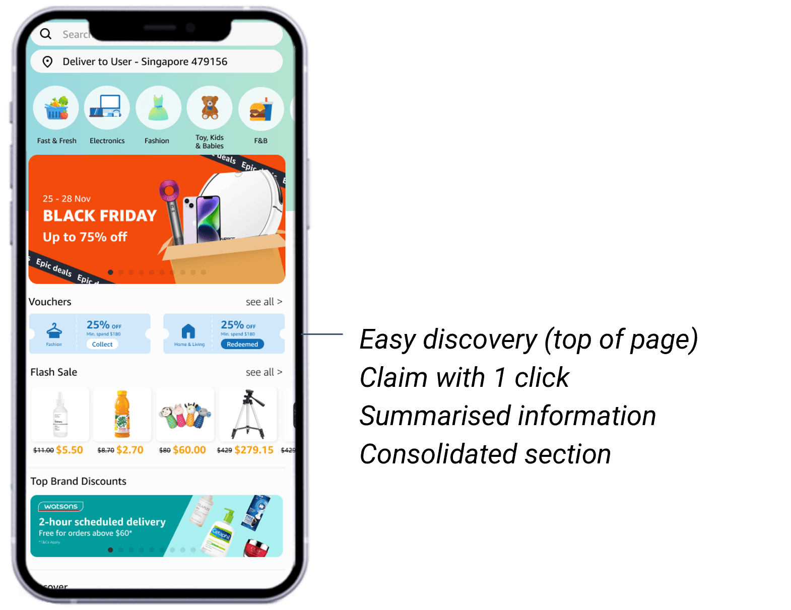
Suggested Design for Vouchers Section
In the current design, the categories have similar designs and naming conventions as products; hence, users get confused. As having sub-categories is an unfamiliar experience for the users, it is completely removed in the new design.
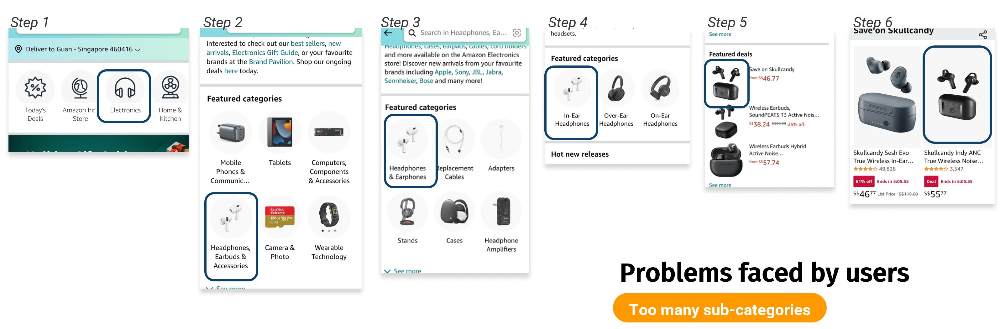
Sub-category Flow in Current Design
Before and After Removal of Sub-category
The current filter is hidden within the hamburger menu, which is unconventional for an e-commerce app. In addition, the filter options are not precise and disappear when the user goes down a few pages. In the new design, the filtering is being removed and placed in the top-right corner (usually where the filter is found). A more precise filtering option has also been added, and the user can now see if the filter is still being applied to the page.
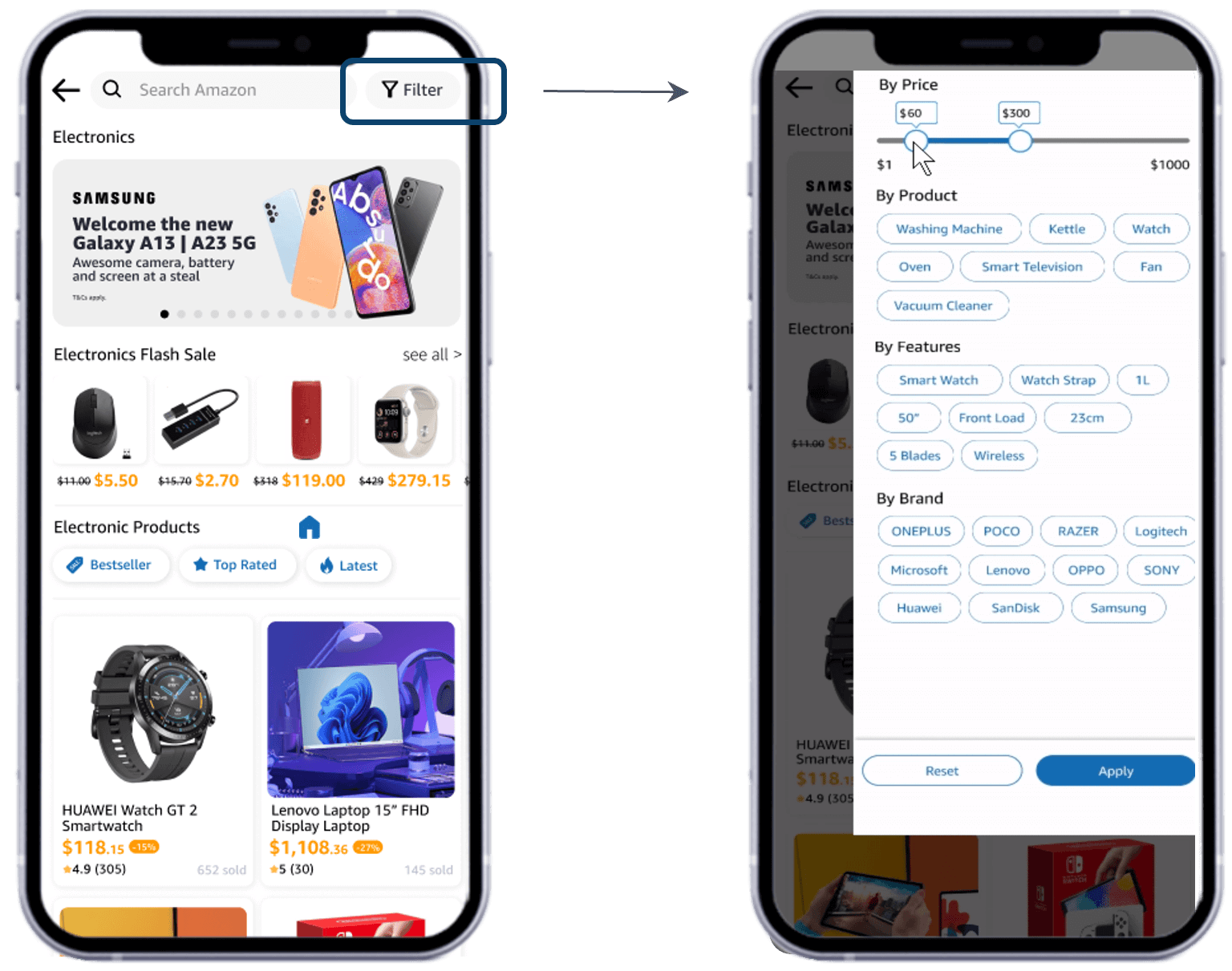
Relocation of Filter Button and more Precise Filtering Options
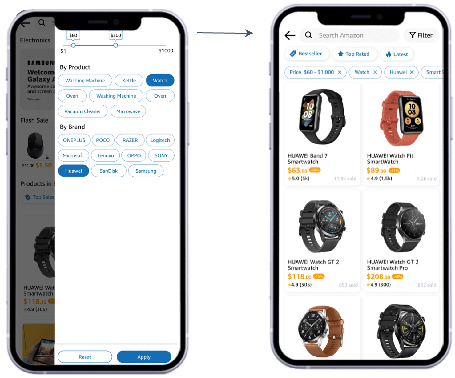
Filtered Options Appearing on Page
Because the review section is an important section that most users look for (all 5 interviewees looked for it upon reaching the product page), the new design shifted it up where it can be easily found and viewed upon loading the product page.
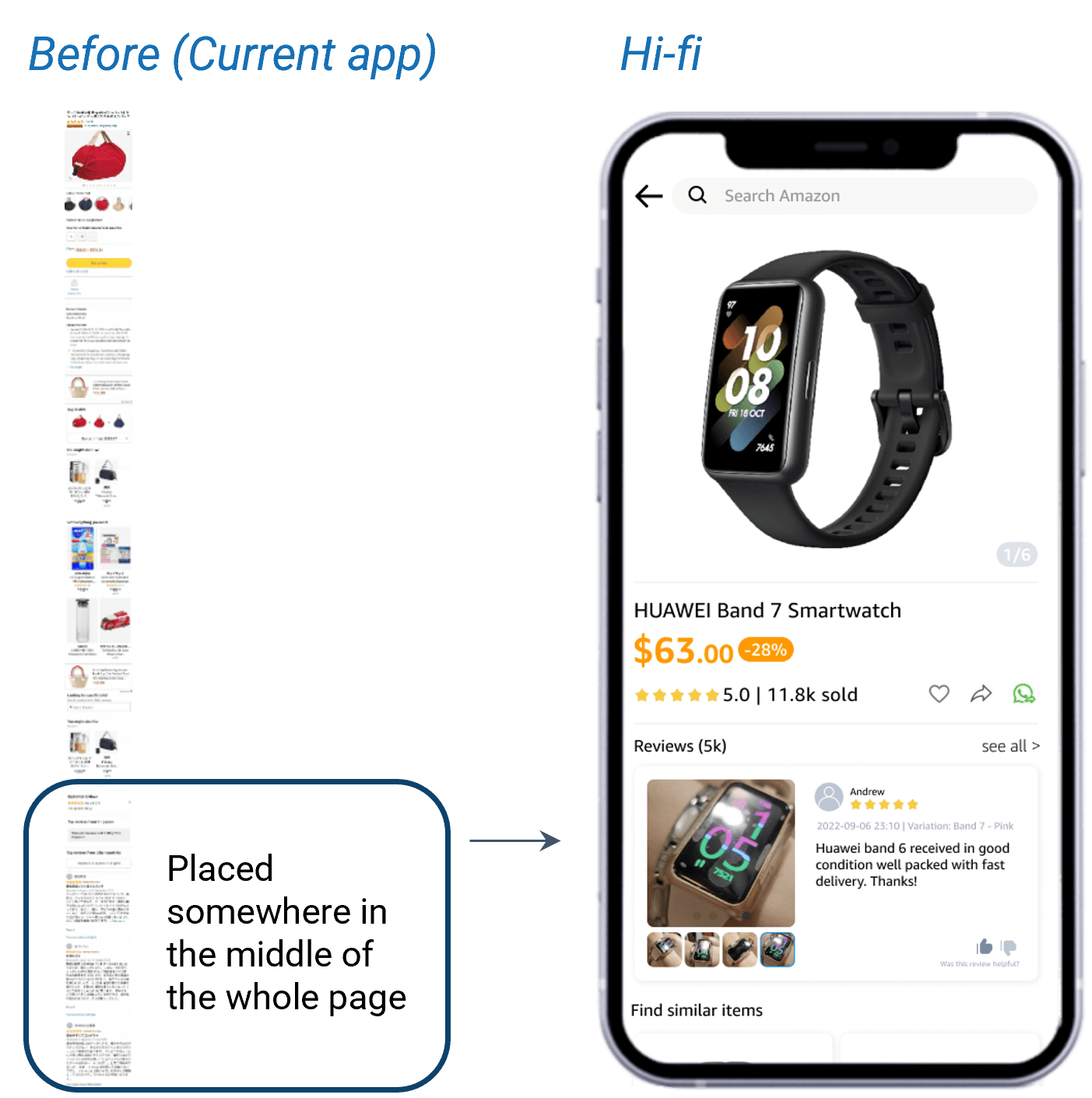
Before and After Relocation of Reviews Section
As the target persona in this study is the wandering customer, a pop-up banner page upon loading the app would help in product or event discovery, which can lead to a higher conversion rate.
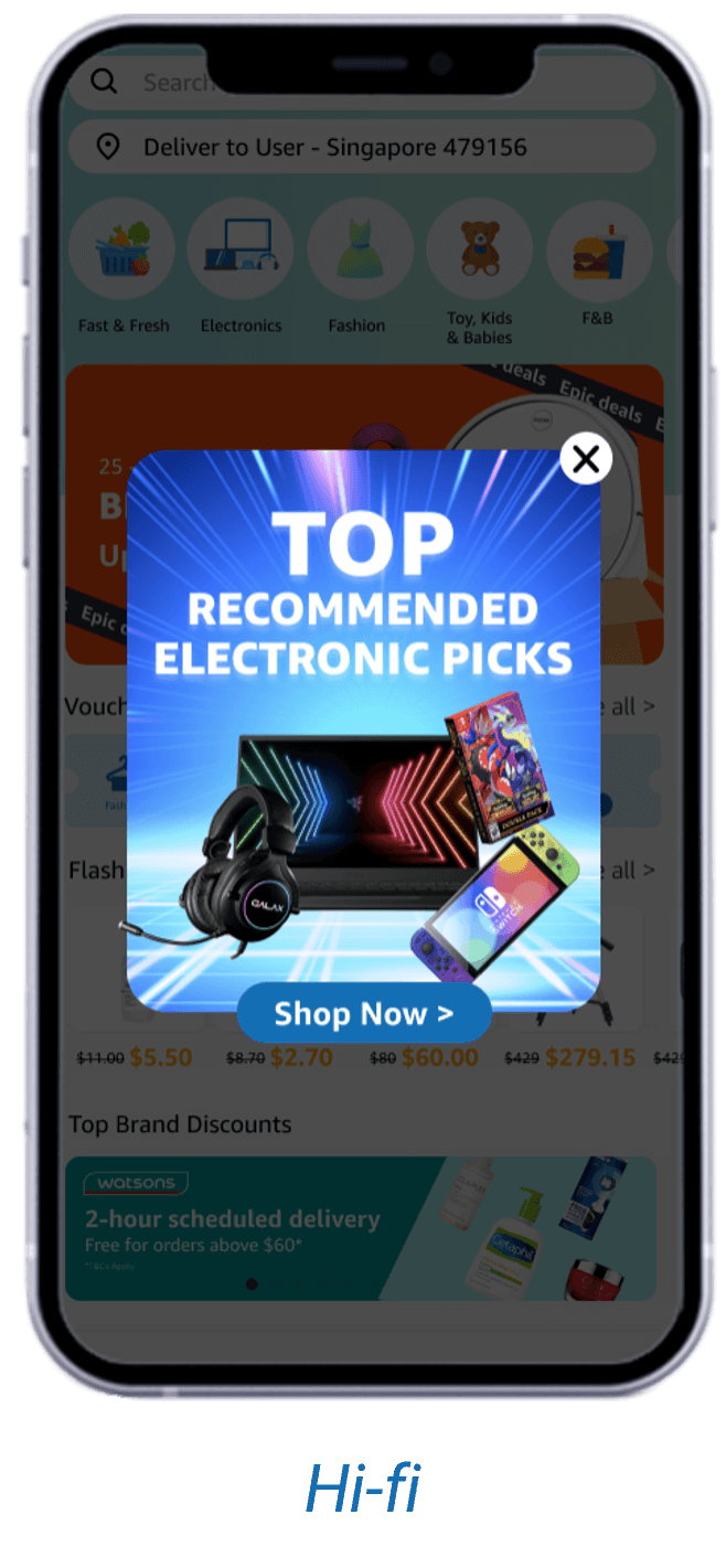
Pop-up Banner Design
The current design is placed in an unconventional location on the page and disappears upon scrolling. Hence, the solution is to make the "add to cart" and "buy now" buttons sticky at the bottom of the page.
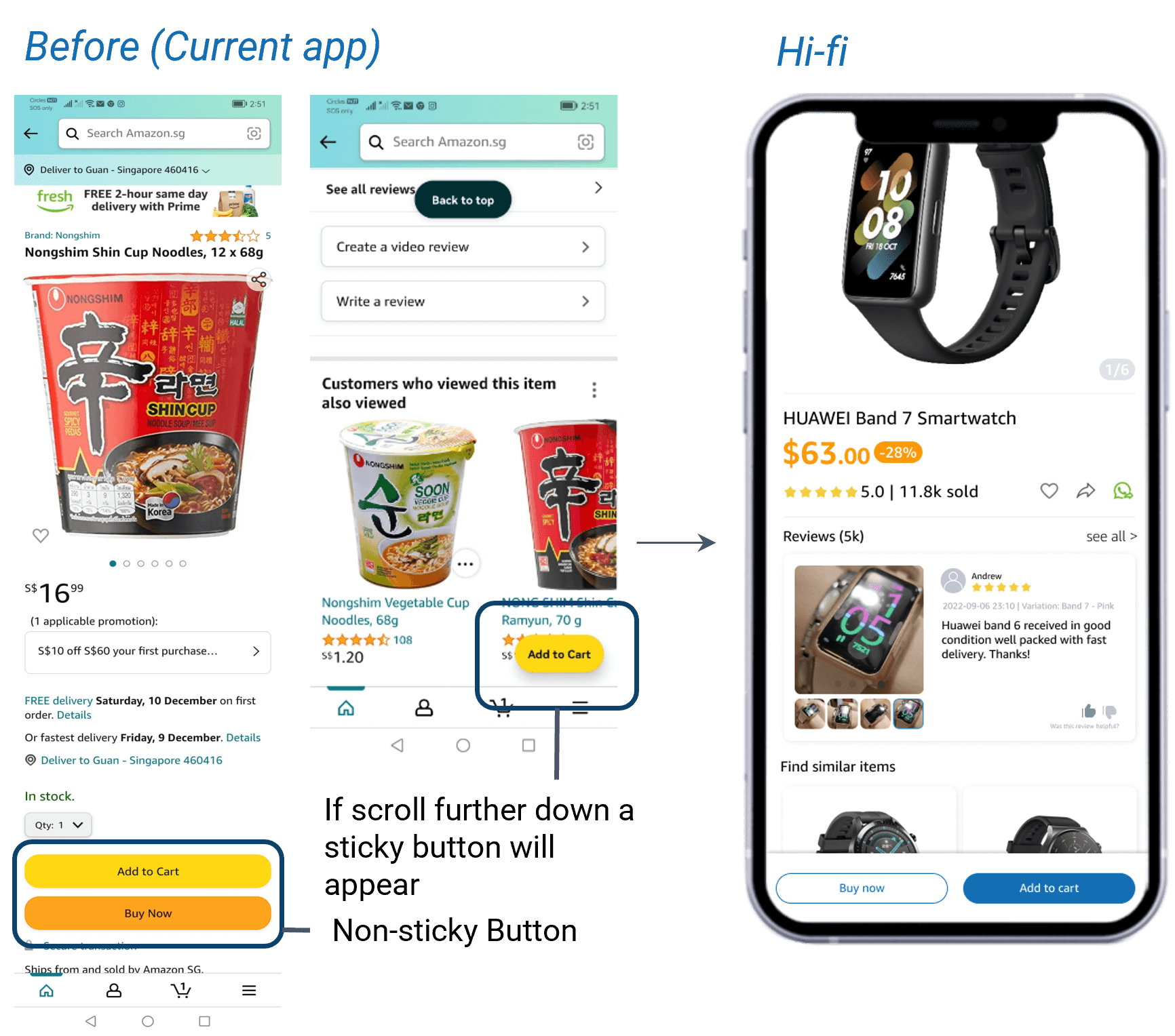
Before and After Design for the 'Add to Cart' Buttons
The prototype is being tested with three different users. Each of the users was given the task of browsing and purchasing a smartwatch within a given price range without using the search bar. This is to test if the user can find the filter function easily and navigate with ease to the desired product.
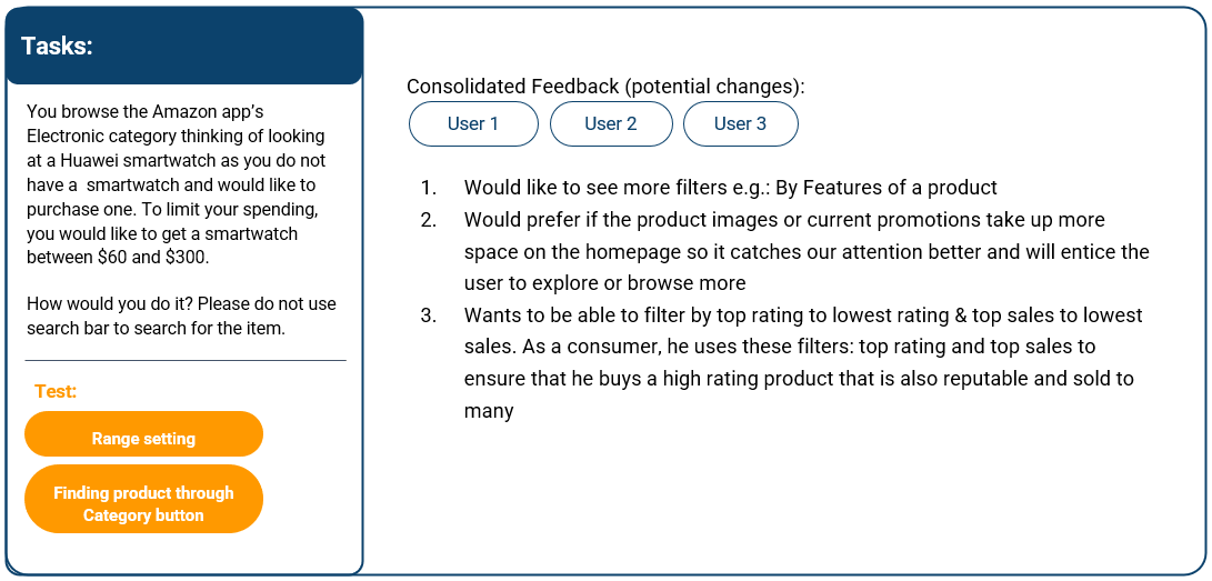
User Testing Task, Scenario, and Feedback
After consolidating and considering the user feedback from the user testing, there were 3 main changes made to the prototype:
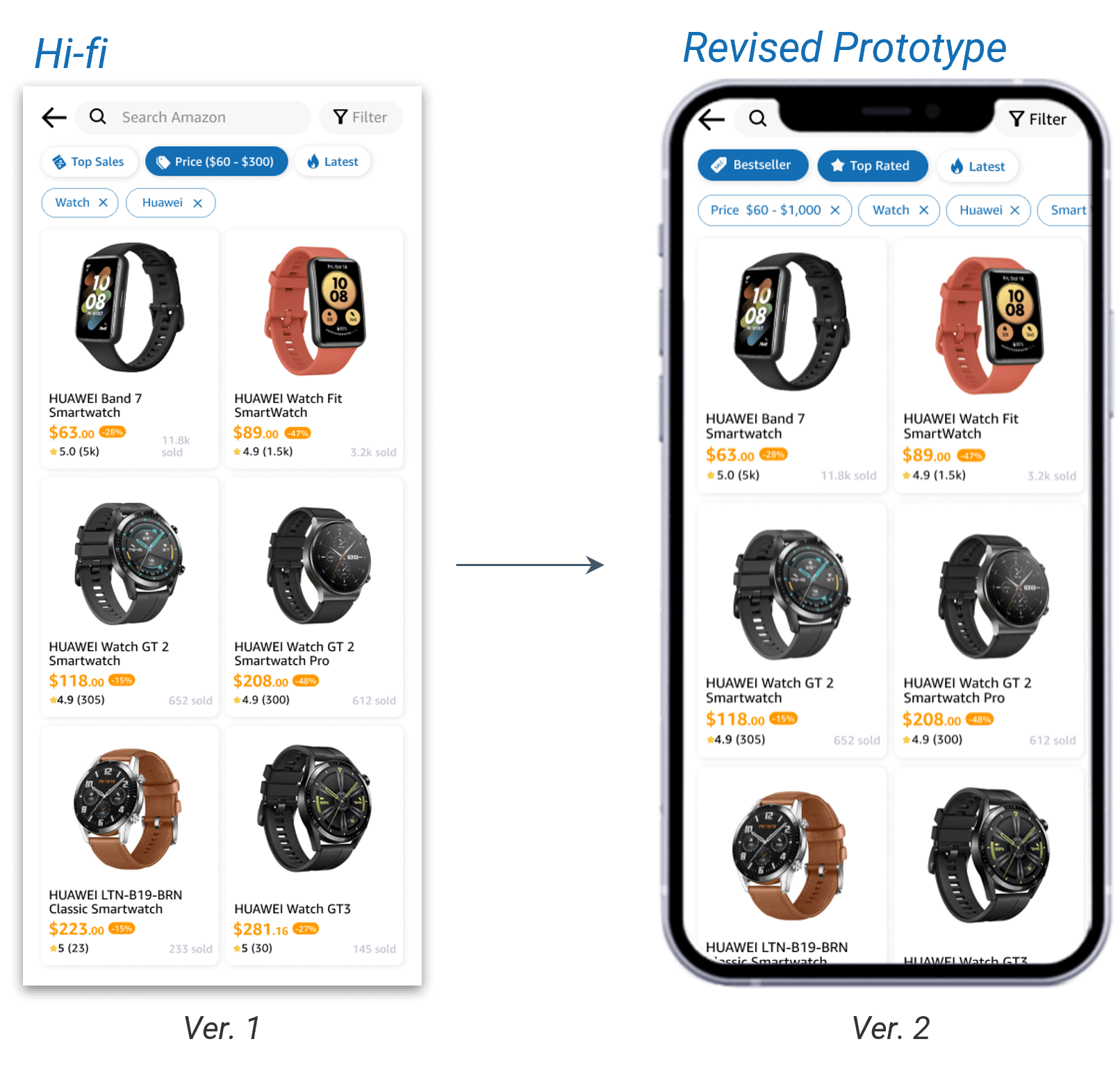
More Default Filtering Option

Increased Banner Size
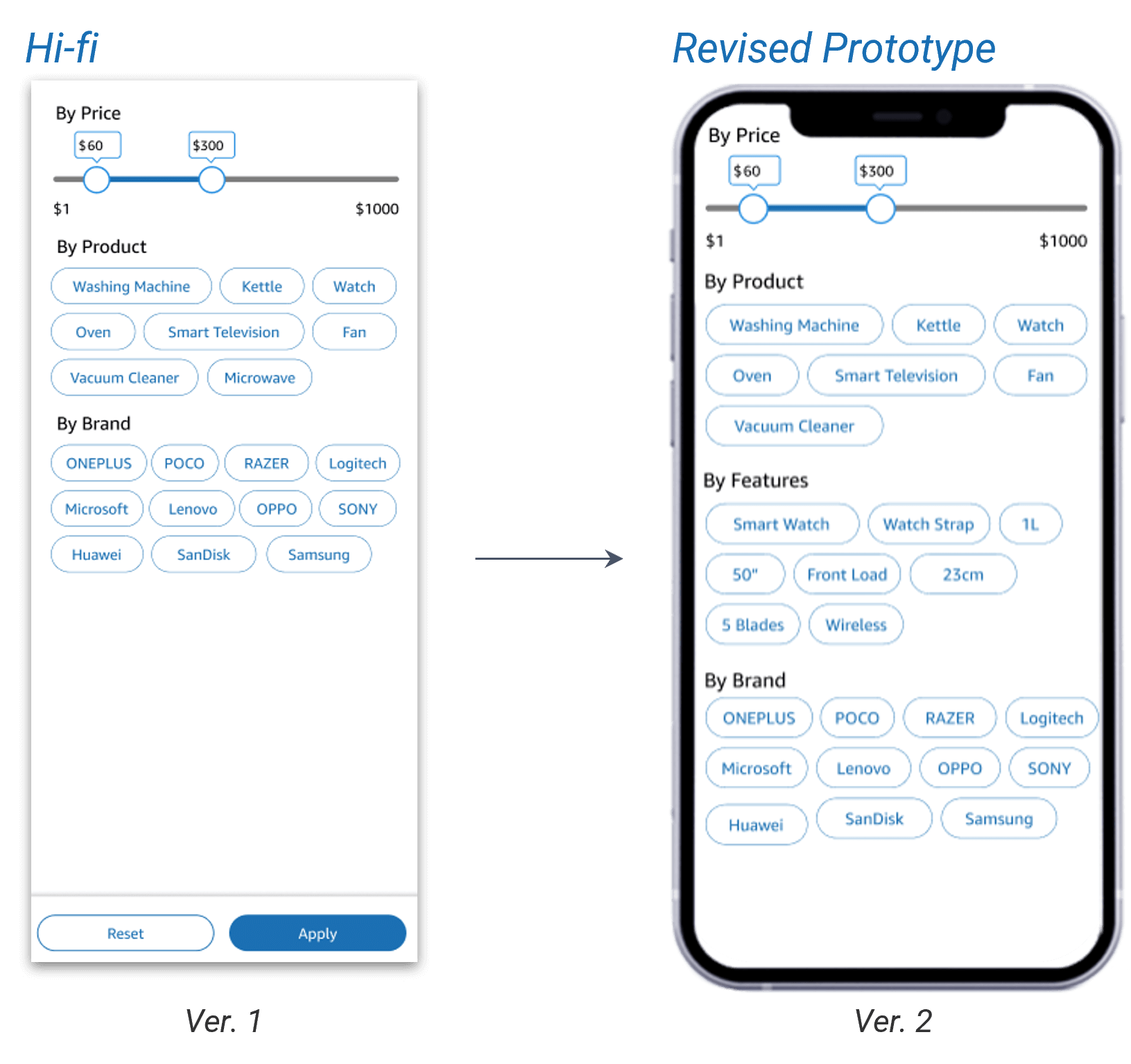
Filter by Features
During the user testing, another SUS survey is being done to gauge the usability of the new design and the current design. The same task was also conducted on the current app design versus the prototype to compare the time taken to complete the task on each design. A comparison is being done between the current app and the prototype; below is the result:
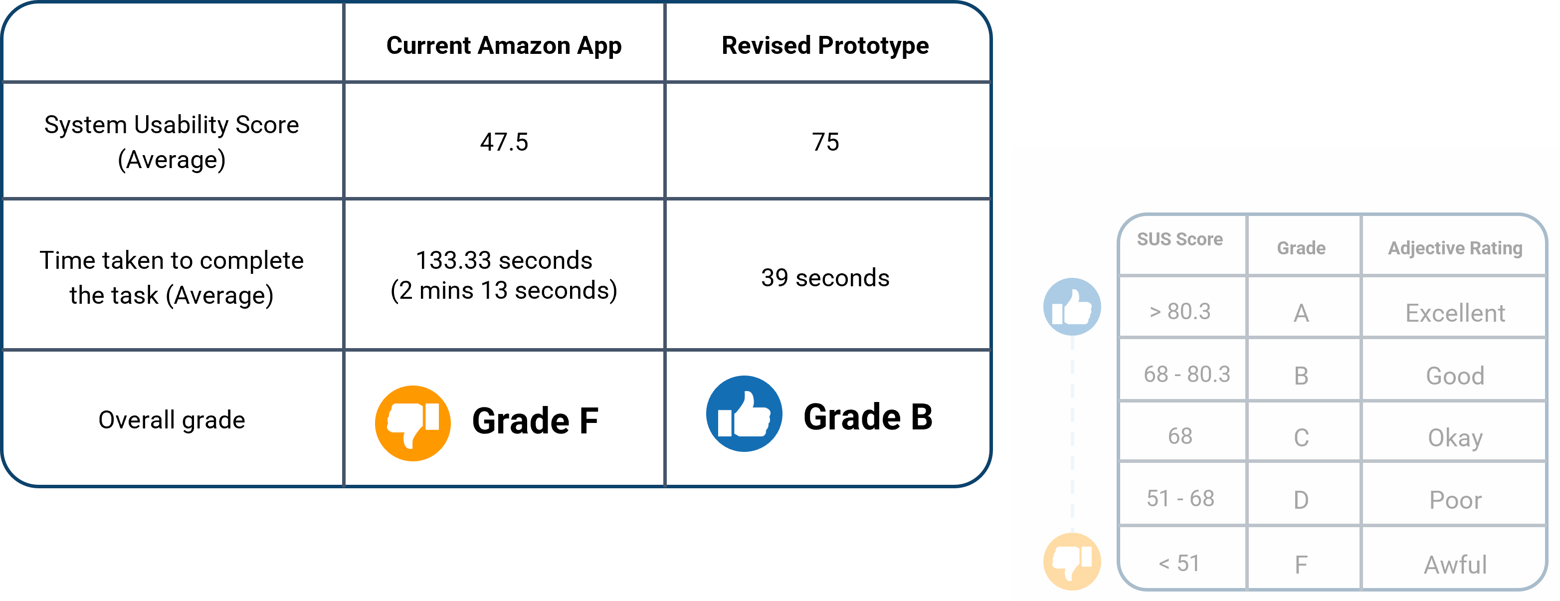
Current App VS Prototype Comparison
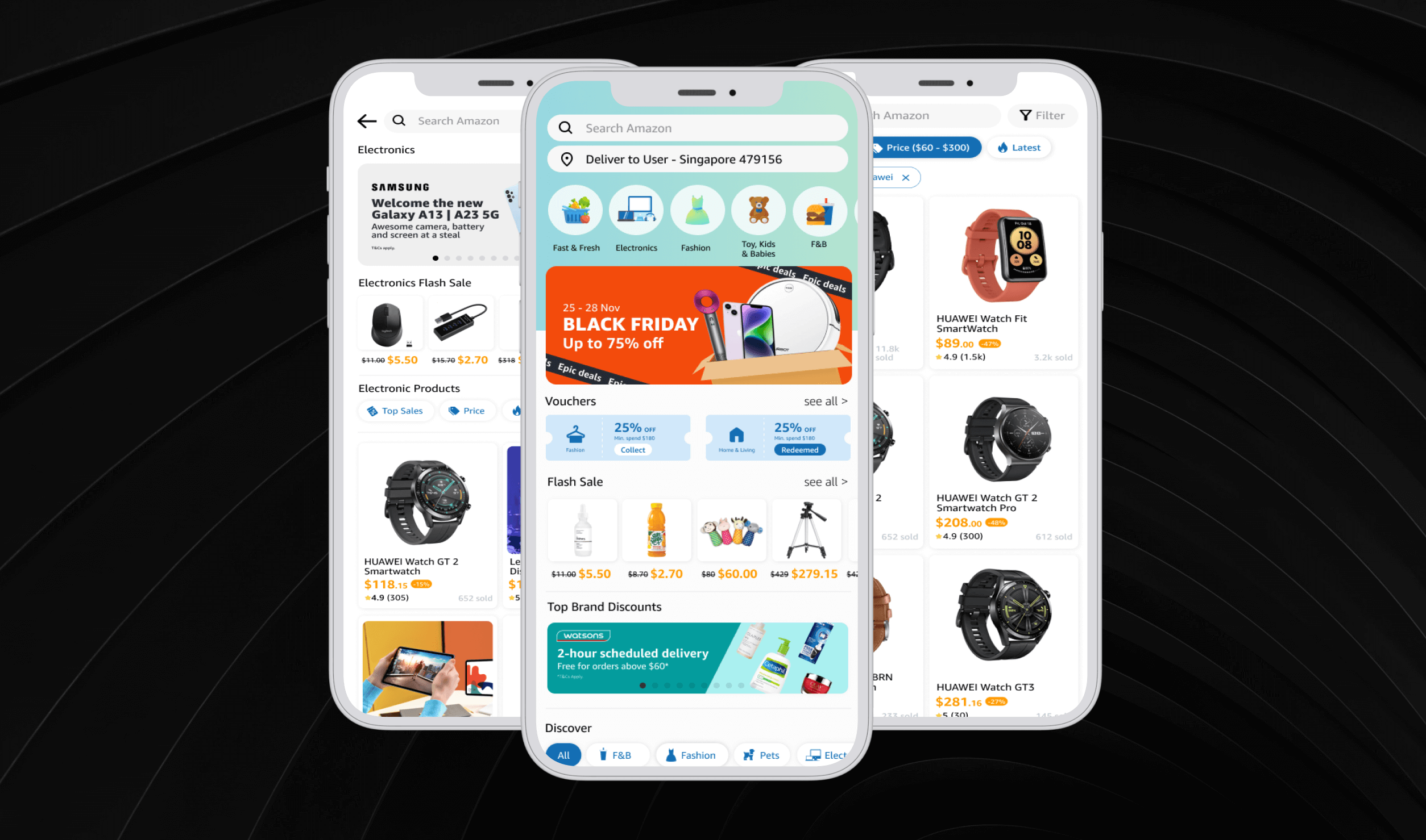
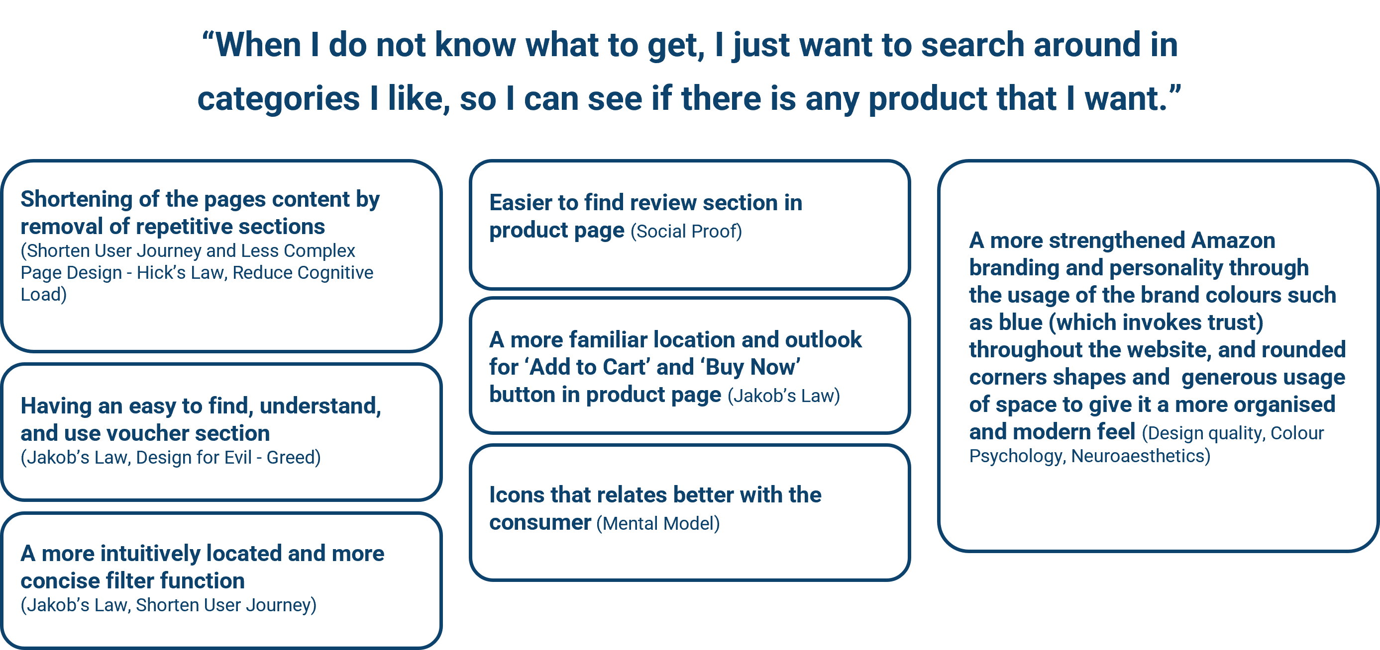
Solved the jobs to be done by shortening the pages through the removal of repetitive sections, having a better location and function for voucher, filter, review, and 'add to cart' and 'buy now', more relatable and obvious icons, and a strengthened branding and personality.
Summary of New Improvements and Laws Applied
It would be helpful to get data such as heatmaps, customer profiles, the conversion rate for different visits, and how long they spent on the site. As this would help better identify more issues with the current application.
Please scan the QR code or click on the link to access the prototype. *Contact me if you cannot access the prototype.