Redesign SCDF Mobile App
7/10 people would download and use the application, 5/10 people would refer a friend
UX designer and researcher (decider)
User flows, Lightning demos, 4-Step sketch, Low-fidelity wireframes, High-fidelity prototype, User testing
Singapore Civil Defence Force (SCDF) (School project)
Figma, Miro board
UX/UI designers
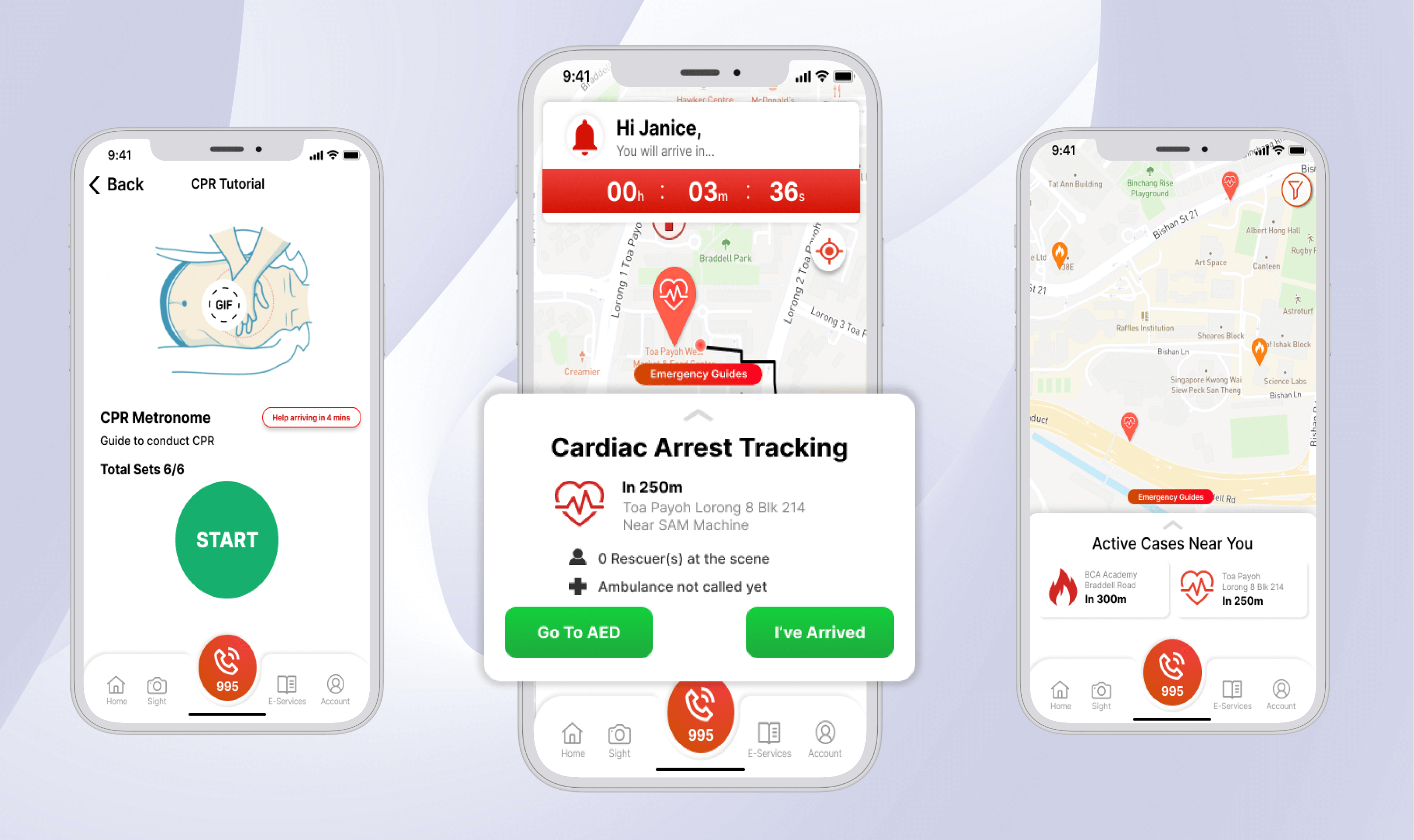
myResponder app is a mobile application by the Singapore Civil Defence Force to alert members of the public to nearby cardiac arrest cases and minor fires. myResponder works by notifying members of the public (also known as Community First Responders (CFRs)) of cardiac arrest and fire cases within 400m of their location, and it also highlights nearby automated external defibrillators (AED) that may be available to the responders and provides guided advisories in the mitigation of minor fires. However, to date, there have been very few downloads, and there are not many active users on the platform.
Design Sprint is a five-day process that focuses on delivering solutions with a holistic approach to the product, business, and customers or users.
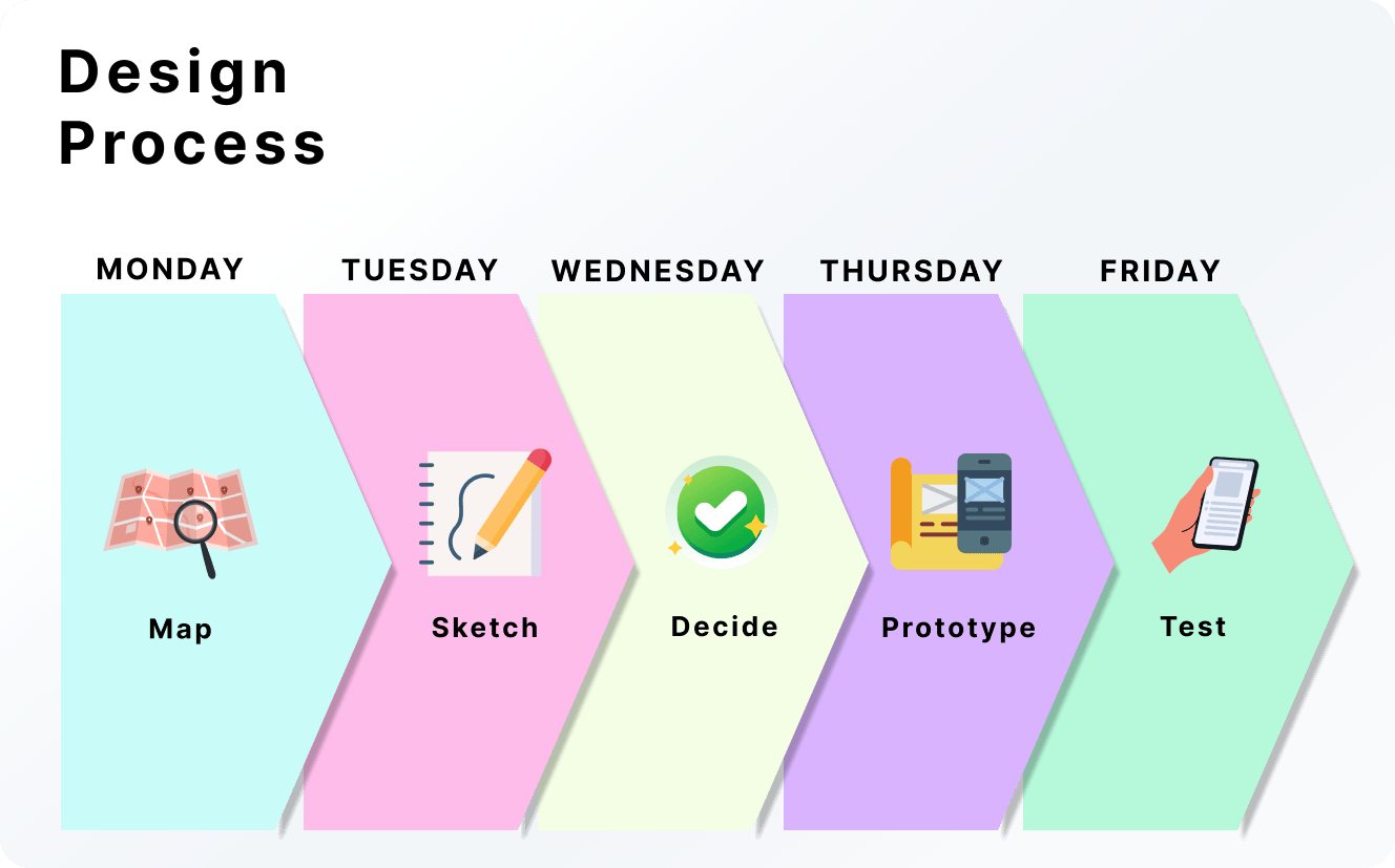
Design Process for myResponder
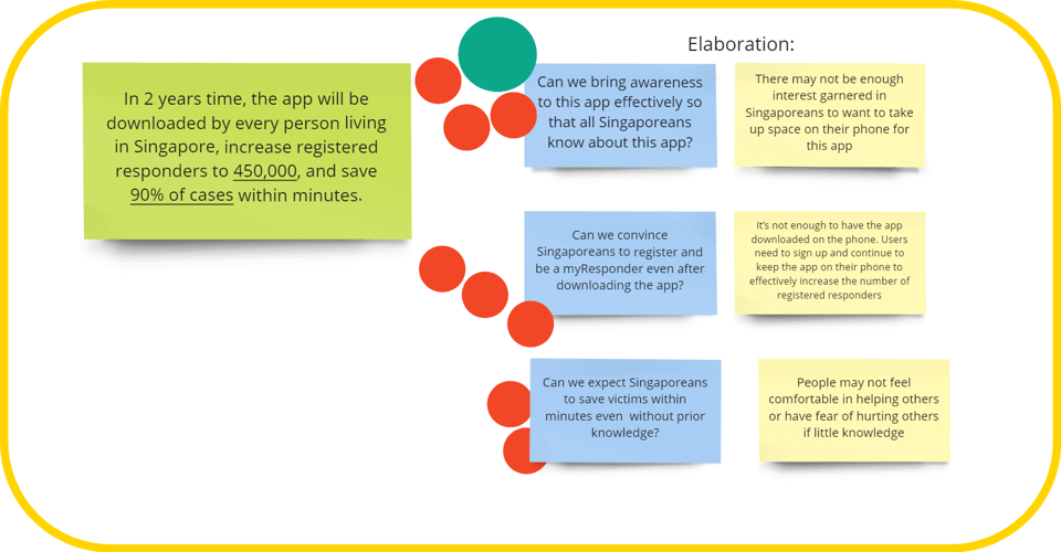
On Monday, the long-term goal and steps to achieve it are being defined. An optimistic 2-year goal for this project would be:
Different obstacles that will prevent the team from reaching the long-term goal were being brainstormed, and the top 3 were being voted on as the sprint questions by the decider. The key consideration is whether the questions help to feasibly reach each of the three goals listed in the long-term goal.
Top 3 Voted Sprint Questions (in blue)
The team then listened to some expert interviews and created a list of HMWs statements for the different categories; this helped the team to diverge into more ideas and converge to focus on the most important question or statement. This helped the team to reframe the problems as opportunities for improvement and determine the parts of the app to focus on through voting on the voting tree.
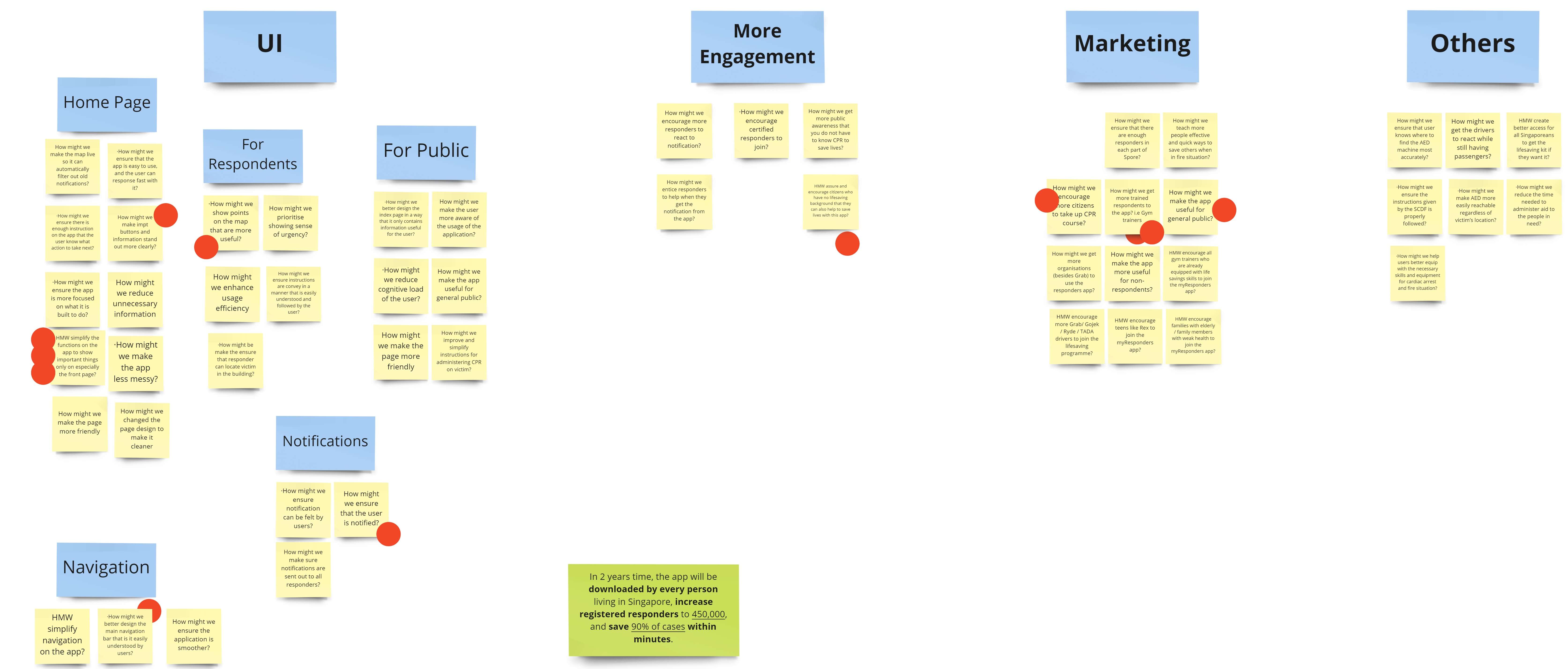
HMW Categories and Voting
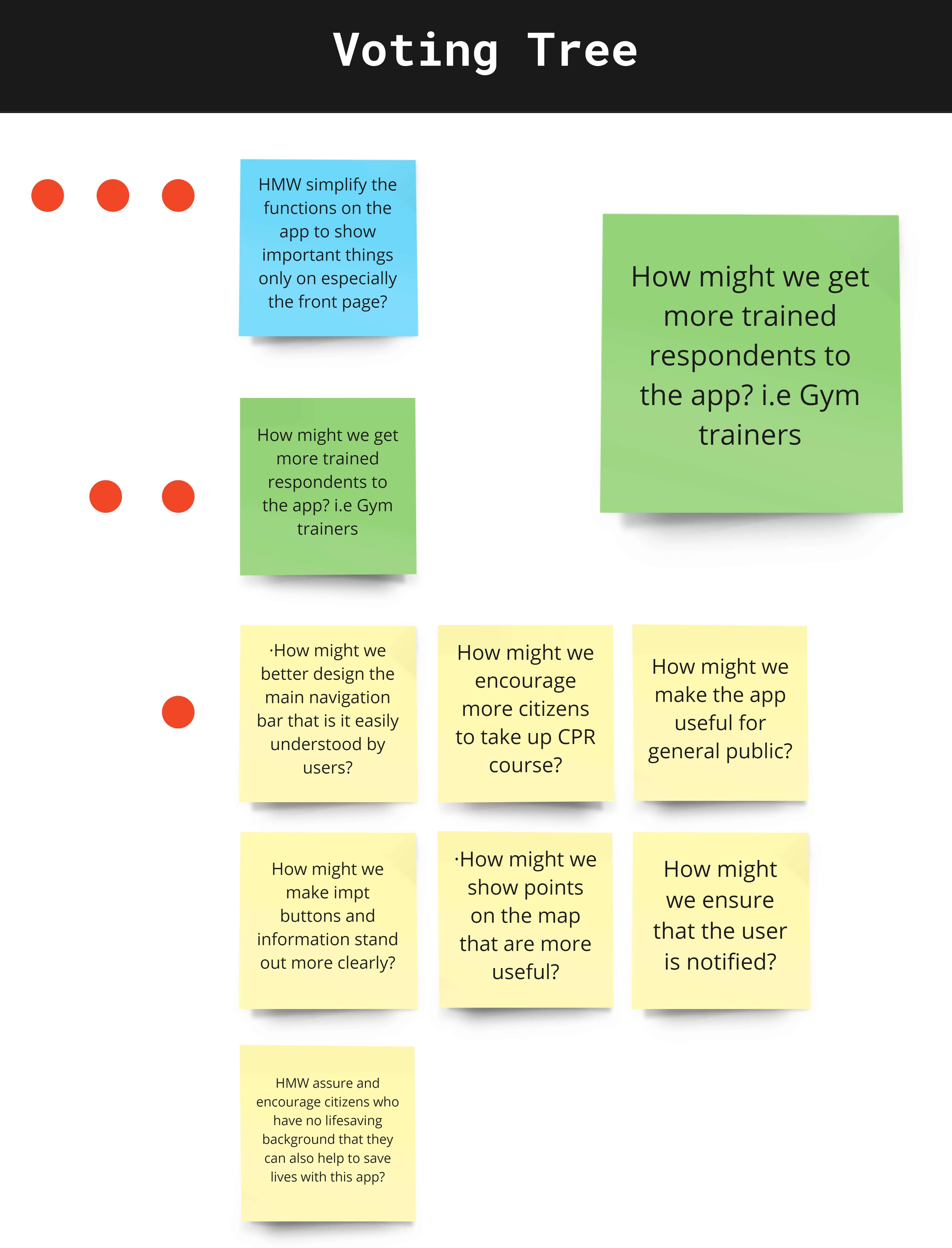
Top HMW Statement on Voting Tree
A user map is then created to clearly identify and connect the users and key stakeholders to our goal. The map allowed the team to visualise every step of the way, from the beginning of passers-by, responders, and SCDF operators' involvement in saving the victim to ensuring that the victim lasts until paramedics arrive and is being saved. For the project, it will focus on solving the HMWs statements for both responders and passersby, as well as the top 3 sprint questions.
After knowing where to focus our efforts on answering our HMW questions. The team searched for existing ideas on the internet or app store, then took 1 - 3 inspiring examples to present to the team. Inspiring examples came from LinkedIn, Netflix, Classpass, Waze, TraceTogether and Grab.
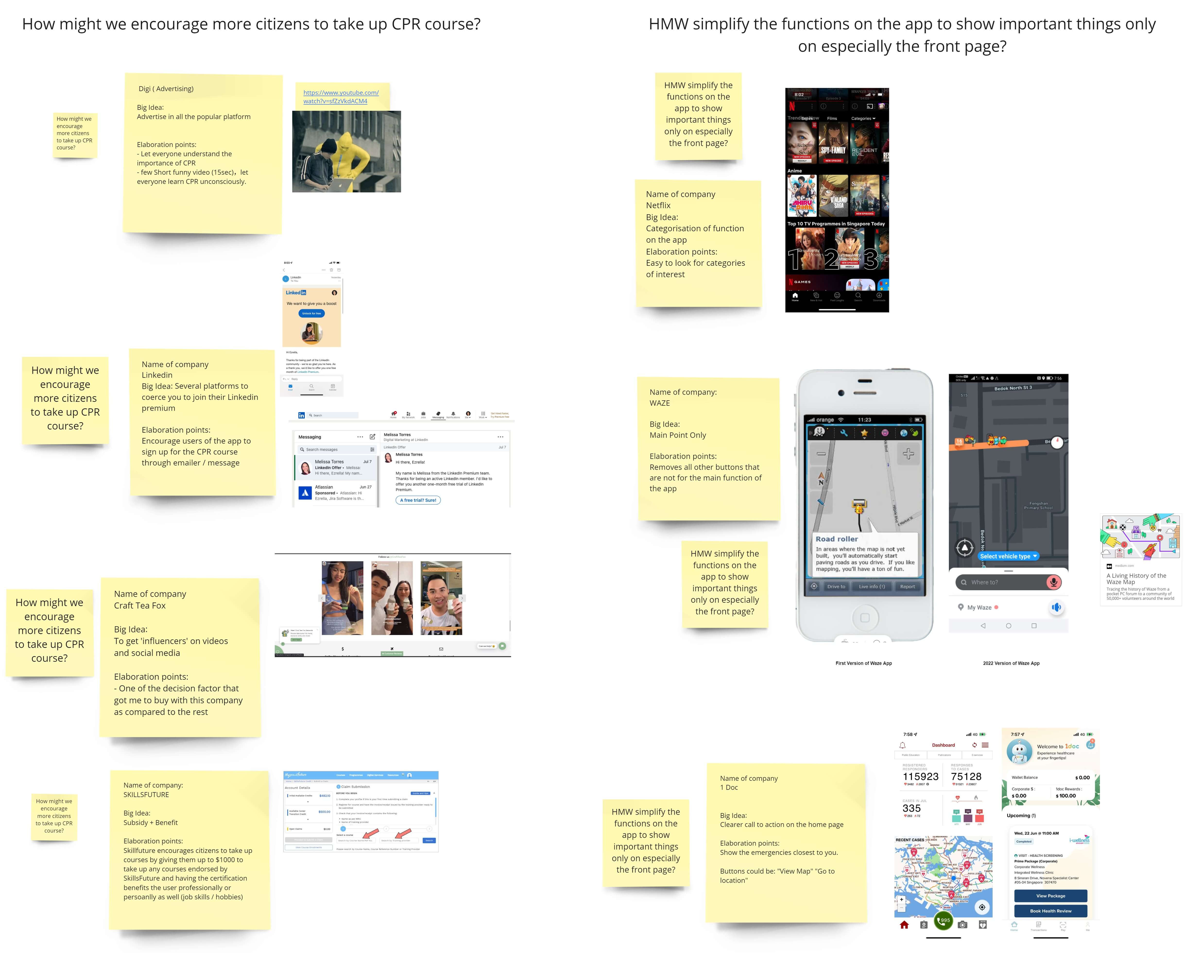
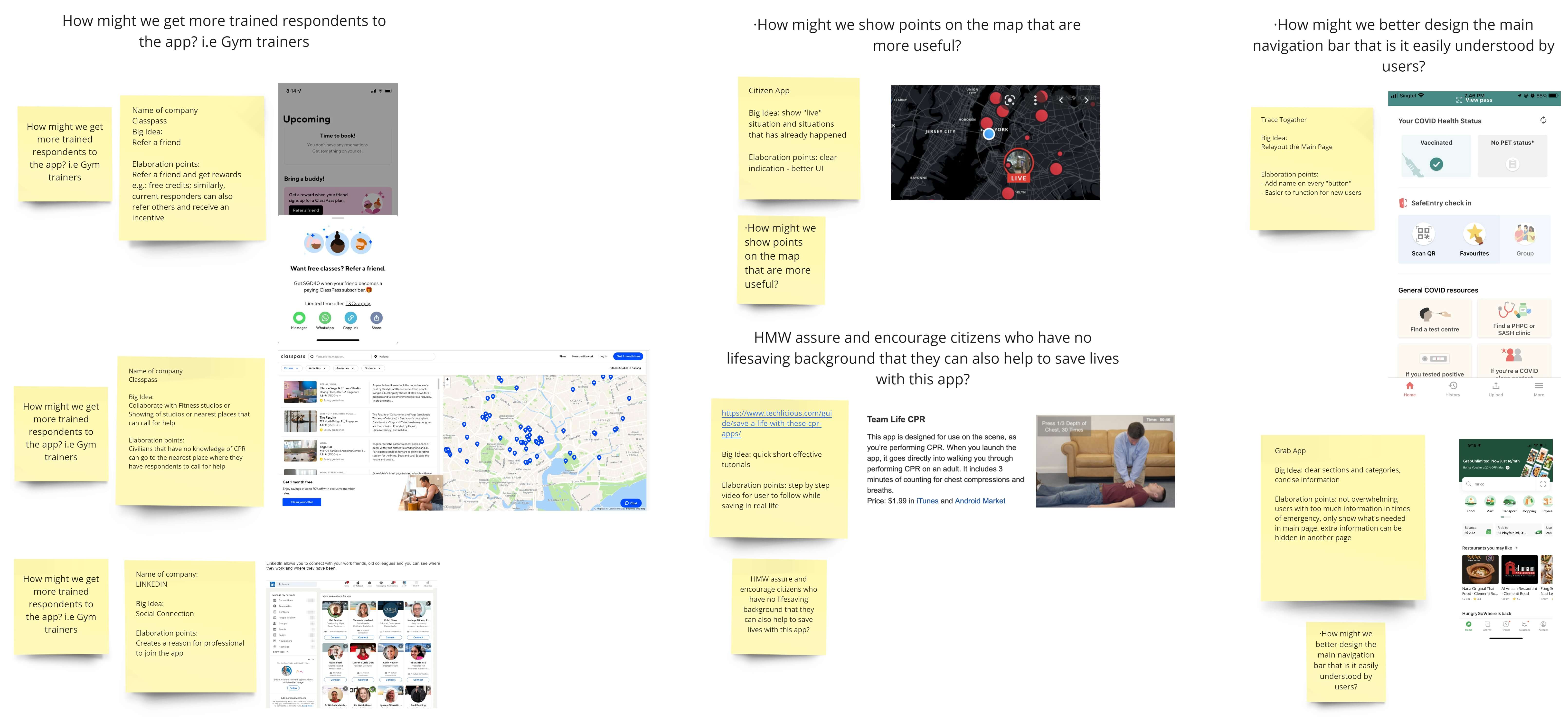
Lightning Demos Ideation
Ideas were further expanded using sketches, where each member created ideas for the app using inspiration from the lightning demos.
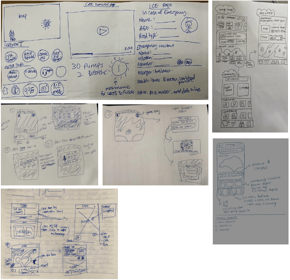
4-Step Sketch Drawings
During heat map voting, each member will take 3 minutes to present their concept and answer each member's questions, and at the end of it, every member will use their unlimited vote to vote for the ideas that they think help solve the sprint questions. There were three top ideas being voted on, namely:
Design Ideas
Members Voted Ideas (Coloured Dots only)
At the end of the session, the decider will cast up to six super votes, which will decide what the team does moving forward.
Super Voted Ideas
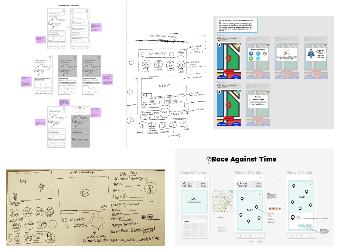
The first step before prototyping is to map out the user flow that a user might go through. Each member gets to come up with a user flow, and the best user flow will be chosen based on its relevance to the sprint questions and feasibility. With the user flow, it will be clearer what the full story might be, and the high-fidelity prototype will be created with reference to the storyboard.
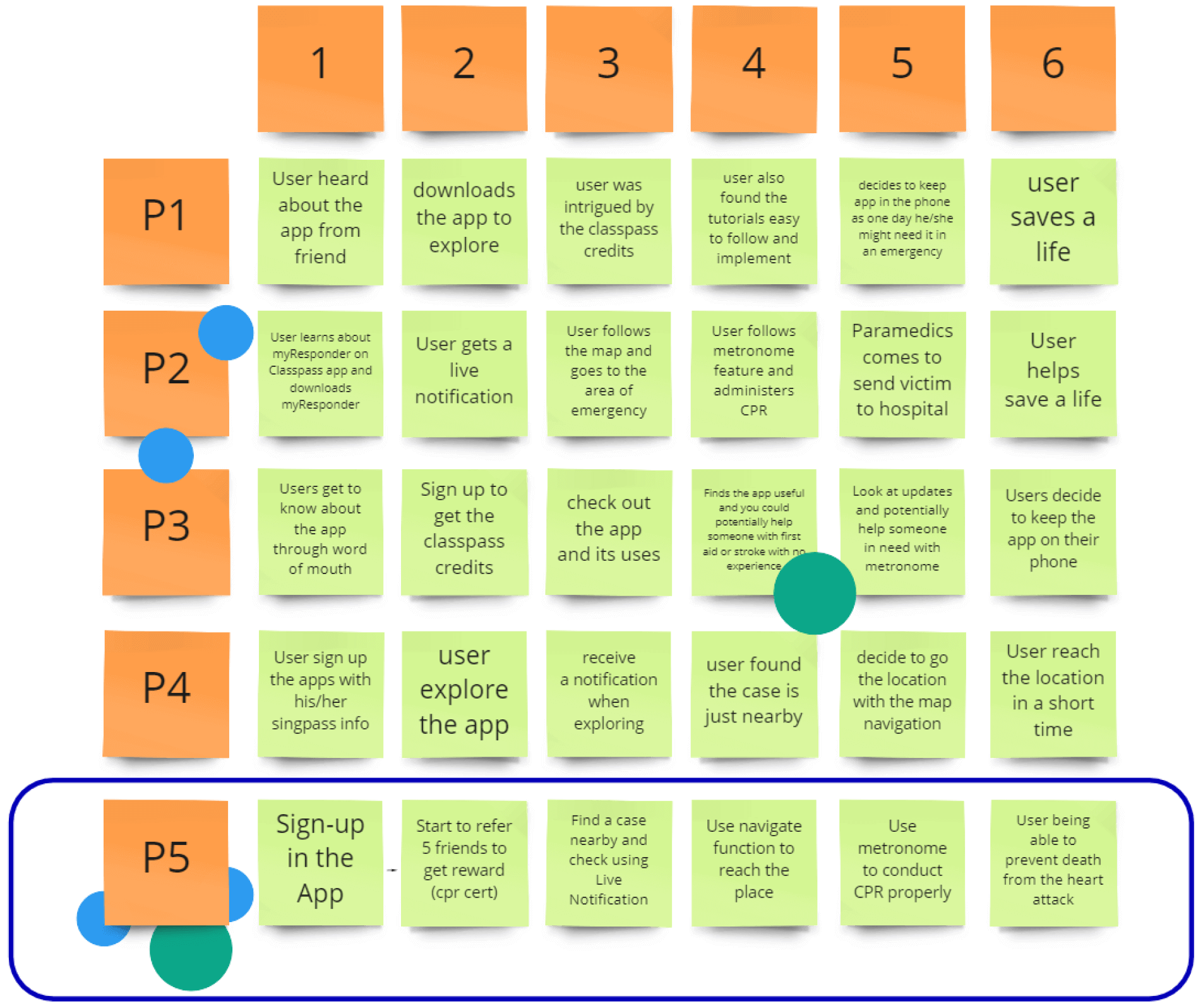
All User Flow Ideas
Storyboarding
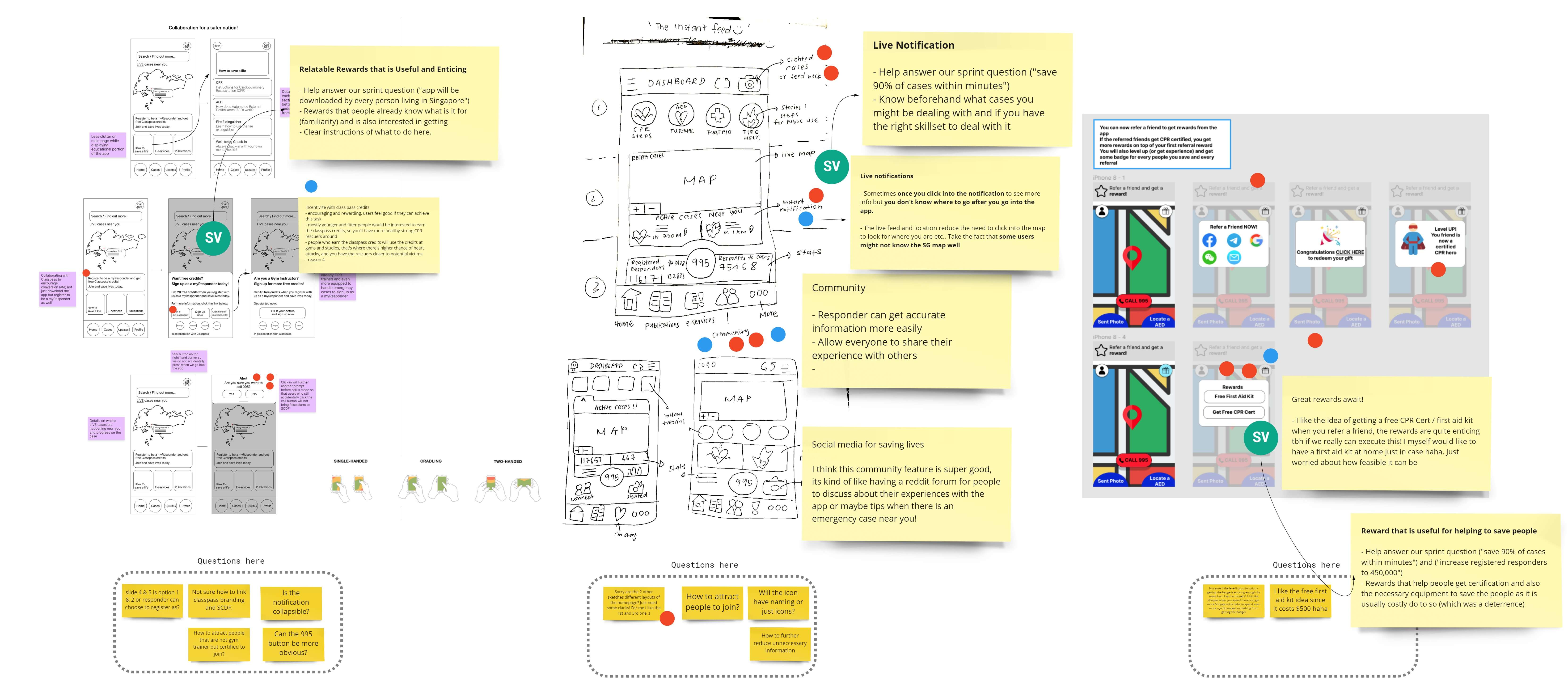
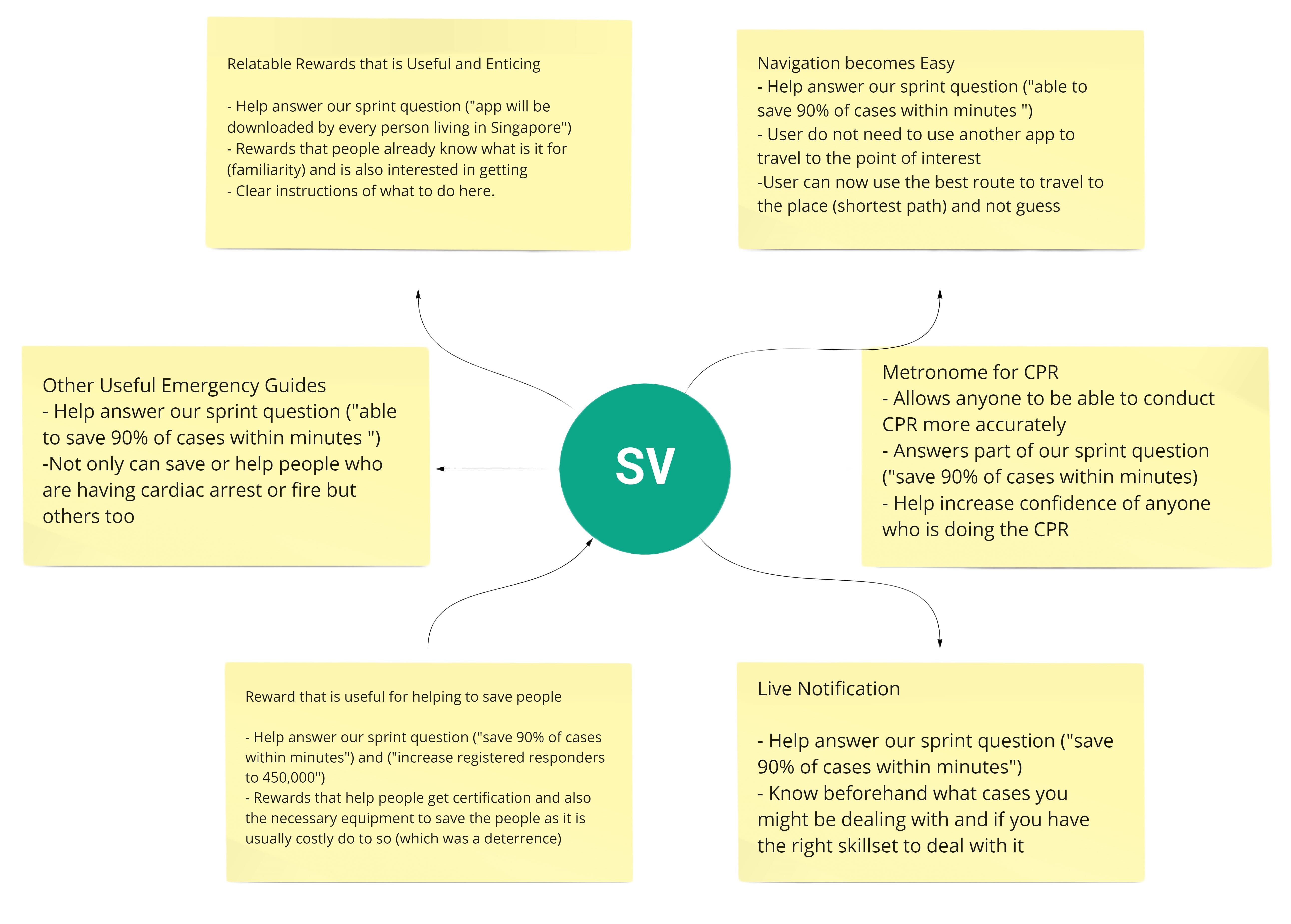
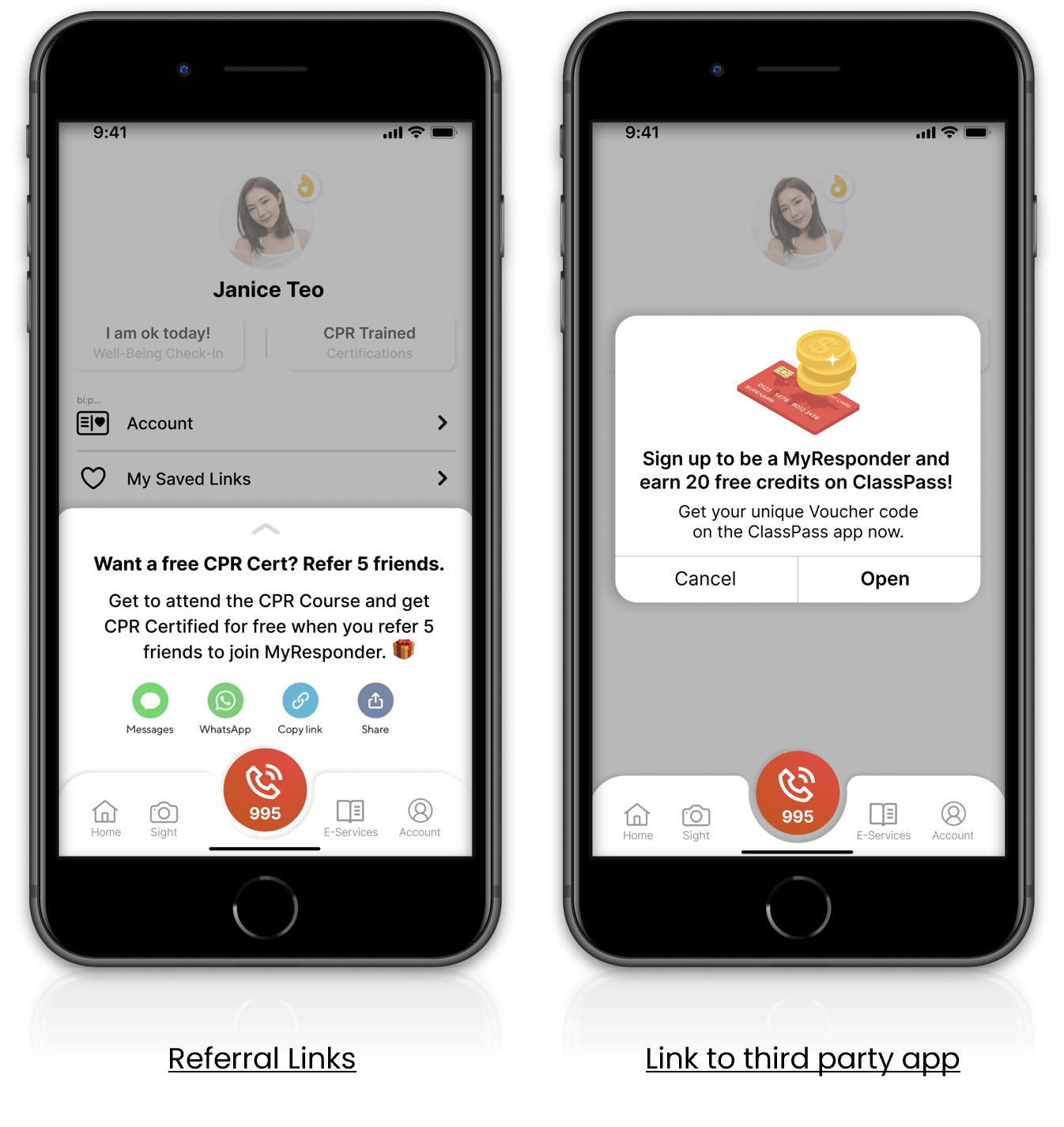
Super vote 4 (the addition of distribution channels) helps to spread awareness and encourage users to download the myResponder app by having more distribution channels and partners.
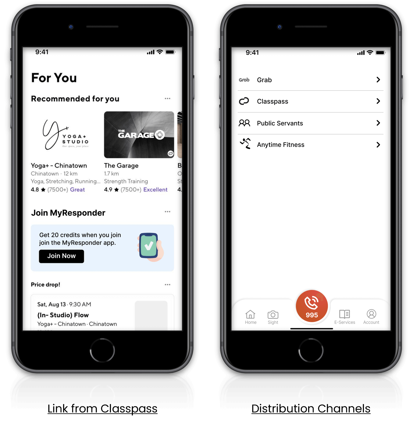
Referral Function with Partners (Super Vote 4)
Super vote 5 (enticing rewards) helps to solve this by giving users some rewards to entice them to get CPR certification.
Rewards System (Super Vote 4)
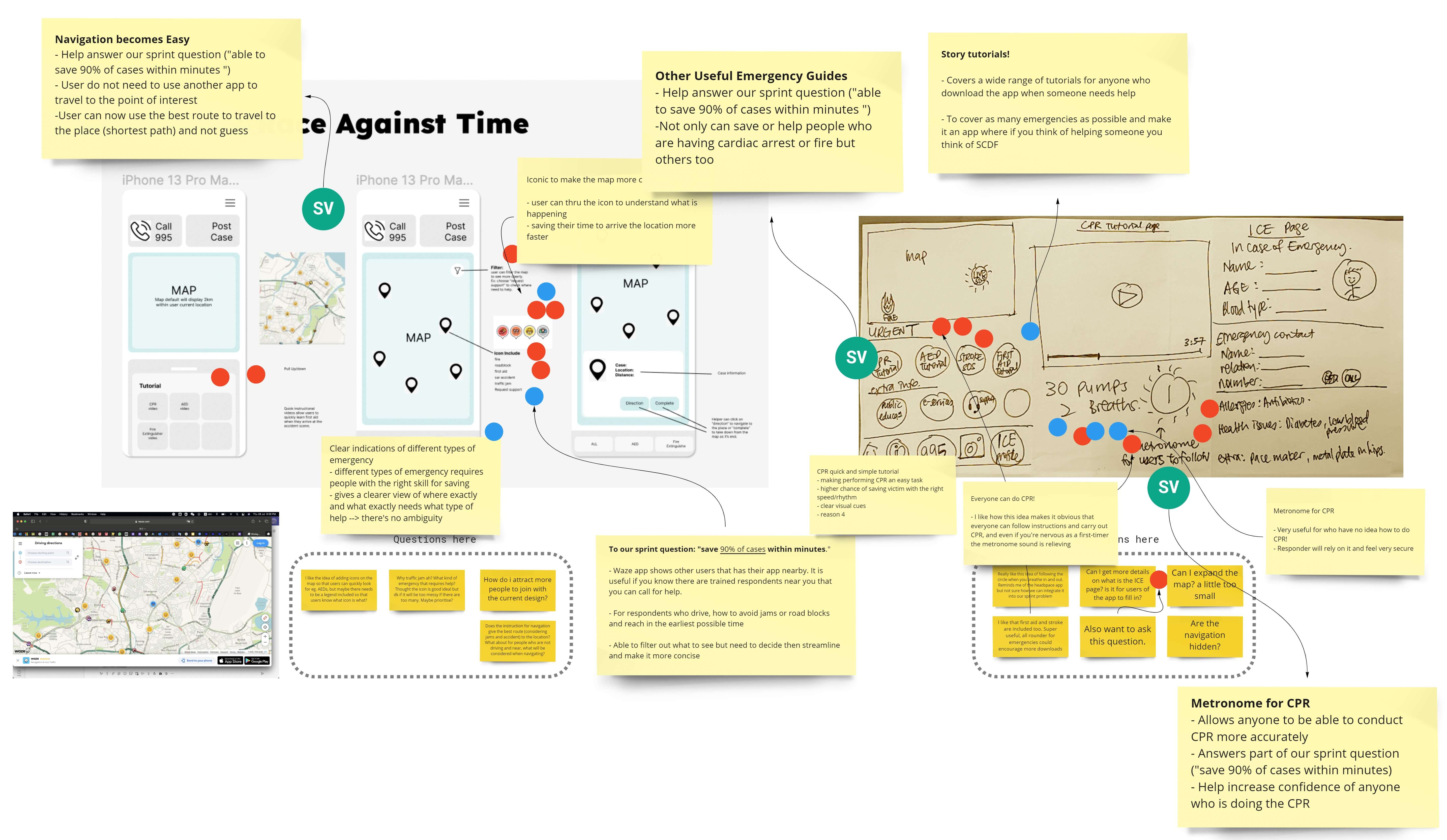
The prototypes are created based on the super votes and user flow with the sprint goals in mind. Super vote 1 (navigation becomes easy) and 2 (live notification) help to solve sprint goal 3, which is to efficiently save 90% of emergency cases within minutes. With these two functions, users can quickly reach the victim with the appropriate equipment, or they can seek assistance from the appropriate professional.
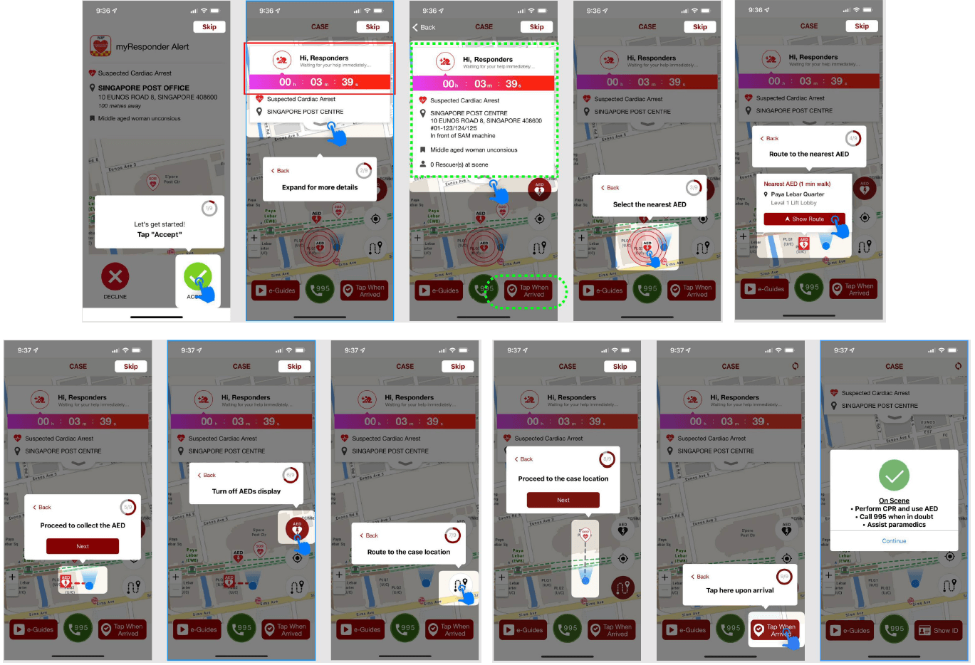
Current User Flow (Super Vote 1 and 2)
Redesign User Flow (Super Vote 1 and 2)
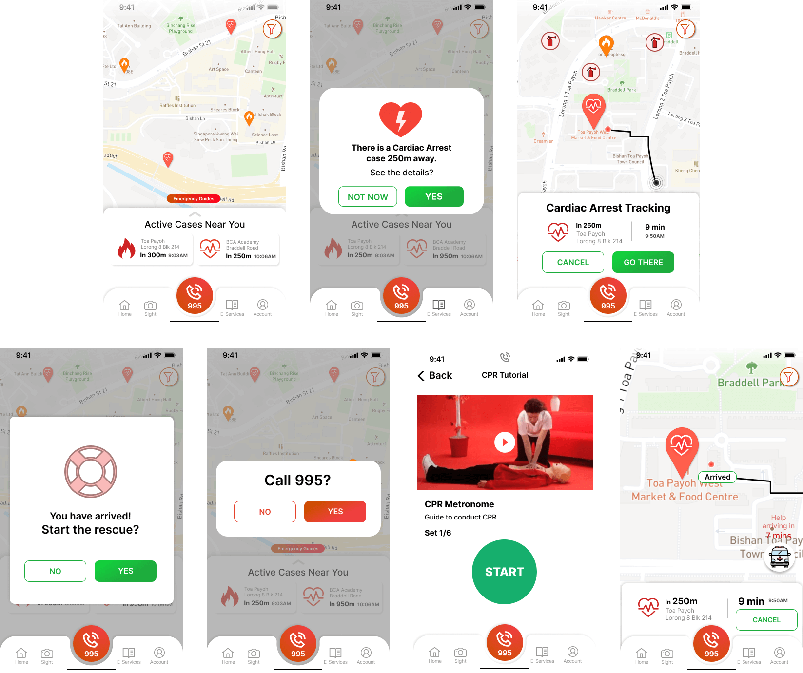
In addition, super vote 3 (emergency guides) can also help to solve sprint question 3 as it provides quick navigation to useful emergency guides where the user can quickly recap what to do in certain situations.
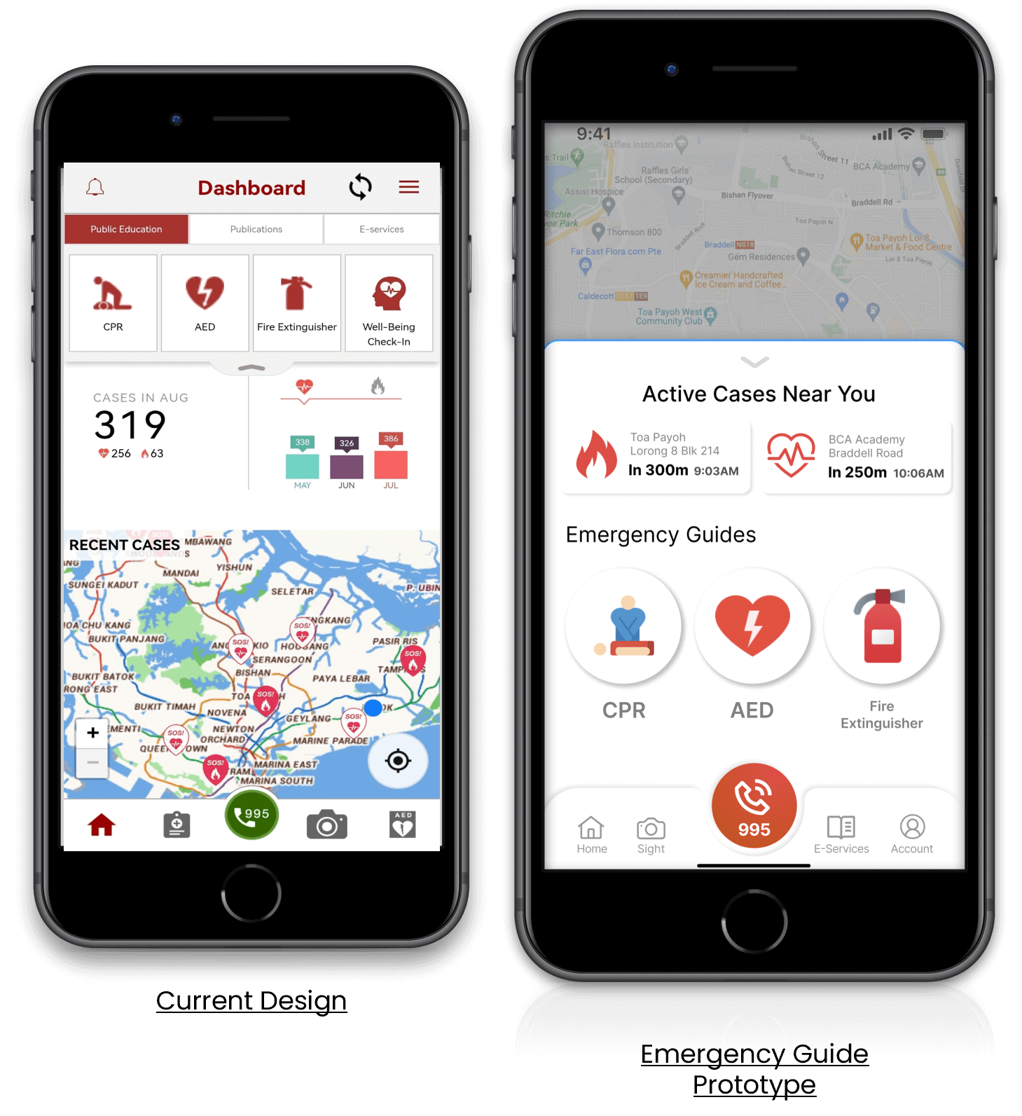
Emergency Guides (Super Vote 3)
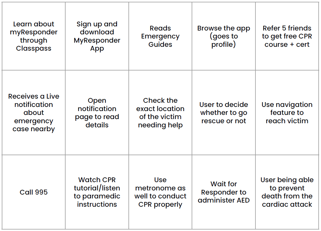
Five different interviewees were being tested on three different tasks. Each task aims to test the different functions of the prototype.
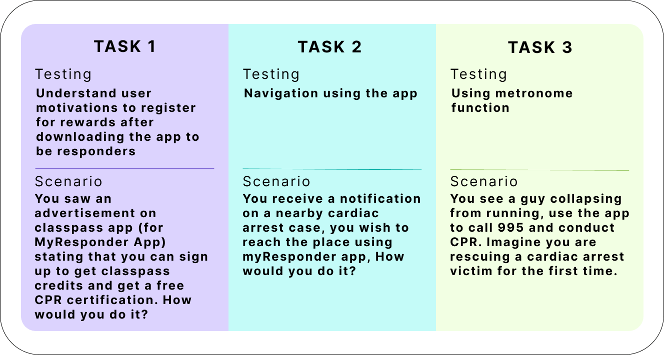
3 Tasks Tested
The team consolidated all the feedback and observations from the different user testing sessions, and below are the consolidated findings for each of the tasks.
We created a prioritization matrix before diving into the new prototype to prioritize more important features that are critical to assisting us in answering the three sprint questions.
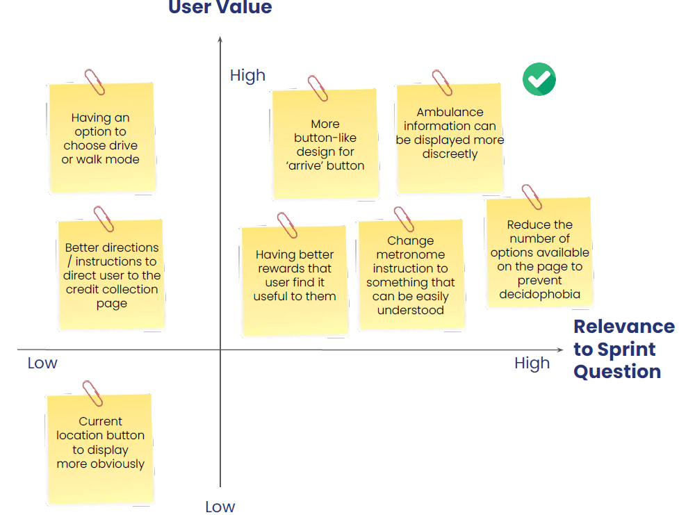
Prioritisation Matrix
Made the design more similar to the current app design, changed its colour to green instead of red, and placed it back into its original position.
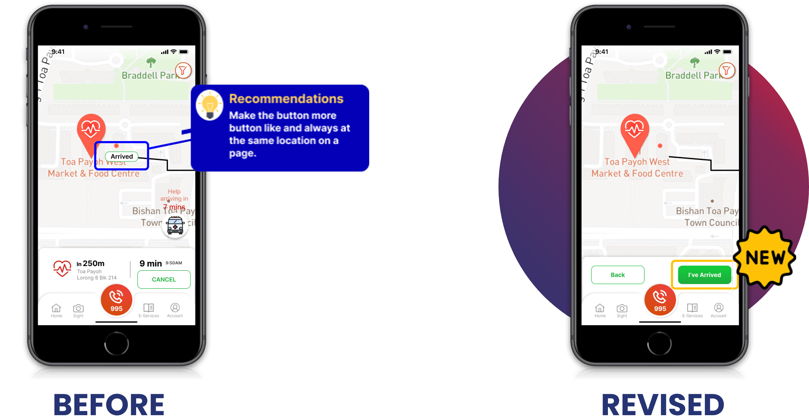
Before and After Arrived Button
Ensure that an emergency guide button will be available on every page.
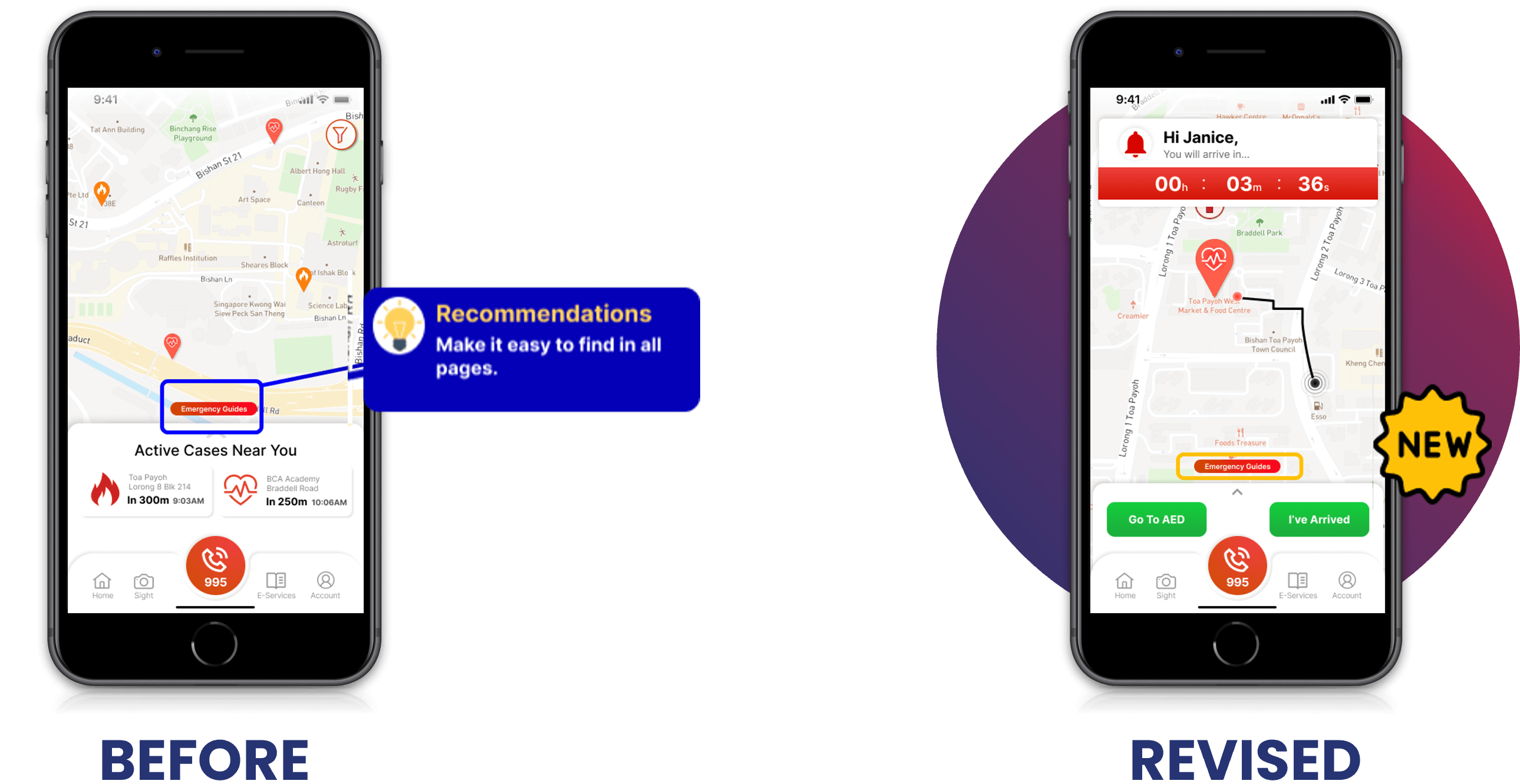
Before and After Emergency Guide Design
Ambulance information was removed from the map to save space on the map, and it was grouped with the other information details.
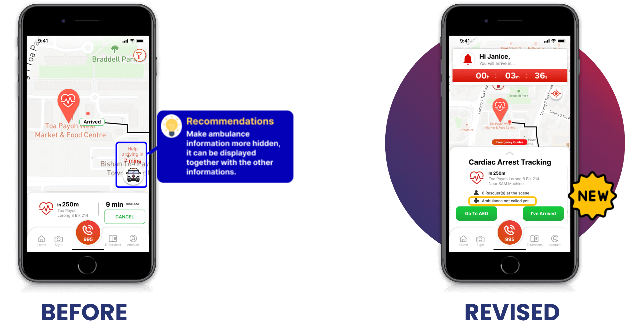
Before and After Ambulance Information Design
Changed the video format to GIF so that the user does not have to decide whether or not to play the video.
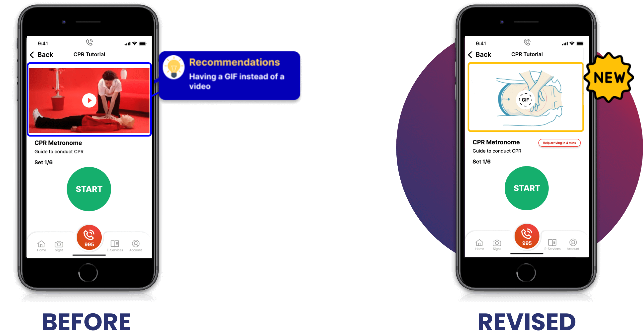
Before and After CPR Instruction
Simplify the metronome guide by changing beats to a countdown in numbers and using the red button to start.
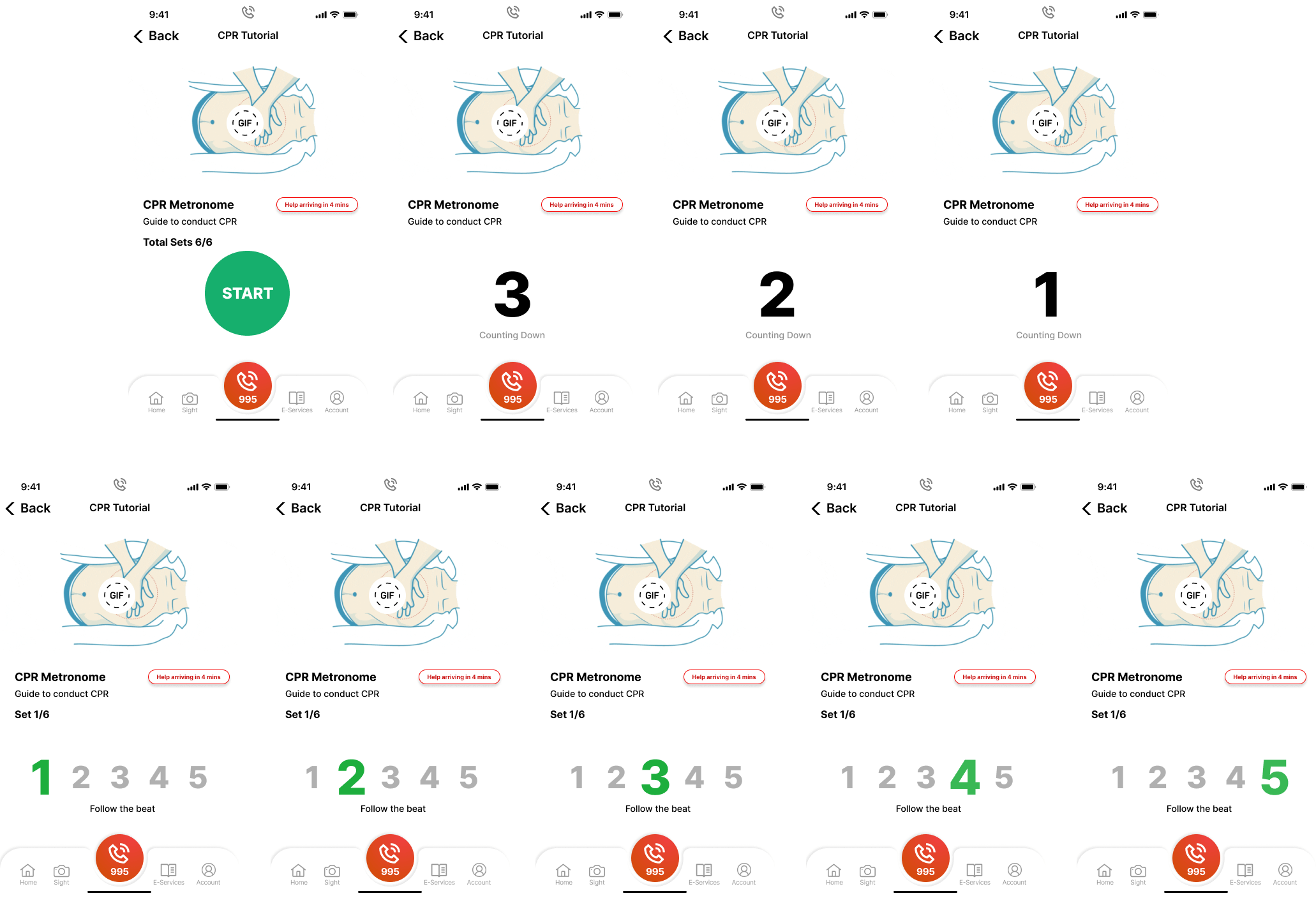
New Metronome Design
Introduced a "coin" system where every referral will be rewarded with some coins that can be used to exchange vouchers that can be used in most places.
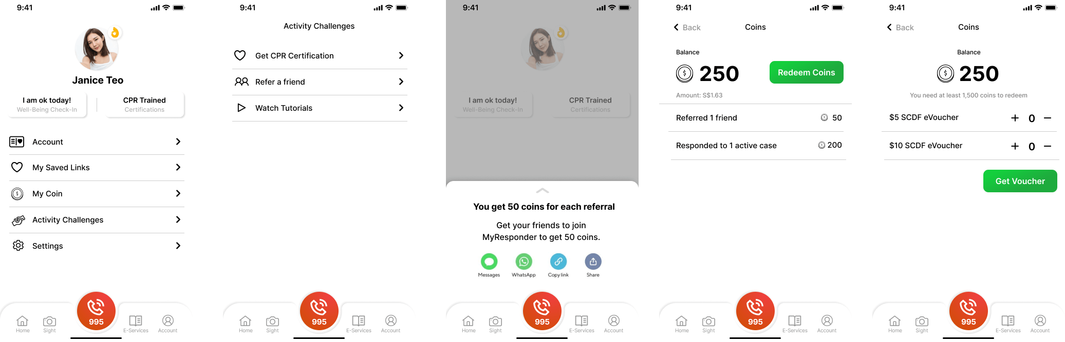
More Enticing Reward System
The team has managed to come up with user-centric solutions that can help the MyResponder application solve the three design sprint questions, leading us to reach our long-term goal for the application.
The team dove too deep into each sprint question and ended up solving a bigger issue than just the single issue that we were supposed to target, which resulted in spending much more time on discussion of the issue and brainstorming on how to resolve it. The lesson learned is to always ask, remind yourself of the goal, and ensure that everyone is on the same track.
Please scan the QR code or click on the link to access the prototype. *Contact me if you cannot access the prototype.