LifeSG - My Benefits

Mobile app and web app design

Project Summary

Results

Consolidated platform for different government benefits that is available on LifeSG mobile app and website.

Role

UX designer and researcher

Things Done

High-fidelity mockups and prototype, Research planning, and Moderated and unmoderated user testing

Project Client

Public Service Division (PSD)

Tools Used

Figma, Maze

Team

UX designers, Developers, Business analyst, Project manager, External stakeholders

Introduction


Keypoint: Create a service to assist citizens in quickly finding their entitled benefits

Currently, citizens must visit multiple platforms to access various benefits such as CPF vouchers, the Silver Support scheme, SkillsFuture credits, and more. This process is time-consuming and complicates tracking and verifying their entitlements.

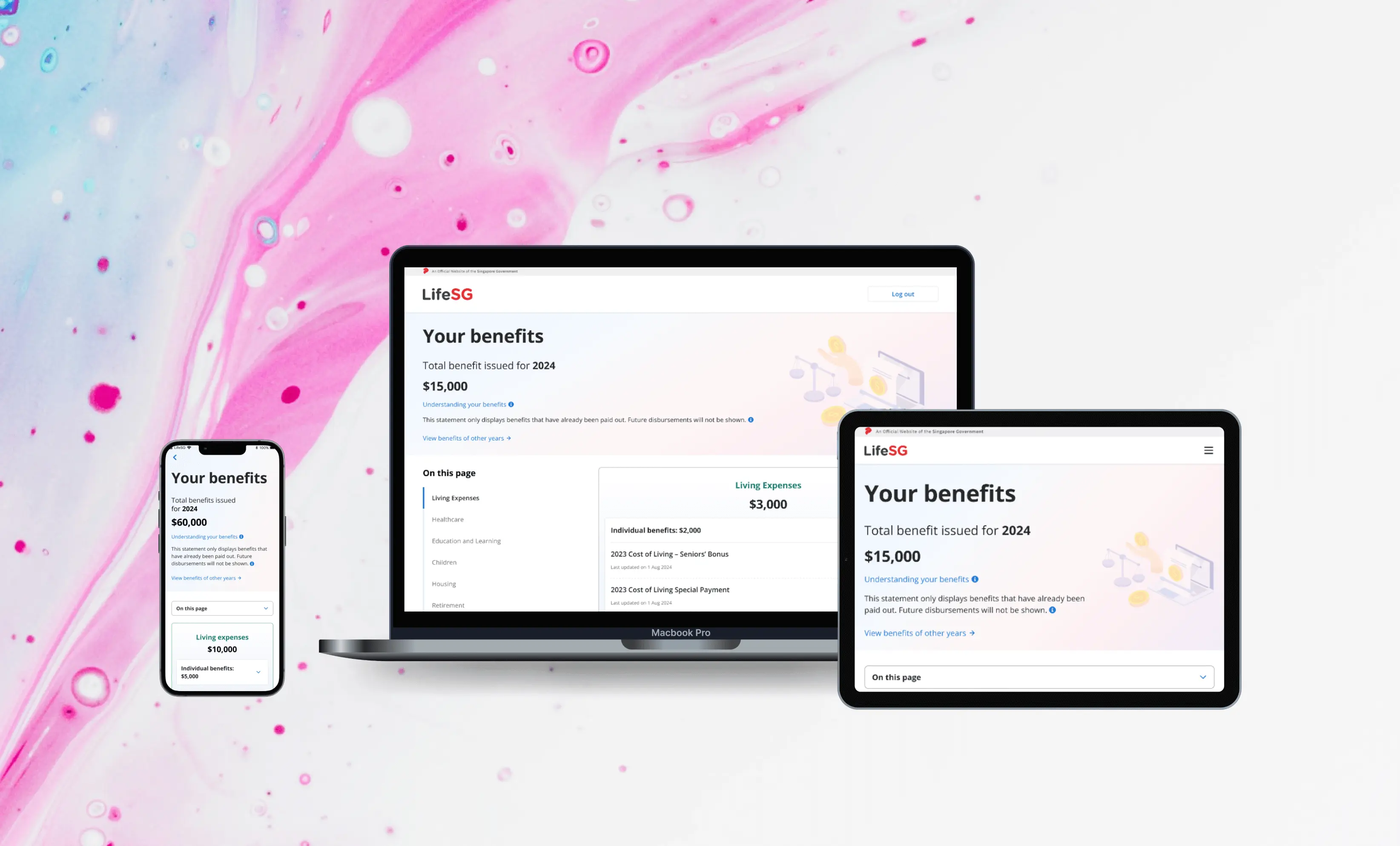
In response to this challenge, we are collaborating with Smart Nation and Digital Government (SNDG) to introduce the 'Statement of Benefits' concept within the LifeSG app. This concept aims to consolidate fragmented information and improve the visibility of government assistance from different channels and platforms into a single, user-friendly platform.

To assess the effectiveness and usefulness of this initiative for citizens, we conducted two rounds of user testing and incorporated feedback from stakeholders to refine the design iteratively.

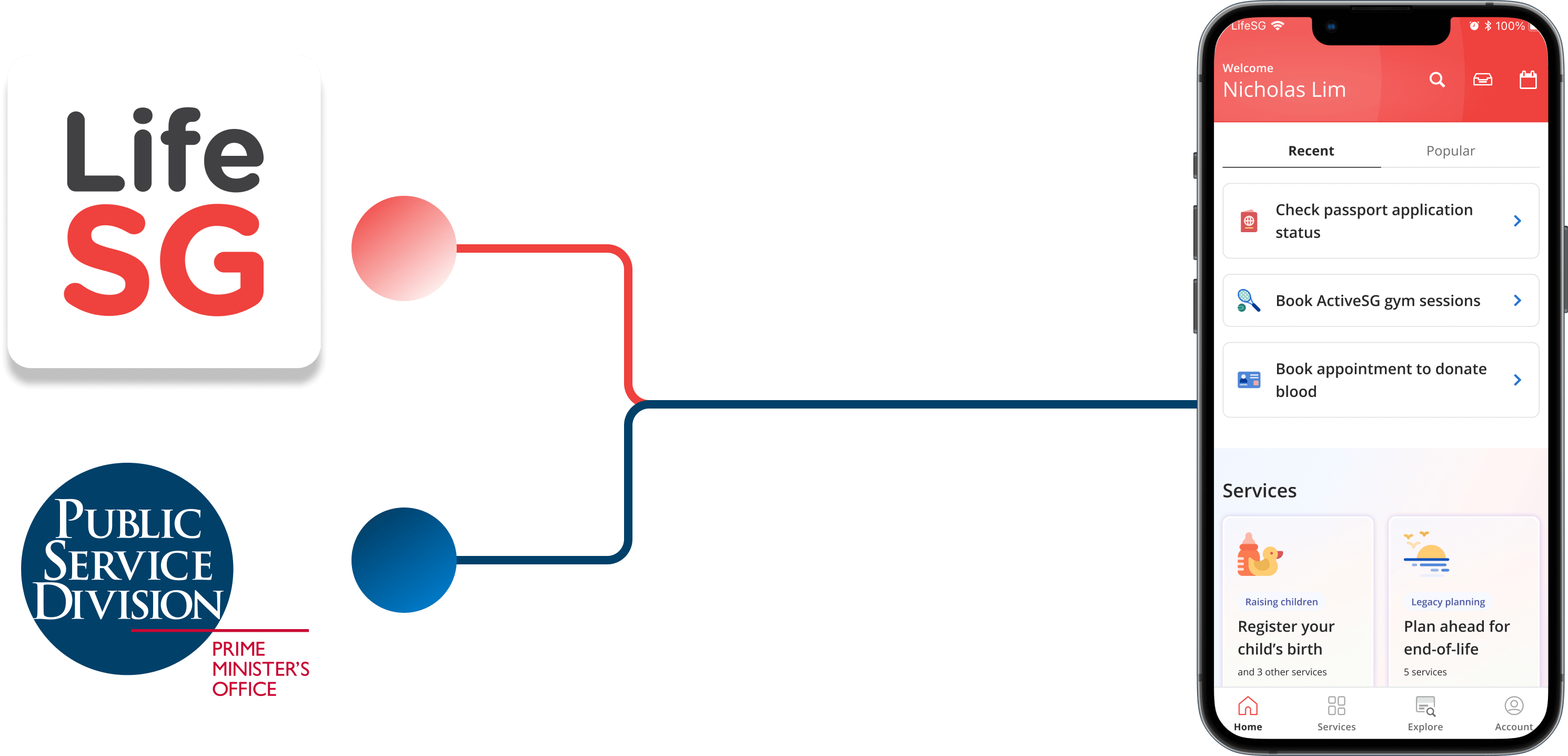
Collaboration on LifeSG app

Research objectives


Two rounds of usability testing were conducted to address different objectives for each research study. Recognizing that the function will eventually be utilized by a wide audience of Singaporeans, the first study employed unmoderated usability testing to capture the perspectives of potential users and assess their initial impressions of the function's usefulness.

The second usability study, involving a smaller group, was moderated to delve deeper into the usability of the MVP and evaluate the clarity of the information and terminology presented in the function.
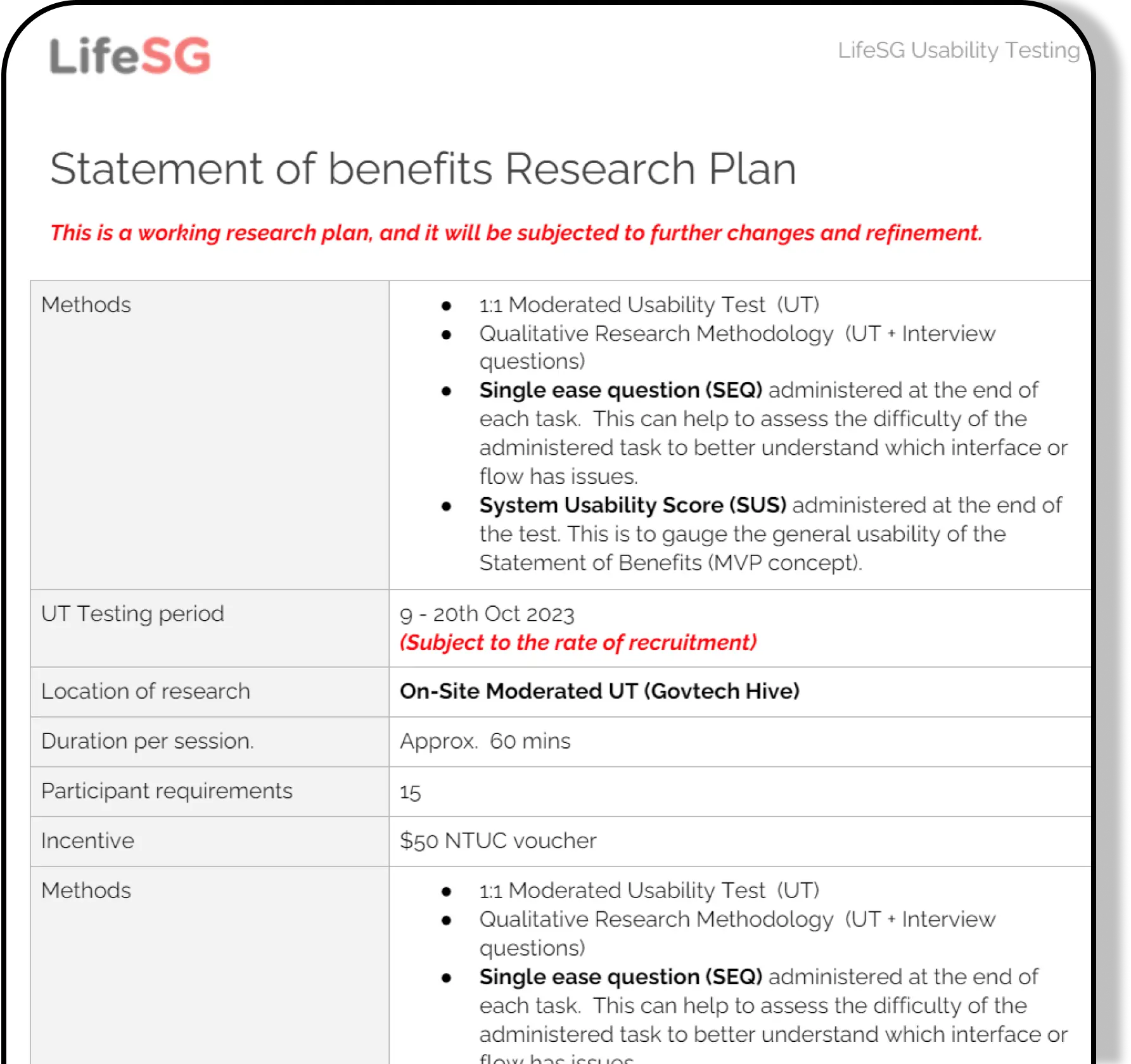
Research Plan

Research overview and insights


Keypoint: Participants find My Benefits helpful, with a SUS score of 73.7

General overview

Both usability testing sessions considered the features being tested, covering app functionality and stakeholder concerns. To ensure thoroughness, a research plan and discussion guide were created and reviewed by stakeholders and other designers. The discussion guides underwent further testing with a pilot tester.

The findings from the two usability tests indicated a positive reception of the function among users, facilitating their access to entitled benefits and providing valuable insights. Notably, the function garnered a System Usability Scale (SUS) score of 73.7, reflecting a commendable rating within industry standards.

Unmoderated testing

The main objectives of this study are to gather impressions on the function's usefulness, usability, and participants' understanding of the terminology and relationship between components.

Participant recruitment and methodology:
  1. Participants:
    • A total of 268 participants were recruited from diverse channels including Techkaki, SG Research Lobang, and through friends and family.
  2. Platform:
    • The test was conducted using the Maze platform.
  3. Device used:
    • Mobile phone
  4. Exclusion criteria:
    • Participants were required to be at least 15 years old, ensuring eligibility to access LifeSG via Singpass.
  5. Diverse representation:
    • To ensure comprehensive coverage, participants were selected based on various demographic factors including age, race, family structure, housing type, and income.
  6. Testing scope:
    • The study encompassed testing across all pages of the platform.

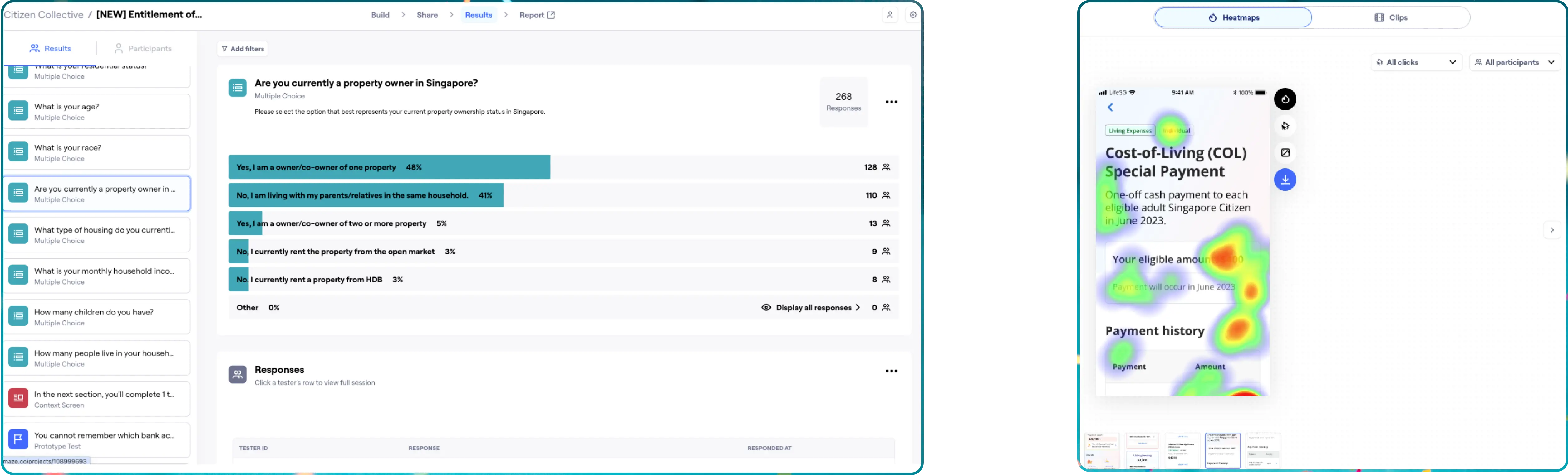
Maze platform research results

Moderated testing

The main objective is to assess the usability of the revised concept (following iteration from the unmoderated testing), focusing on the findability of critical information across different pages and the clarity of displayed information and terminology.

Participant recruitment and methodology:
  • Participants:
    • A total of 15 participants were recruited from various channels, including Techkaki, SG Research Lobang, and referrals from friends and family.
  • Mode:
    • The usability testing was conducted in a hybrid format, with 12 participants attending in-person sessions and 3 participating online via Zoom, using the Figma prototype.
  • Set up:
    • Each session was facilitated by one interviewer and one scribe, with additional observers present in the observation room. The entire session was recorded for analysis.
  • Device used:
    • Mobile phone, tablet, and laptop
  • Duration:
    • 1 hour 30 minutes
  • Exclusion criteria:
    • Participants were required to be at least 15 years old, ensuring eligibility to access LifeSG via Singpass.
  • Diverse representation:
    • To ensure comprehensive coverage of different demographic groups and that all functions were tested with potential users, interviewees were grouped into three main categories: parents with children, homeowners, and seniors.
  • Testing scope:
    • The study encompassed testing across all pages of the platform.
  • Tasks:
    • 10 tasks were given, accompanied by some questions to verify clarify, understanding, and usefulness.
Study findings:
  1. Overall SUS rating:
    • A SUS questionnaire was given at the end of the research study, a score of 73.7 (good) was achieved.
  2. SEQ rating:
    • To measure ease of use, a SEQ was given at the end of each task, overall participants find most task easy to complete.
  3. Others:
    • Explored participants' emotional responses to certain situations and their corresponding expectations.

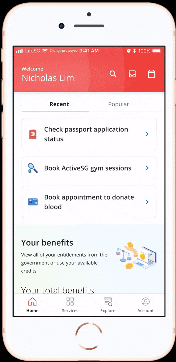
Prototype used for UT

Design iterations


Keypoint: Common pain points found through the two research methods

This section showcase the different design iteration and consideration after both usability testing. There are a few changes made after the second user testing, namely:

  1. Reduce user flow, make it easier to produce the MVP as payment history details is complicated to obtain
  2. Homepage (view image below to changes the findings)
  3. Overview page (view image below to changes the findings)

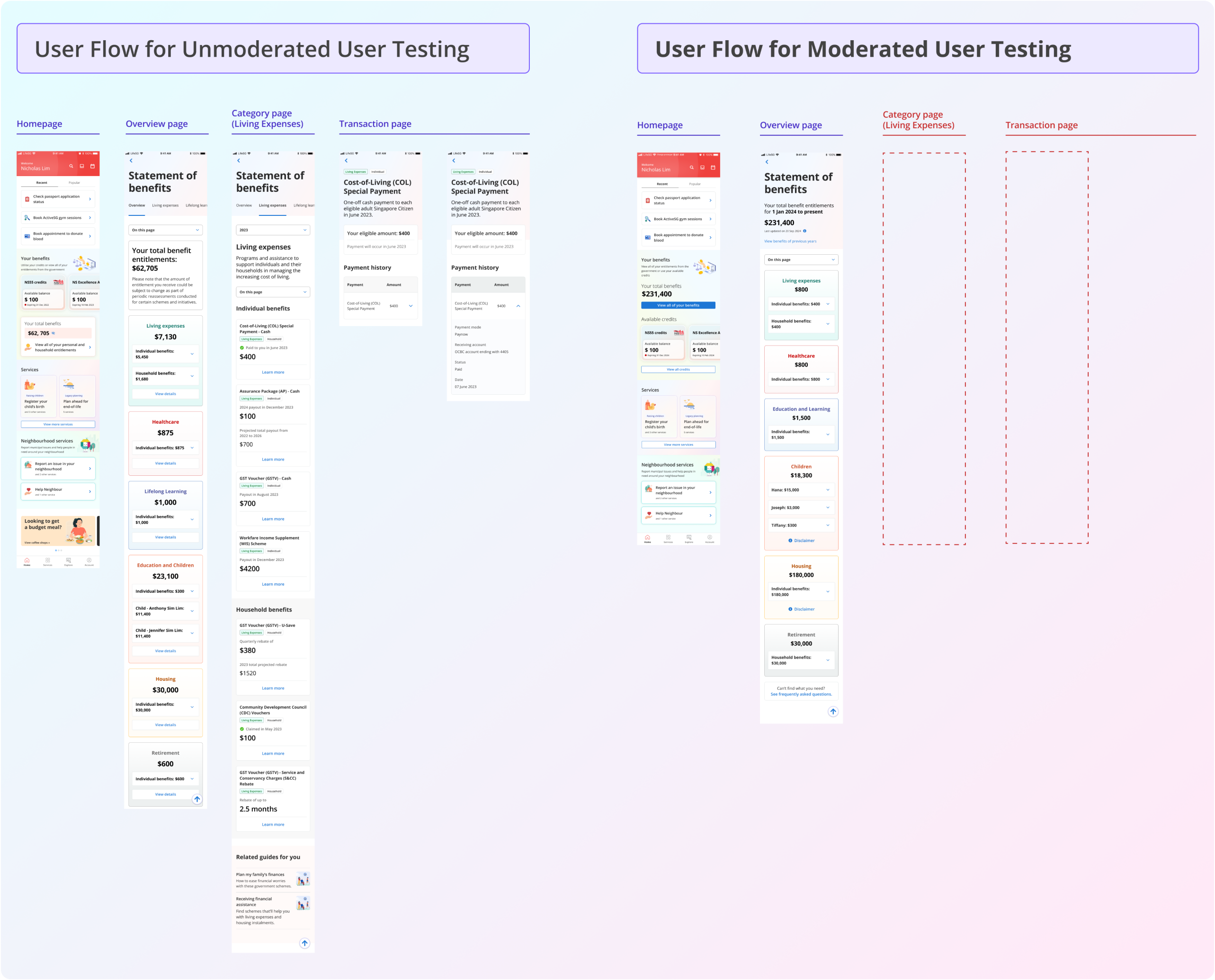
User flow comparison

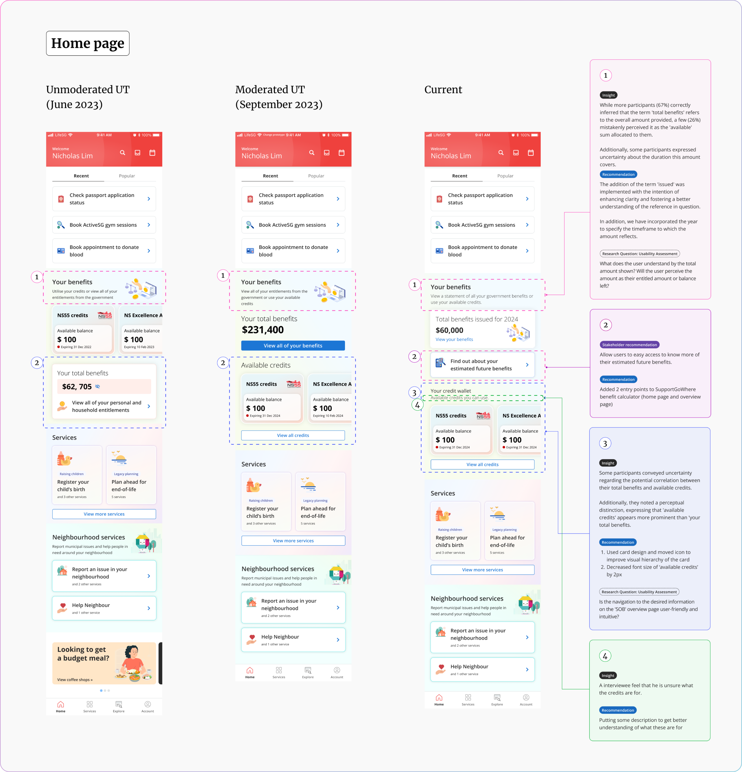
Home page comparison

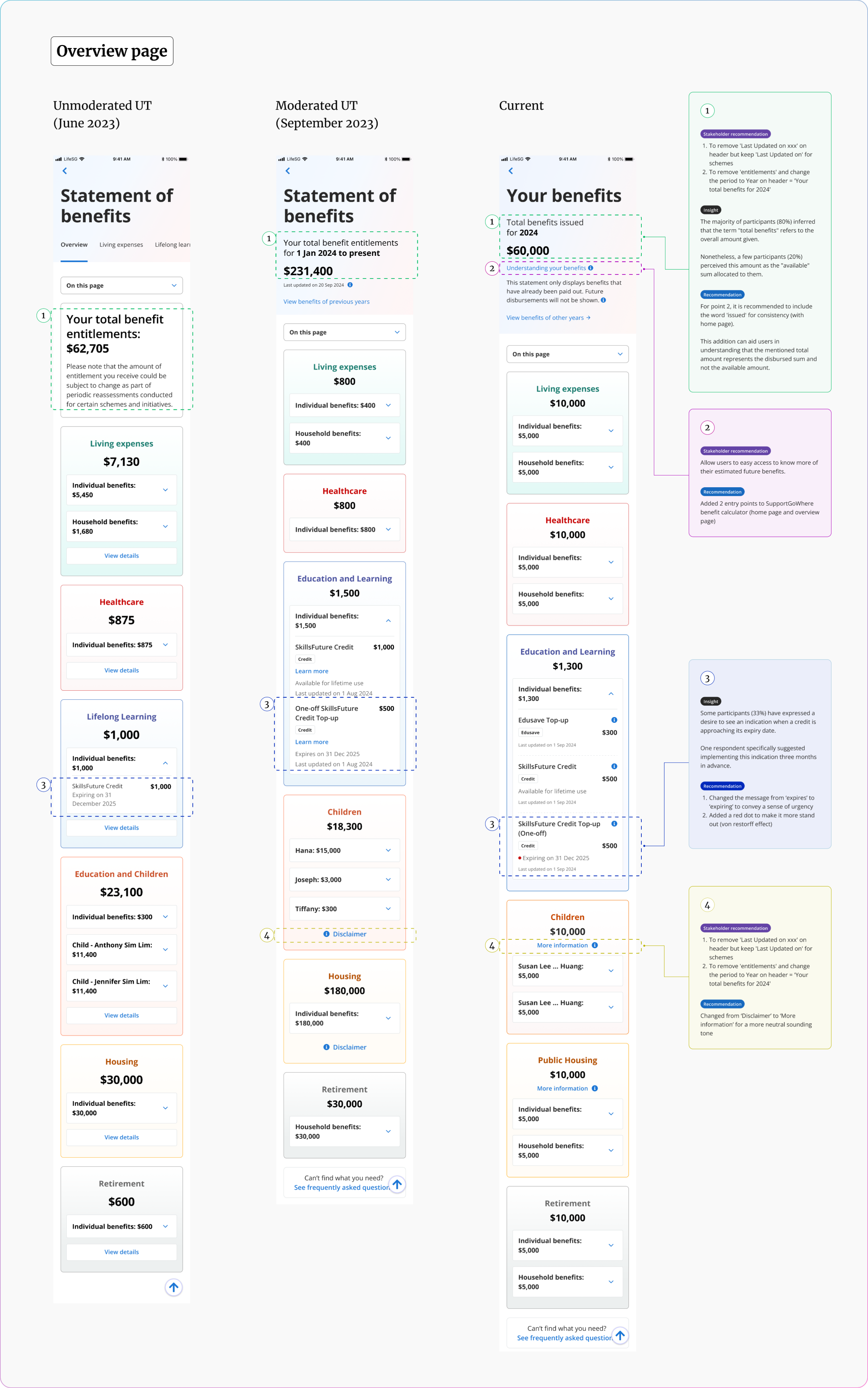
Overview page comparison

Key learnings


Through this project, I have had the privilege of collaborating with talented designers (including my supervisor and project lead), a project manager, a business analyst, and external stakeholders. From these experiences, I have gained valuable insights, including:

  1. Improving my ability to strategize and effectively communicate my ideas and research findings to diverse audiences.
  2. Developing more comprehensive research plans that address the goals of stakeholders and tests all the app's functionality.
  3. Enhancing my skills in creating thorough research reports while maintaining clarity and avoiding excessive detail.
  4. Learning how to conduct usability testing using the Maze platform and optimize heatmap results.

Next step


The product is currently under development and UX team will help in answering any development worries and issue that a design would affect. The product would be launched in end of 2024.

×