Relooking at Fairprice Self-Checkout Interface Design
All 5 users prefers the new design
UX designer and researcher
User research and interviews, Customer journey map, Low-fidelity wireframe, Mid-fidelity prototype, Usability testing
Fairprice supermarket (School project)
Figma, Miro
UX/UI designers
Singapore's largest supermarket, Fairprice, launched its self-checkout counters in 2014. Fairprice serves over half a million customers daily through its network of over 370 outlets. Out of which, 20% of the customers (over 100,000 customers daily) use their self-checkout counters. Hence, it is important to better understand the self-checkout experience from the user's point of view.
The goal is to improve the user experience on the kiosks by doing the following:
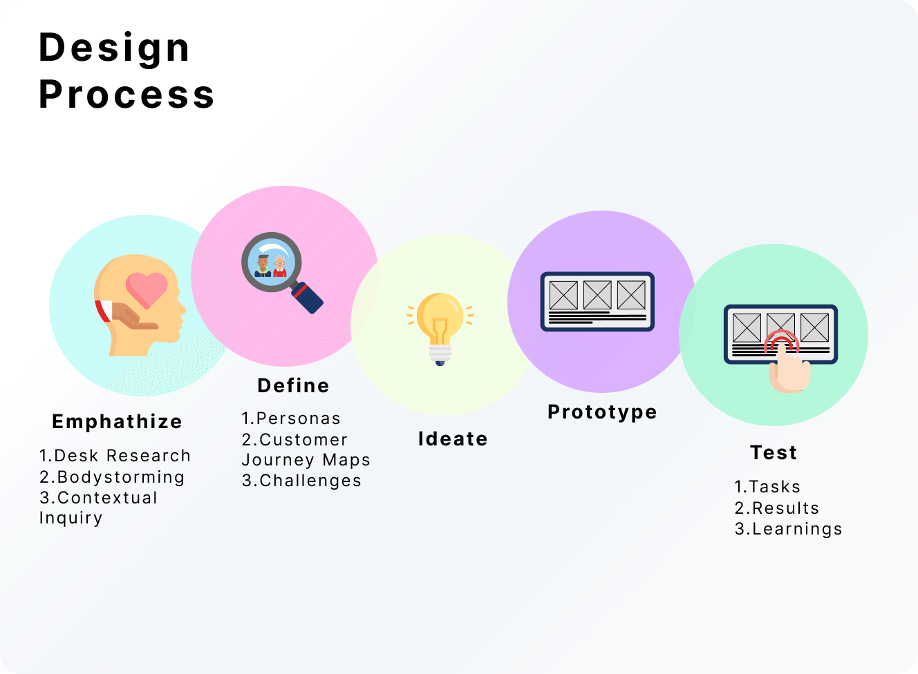
Design Process for Fairprice Kiosk
Through research on past market research data, social media analysis (Facebook comments), general survey feedback, and our personal experience using the self-checkout kiosk, there are a few common pain points and feedback, namely:

Non-Self-Checkout Kiosk Users' Reaction
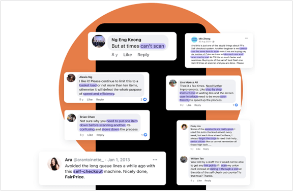
Social Media Comments on Fairprice Kiosk
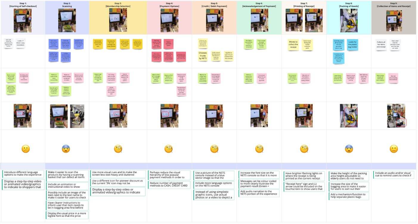
A simple task of purchasing some items was given for the interviewee to try on the self-service kiosk. During the process, things such as what the interviewee felt, said, did, and thought were recorded and put into an empathy map to help us get the common topic from the insights, which was further narrowed down into five different areas as shown in the table below.
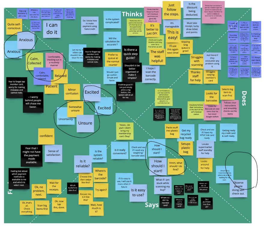
Empathy Map Findings from Contextual Inquiry
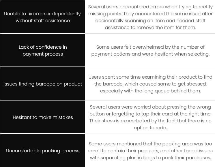
Table 1. Five Areas from Insight to Focus on.
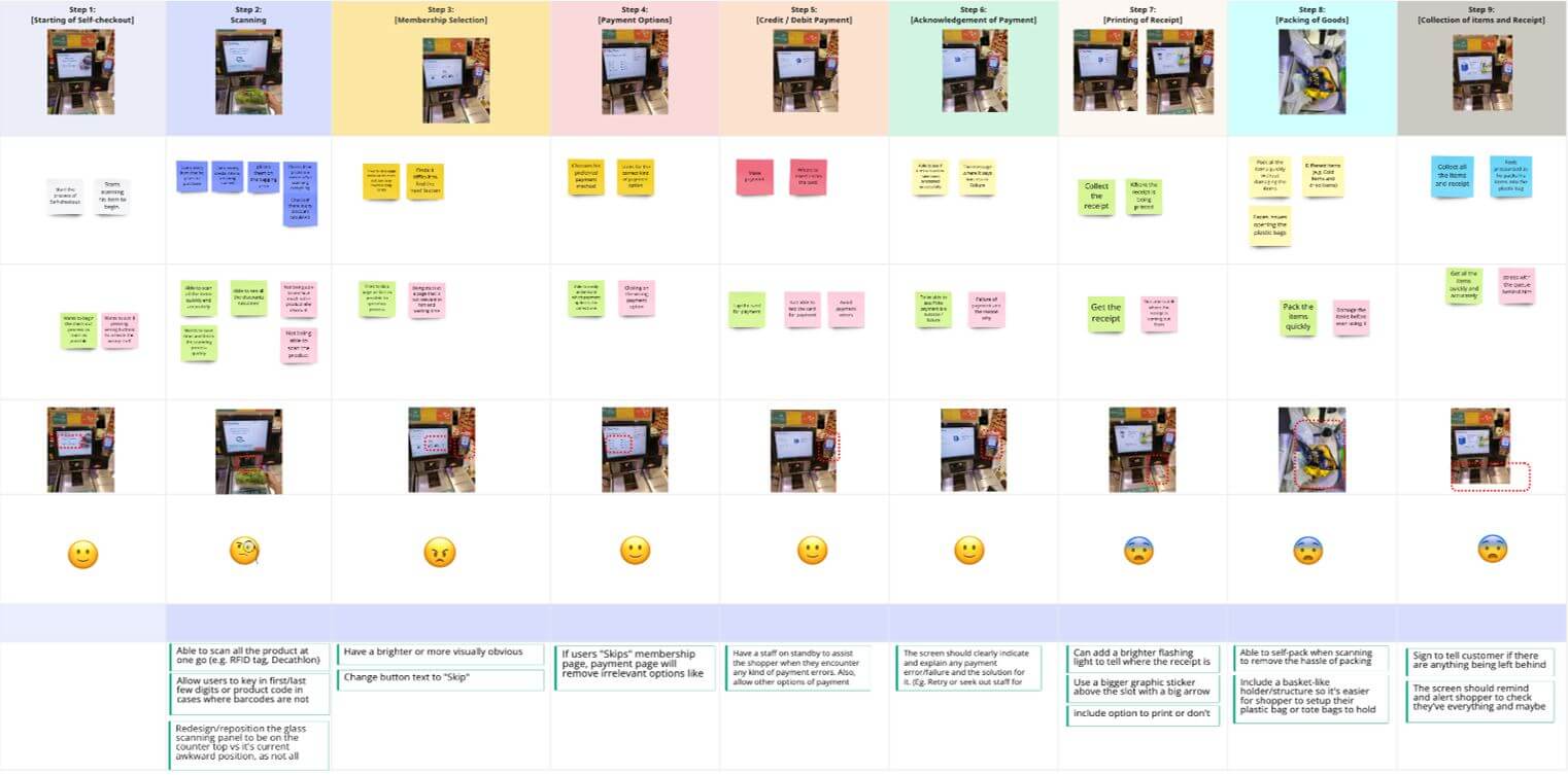
Based on our research, we decided to focus on two distinct types of personas who might use the self-service kiosk.Firstly, Jaden is a Gen-Z guy who is tech savvy and has a very packed schedule. Second, Karen is a retired elderly lady who speaks Mandarin and has a low level of trust in digital products.Through the two personas' journeys, a list of opportunities has been found (as listed in Table 2 below).
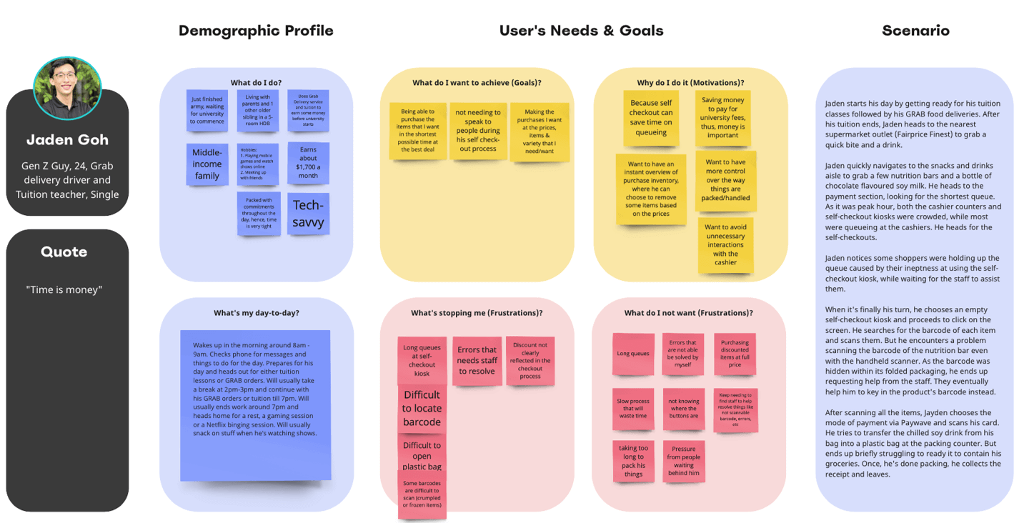
Persona - Jaden
User Journey Map - Jaden
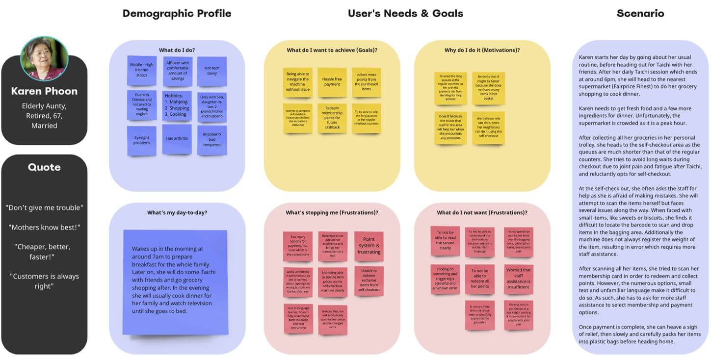
Persona - Karen
User Journey Map - Karen
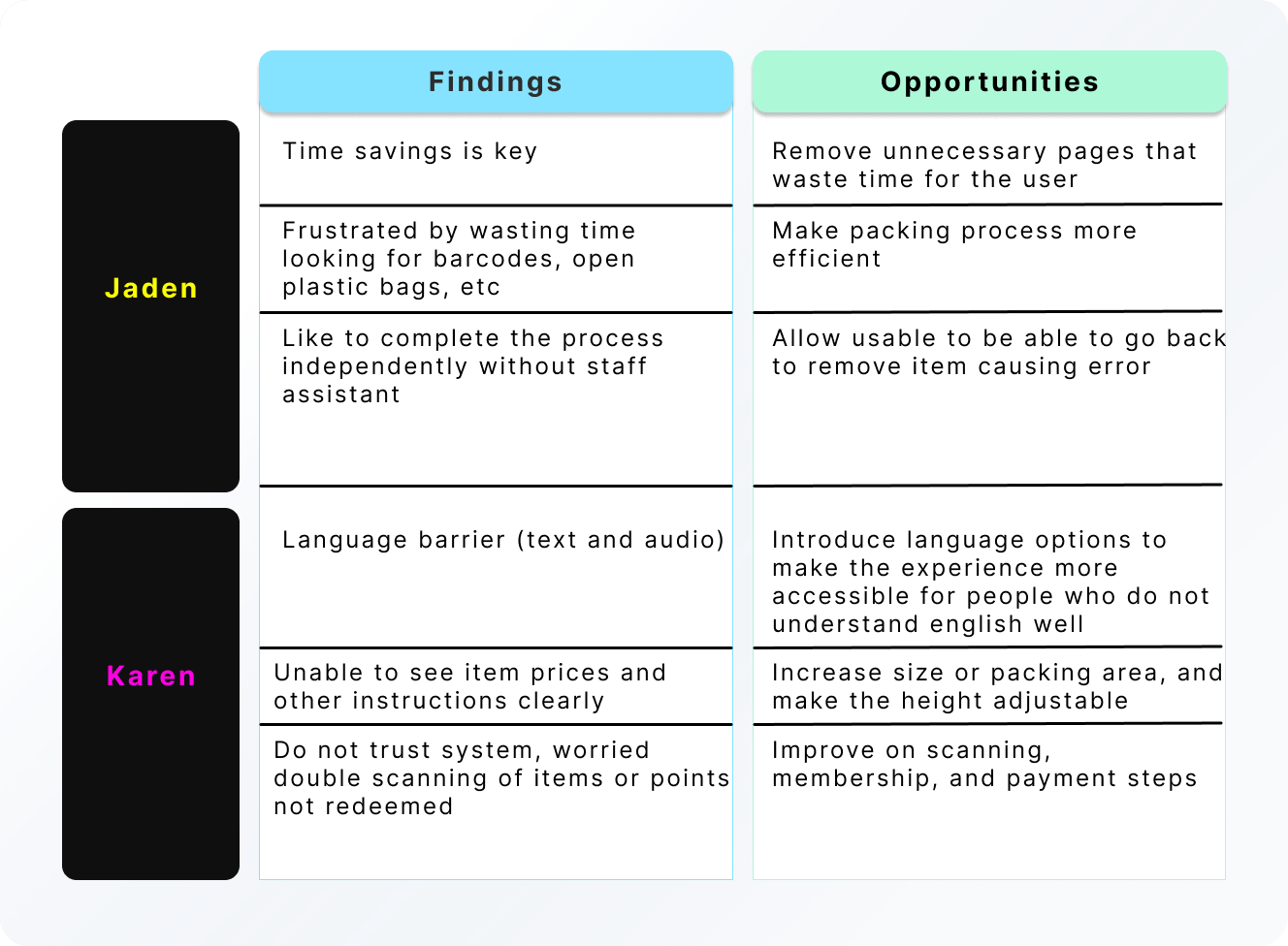
Table 2. Findings from Users - Jaden and Karen.
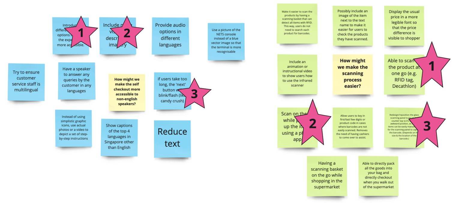
4 key challenges have been derived from narrowing down the opportunities identified in the persona and customer journey map. The 4 key challenges are:
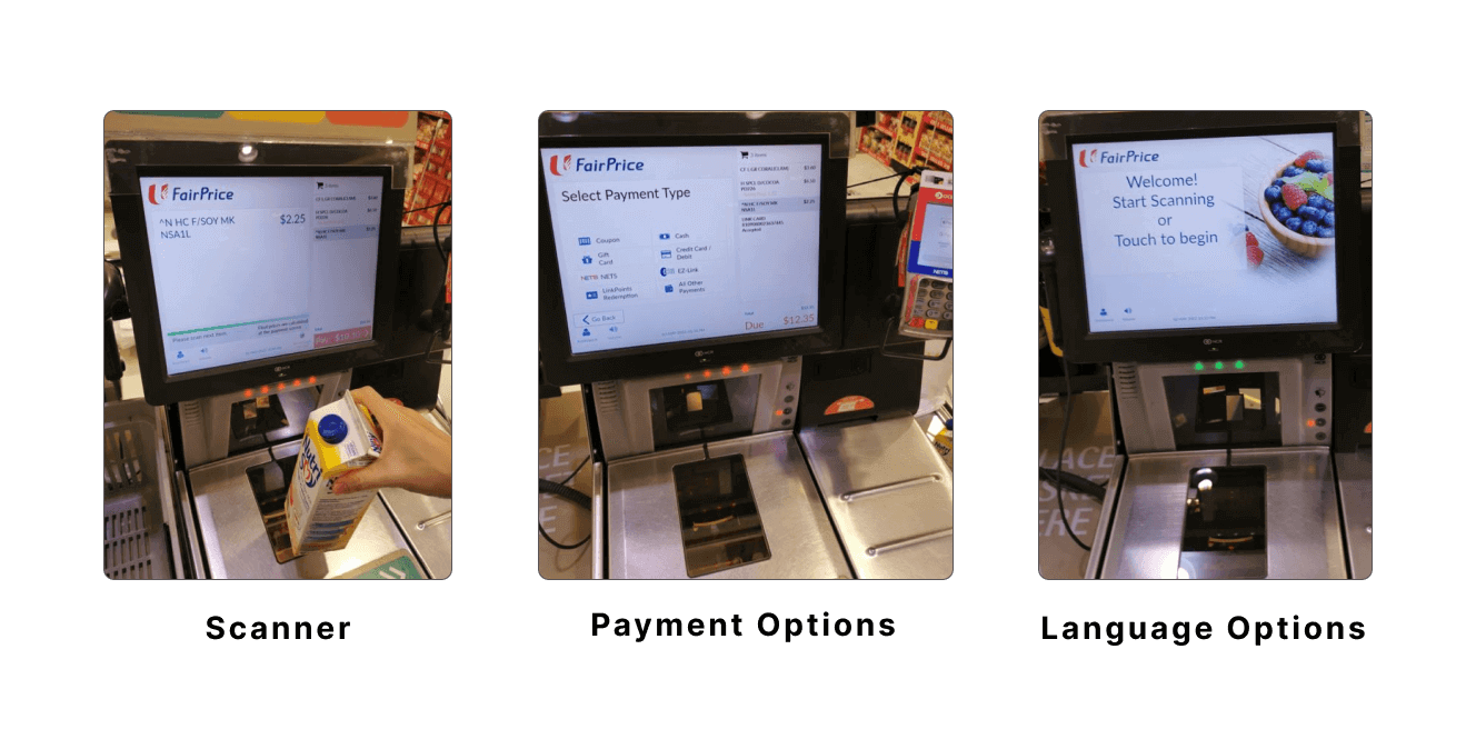
Current Self-checkout Kiosk Design
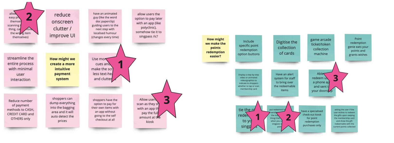
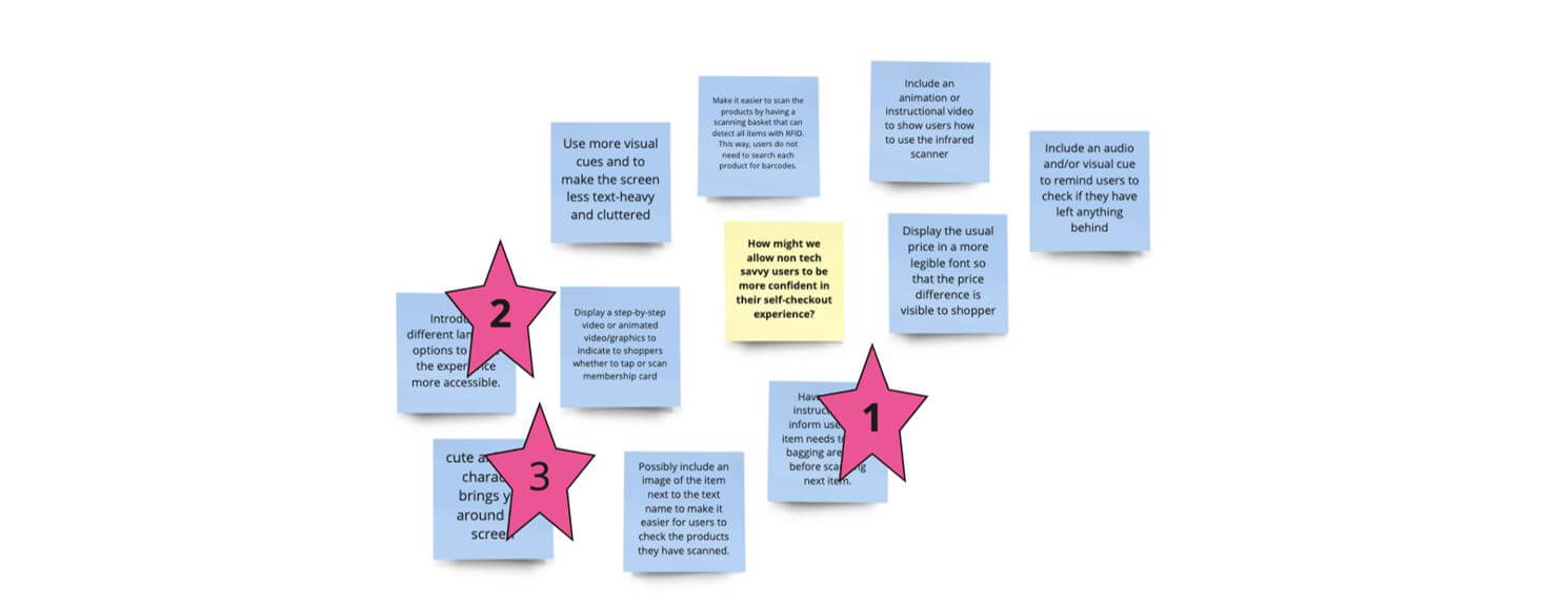
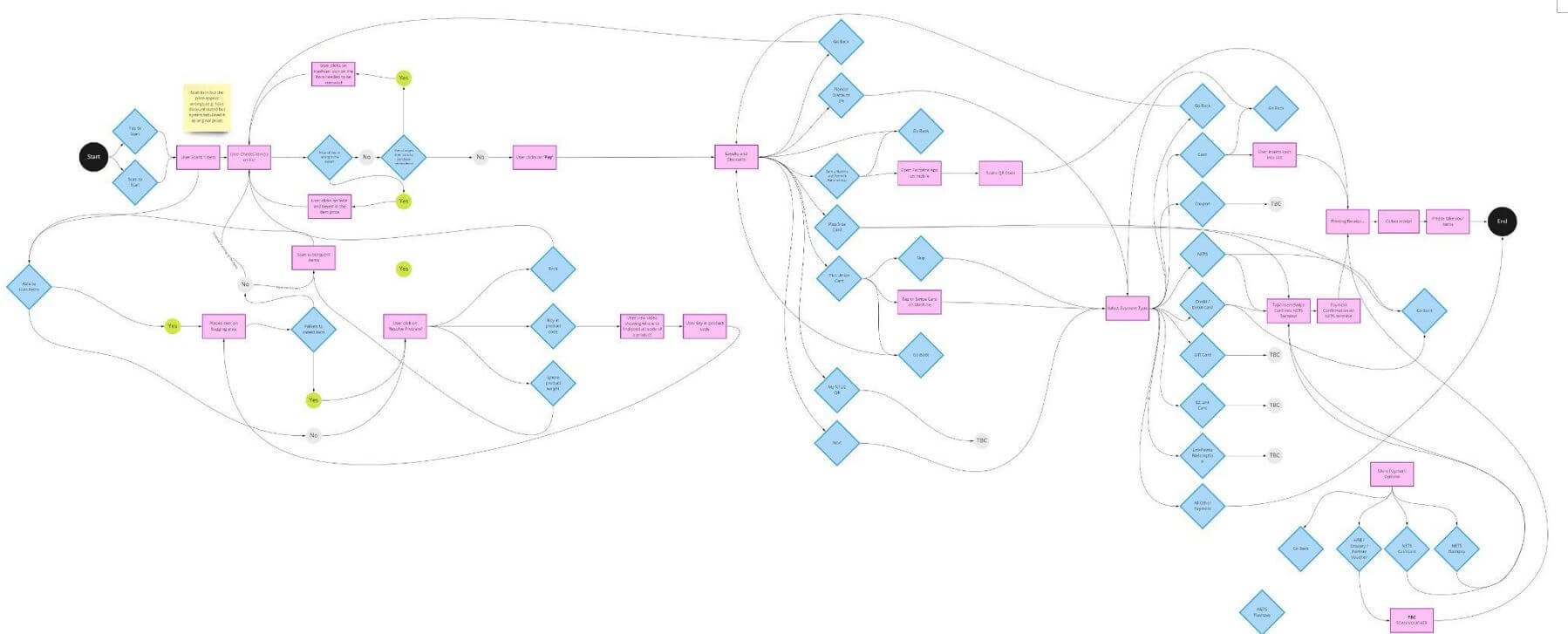
How-Might-We(HMWs) statements were used to reframe the problem identified in the persona and customer journey map, and five of the HMWs statements were shortlisted according to how well they resonated with the user's needs. The top 5 HMWs statements were further expanded using the lotus blossom technique. Three ideas from each of the top five HMWs statements were picked according to how applicable and feasible they were. The top 4 ideas to focus on were picked from these 15 suggestions. The HMWs statements:
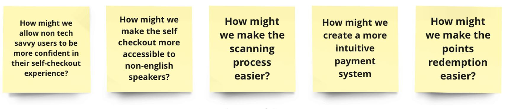
Top 5 HMWs Statements
Diverged Ideas from Top 5 HMWs Statements
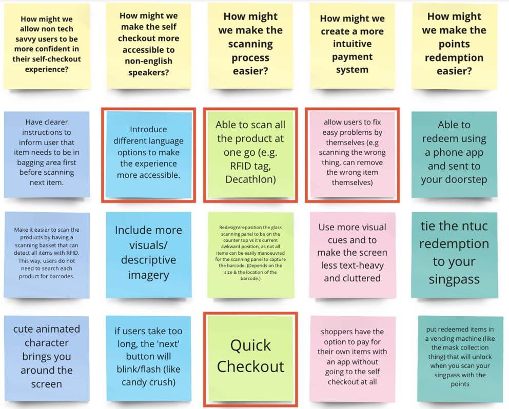
Top 4 Ideas
Below are the 4 design for the initial prototype:
Currently, users have to scan each item individually. Having this feature will tag items with RFID which will help reduce scanning time at the kiosk. Users will place their baskets in an allocated spot while the system automatically scans everything. They can also easily add or remove any item as desired. This will also reduce errors such as double-scanning or unscannable barcodes.
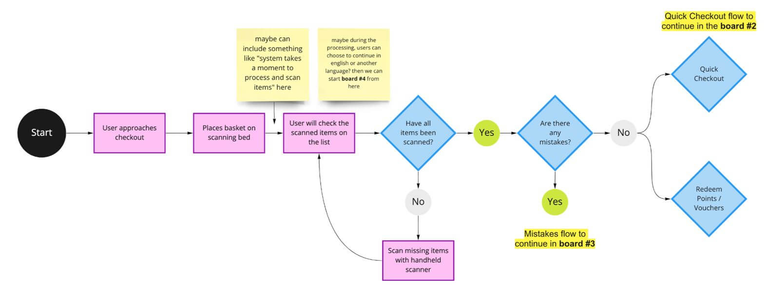
User Flow Diagram: RFID Functionalities
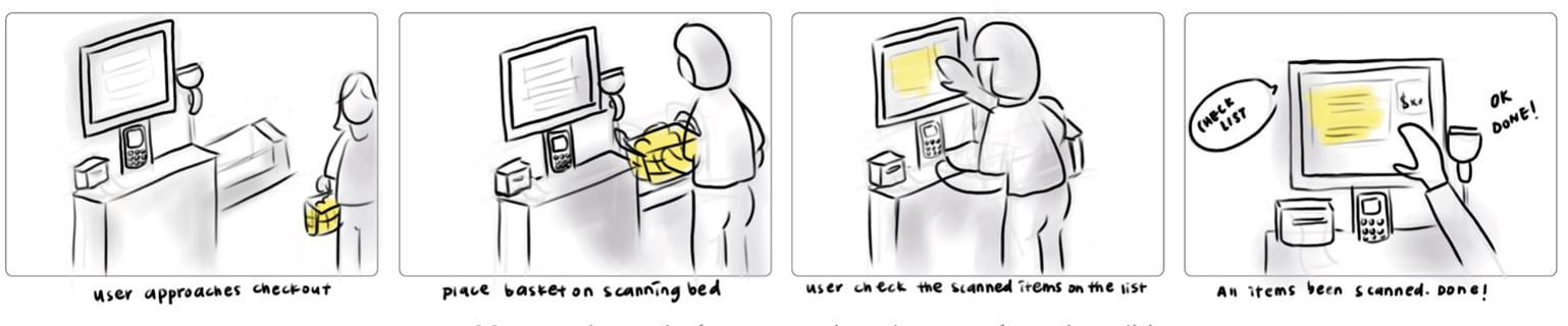
Storyboard: User using RFID Functionalities
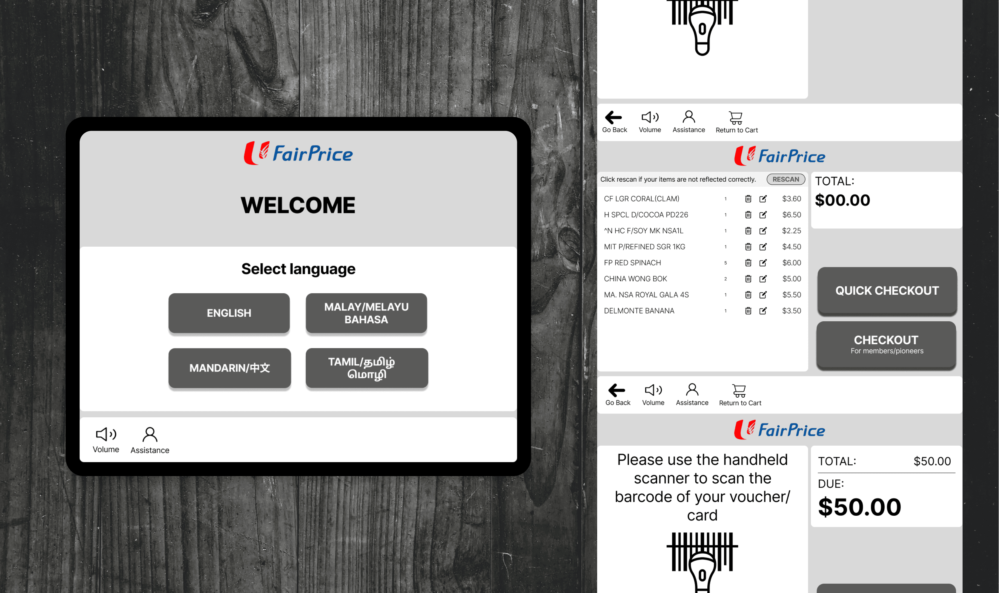
During payment, there are numerous payment options for both non-members and members to select from. This can be time-consuming and overwhelming for users, as it increases cognitive load. By streamlining these options, we are able to cater to both user personas. For users who prefer a speedier process (e.g. Jaden's persona), they are able to choose the quick checkout option, where it will skip all membership and loyalty options and go straight to the payment screen. This feature aims to reduce the overall checkout time for users. Users are still able to access all other functionalities via the "checkout" option.
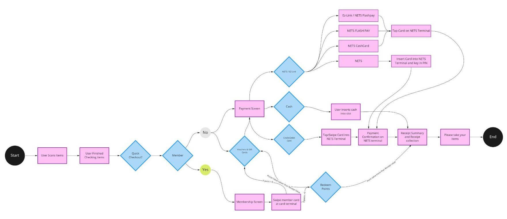
User Flow: User using Quick Checkout
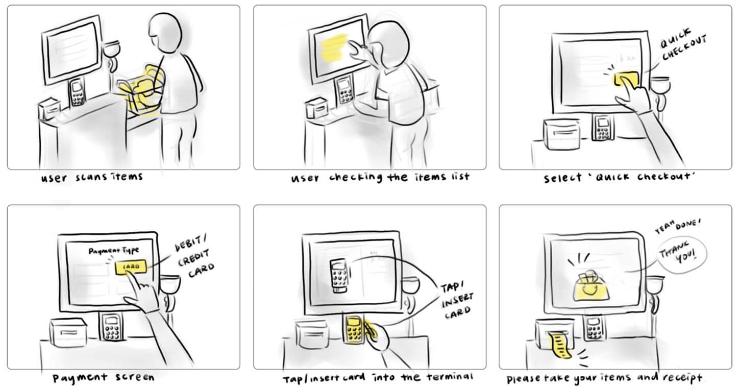
Storyboard: Quick Checkout
Low-Fi Prototype: Quick Checkout
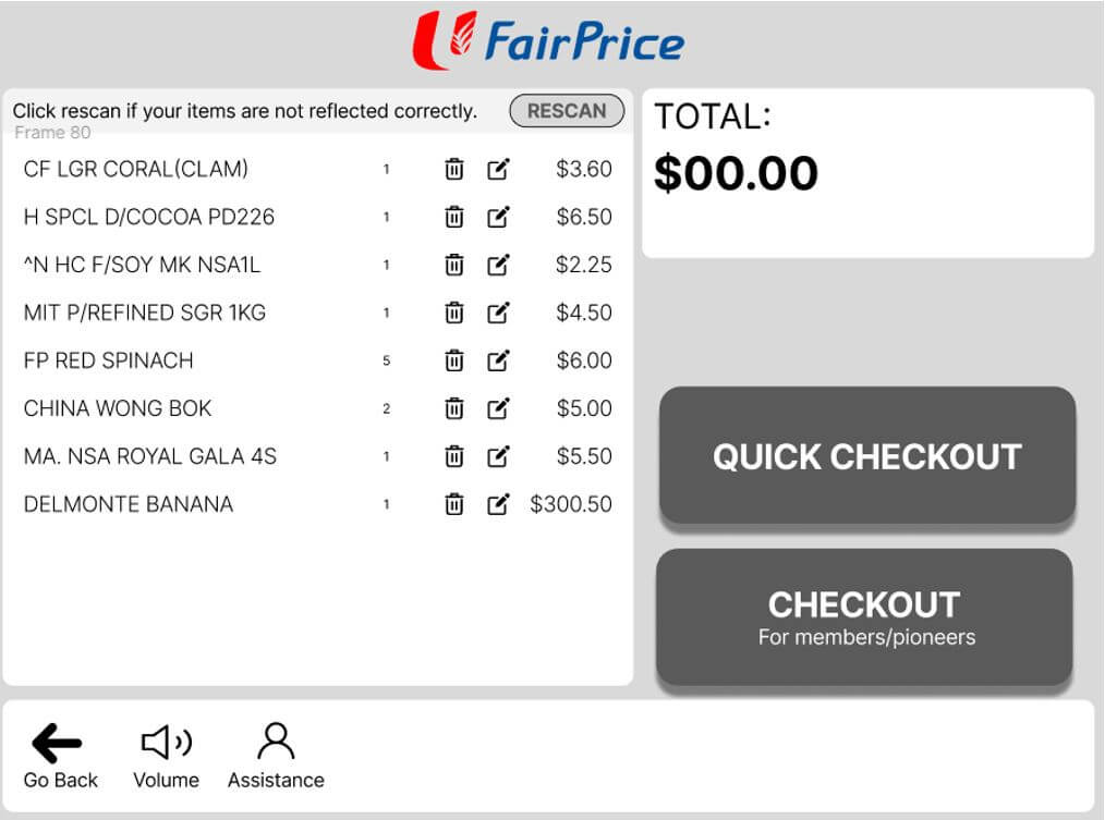
To give users a greater sense of independence and control over their self-checkout experience, users are also given the option to go back to the previous screen and also return to their cart. We also included the option to remove items or edit prices. In scenarios where items are tagged incorrectly and prices are incorrectly reflected, users are able to edit prices to the correct value. This will be done through a backend check with other databases to ensure that the inputted price is reflected correctly. This reduces the need to request assistance from staff.
User Flow: Quick Checkout
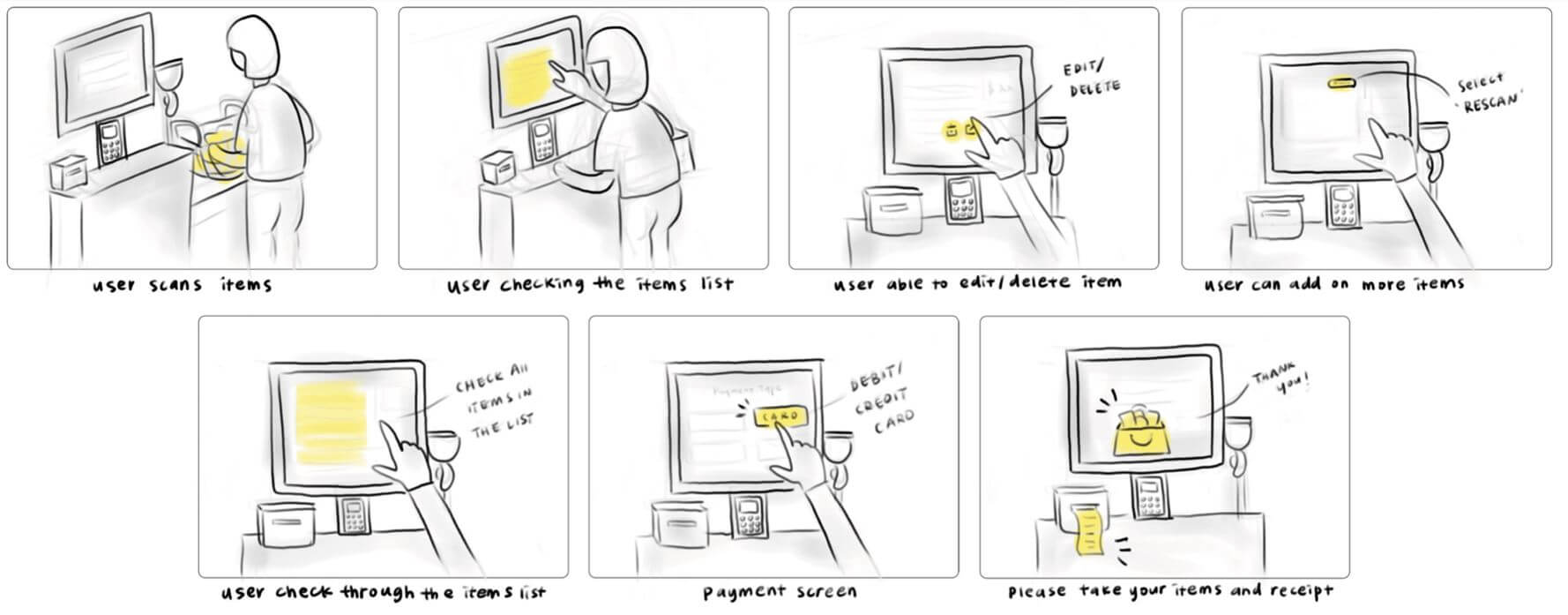
Storyboard: User Self-solving Errors
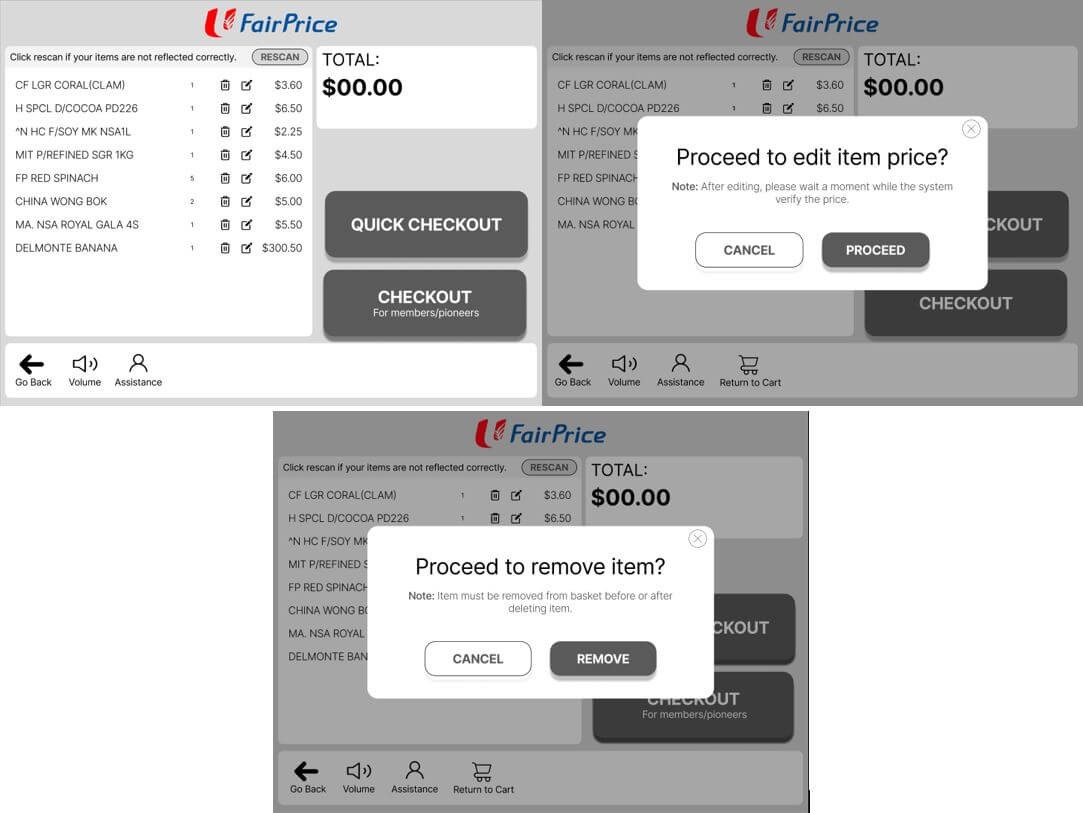
Low-Fi Prototype: Self-solving Errors
Language options will be made available to cater to users who may not be familiar with English. The options are available on the starting screen so that users are able to immediately start with their preferred language.
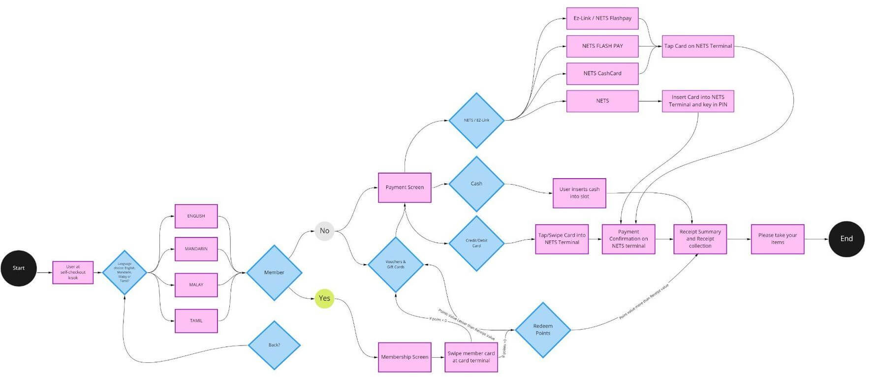
User Flow: Language Options
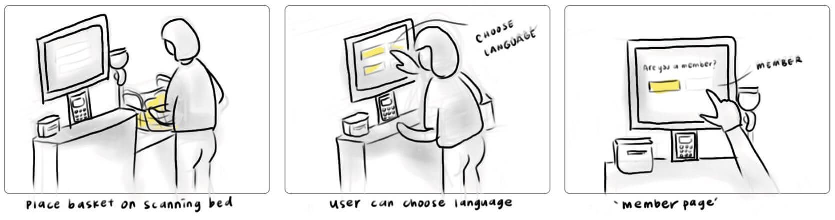
Storyboard: User changing Language
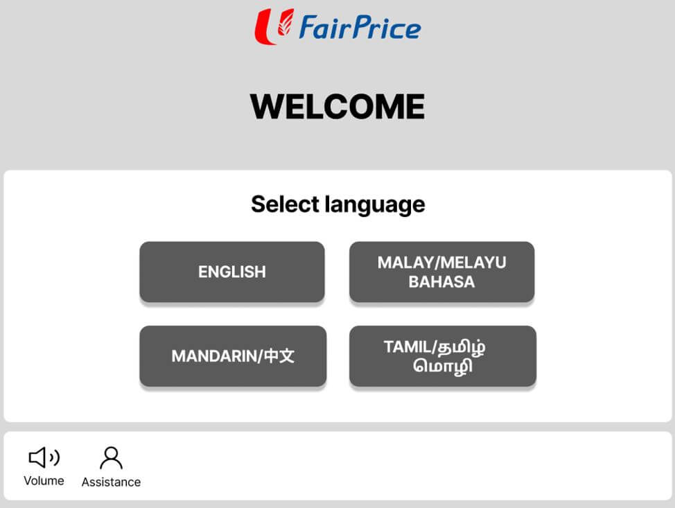
Low-Fi Prototype: User changing Language
All five interviewees go through four different tasks. Each task is designed to test a different function implemented in the prototype.
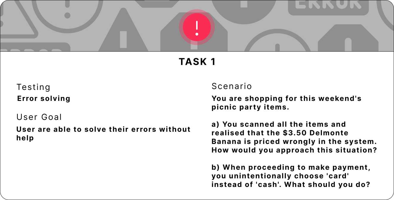
Task 1 - Independent Error Solving
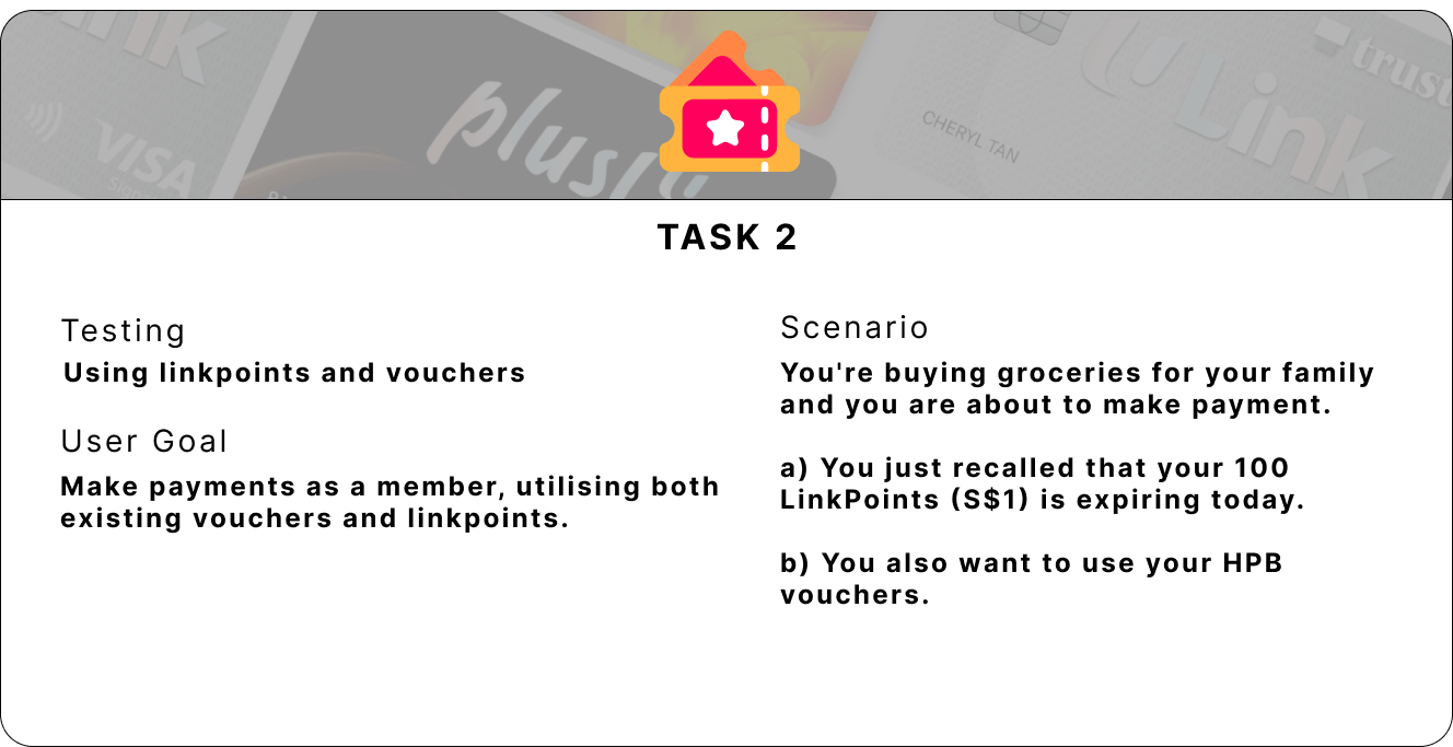
Task 2 - Easy use of Linkpoints and Vouchers
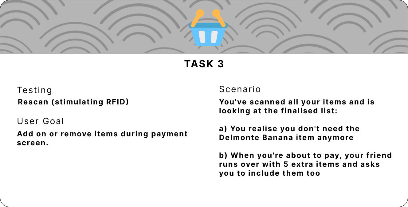
Task 3 - RFID Function
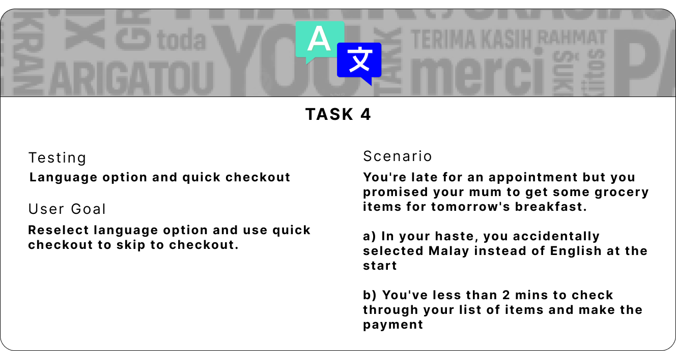
Task 4 - Languages Option and Quick Checkout
5 interviewees were gathered to help with testing and this are their user profile:
All five users managed to complete the four tasks given and were asked to rate the difficulty using a 5-point Likert scale, with 1 being very easy and 5 being very difficult. Below are the results:
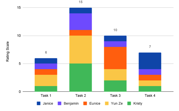
Difficulty Rating for the 4 Tasks
There are 4 main findings from the user testing.
After gathering feedback and findings, the prototype is being reiterated with four main changes.
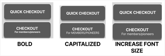
Proposed 3 different designs to make the "members" wording more obvious. Specifically, bolding the text, capitalizing the text, and increasing the font size.
3 Proposed Design to make Hint Text more Prominent
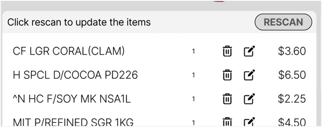
One interviewee was confused by the "not reflected correctly" hint text next to the "Rescan" button. She felt that it implied that there were errors with the pricing or items. Hence, to make it more clear, the hint text has been changed from "Click rescan if your items are not reflected correctly" to "Click rescan to update the items".
Revised Hint Text for 'Rescan' Button
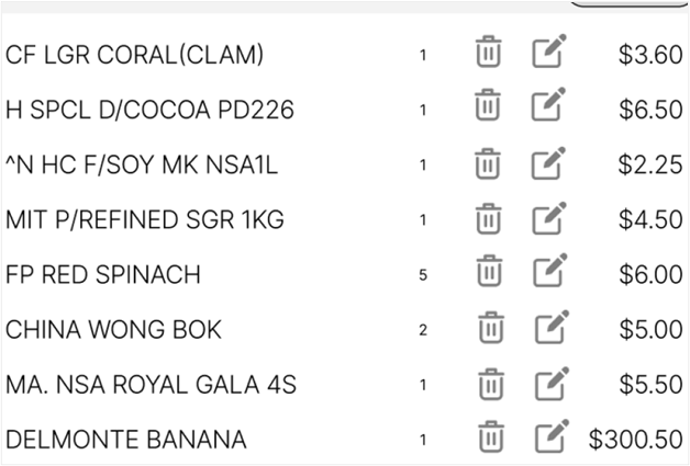
According to Jin et al.(2007), buttons that are too small or too big have the lowest touch accuracy. The recommended size for buttons is 42 to 72 pixels. However, due to space constraints, we have increased the size of the "Delete" and "Edit" buttons to be closer to 42 pixels (px) to 30px. A bigger pixel size would decrease whitespace, increase clutter on the screen, and divert attention from vital elements like purchase items, quantity, and pricing. To avoid distraction from the important elements, we have also lightened the icons' colour.
Resized 'Delete' and 'Edit' Buttons
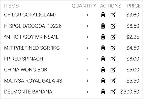
To ensure that our purchase list is more informative, each column has been labeled according to what is commonly seen on similar applications so that the user is familiar with what items are under each label.
New Labels for Purchase List
The new design has helped to solve the four challenges that the current users of the self-checkout kiosk at Fairprice face. To begin, RFID technology has aided in the resolution of scanning issues by allowing users to scan all of the items in the basket at once. Secondly, the number of payment options has been reduced by having a "quick checkout" option and a more streamlined "checkout" option. Thirdly, allowing users to self-correct their errors by including options to go back to the previous screen, return to cart, remove items, and edit prices. Lastly, with the new language option, the Fairprice self-checkout kiosk is now more accessible to users who do not understand English by giving them the option to change the language of the system.