Responsive Web Design
One-stop portal for all URA carparks needs
UX designer
Requirement gathering, Desk research, High-fidelity prototype (using HTML)
Urban Redevelopment Authority (URA)
Visual studio code, Azure board
UX designers, Project managers, Scrum master, Frontend and backend engineers, Carparks officers
Urban Redevelopment Authority (URA) offers more than 800 parking spaces across the whole of Singapore that cater to the needs of people who own cars, motorcycles, and heavy vehicles. Currently, owners of the vehicles can apply for the space using the online portal. This makes it difficult for vehicle owners to track all their vehicles and manage each of them, as currently there isn't a central portal to do so. Hence, there is an opportunity to create a one-stop portal.
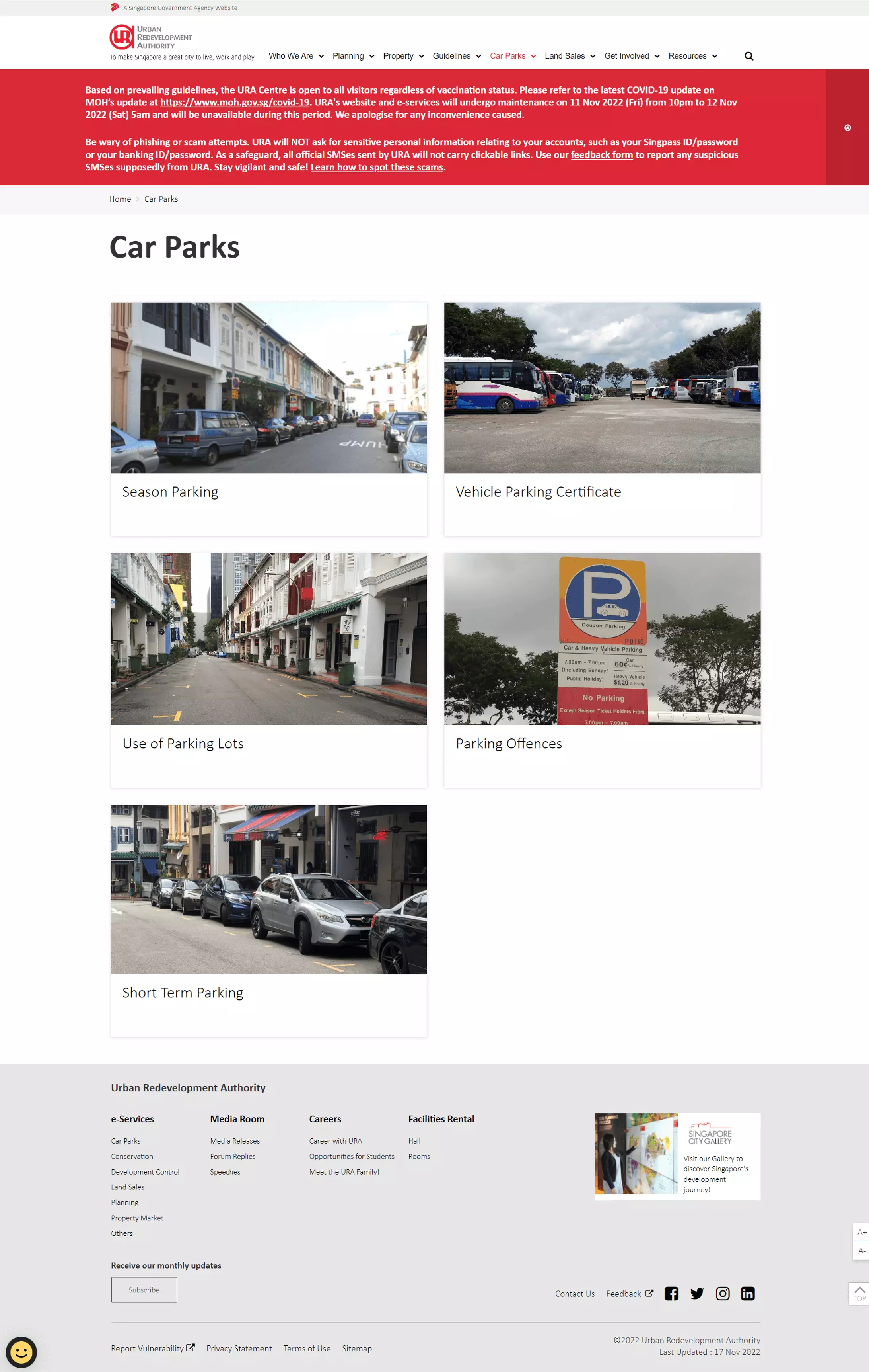
Current URA Carpark Services
The goal is for users to be able to use the platform to:
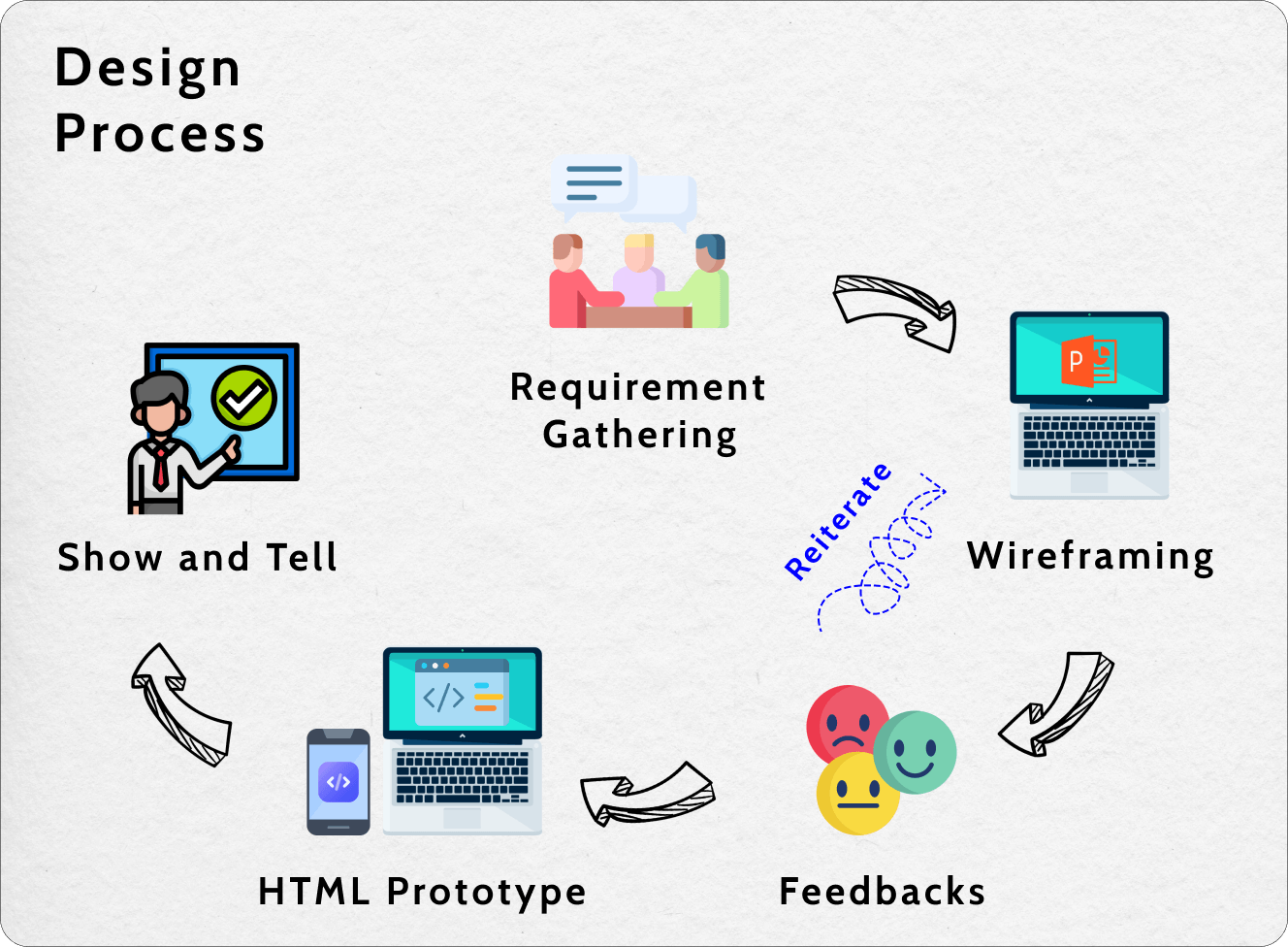
Design Process for SPMS
The project started off with the gathering of requirements from the product owner and processing officers. User stories were also created to better understand the different use cases and ensure that our design will meet different users' needs. The two main types of users identified were personal car owners and users who assist businesses with vehicle management.
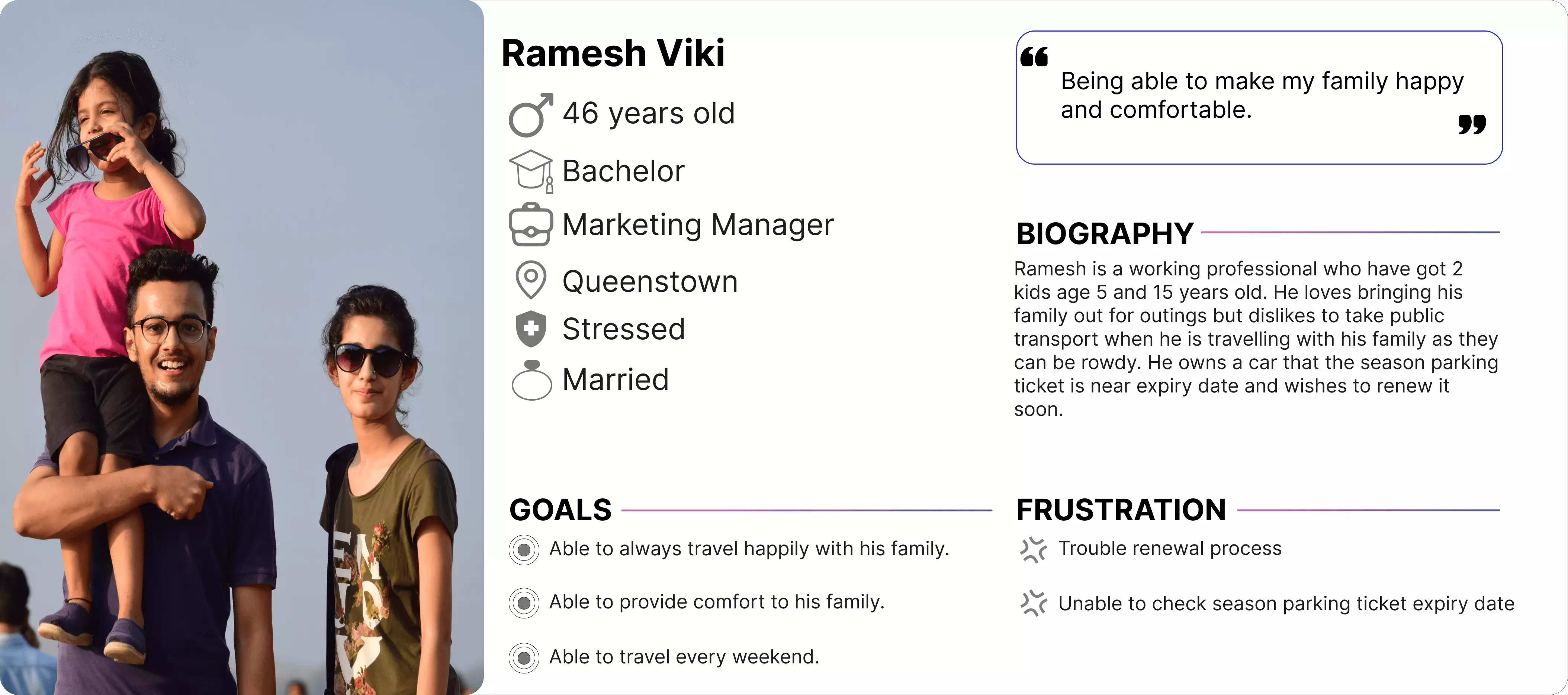
Persona - Ramesh (Personal Car Owner)
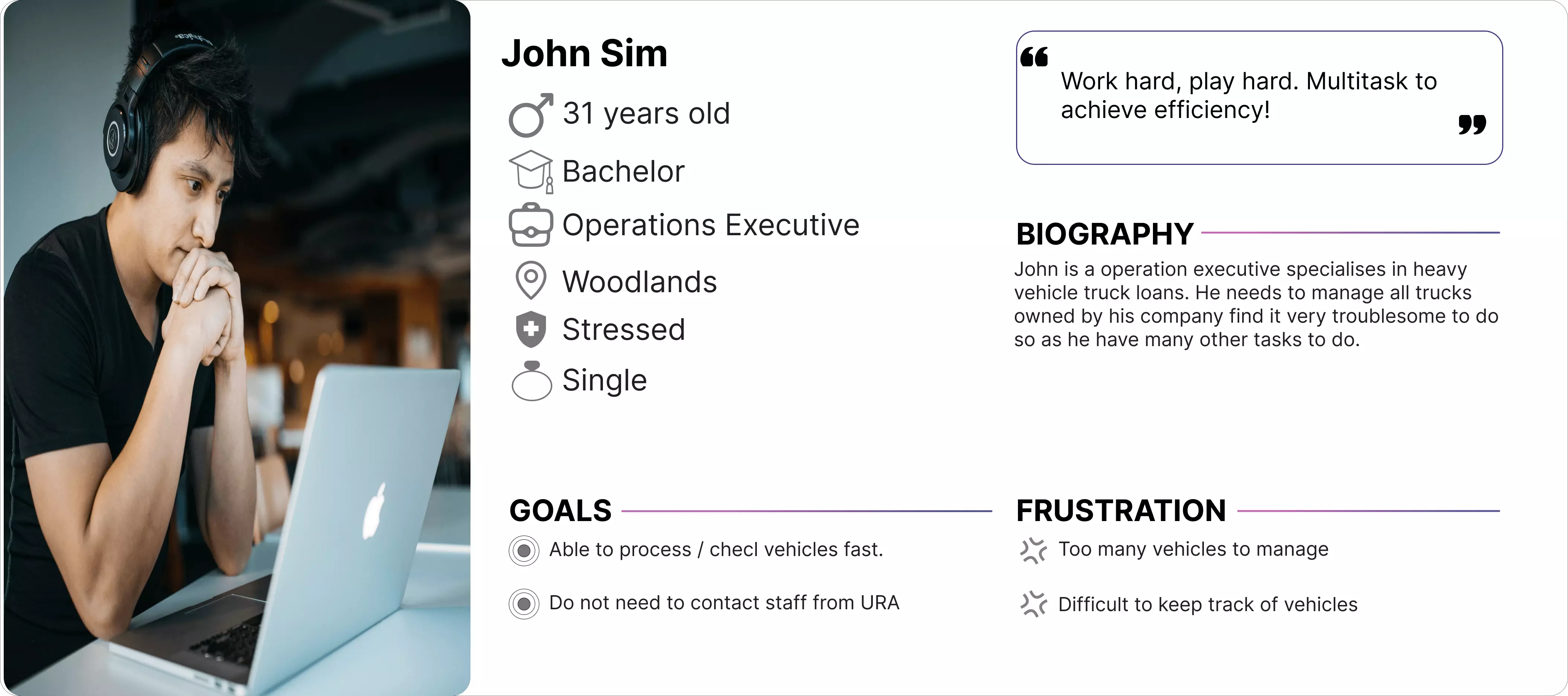
Persona - John (Operation Staff)
To make it more collaborative and accessible, the wireframe is developed in the PowerPoint document (due to some system restrictions, PowerPoint has been the chosen platform for prototyping as some team members' laptops have restricted access to Figma). When there is a confirmed design, the design will be translated into an HTML prototype and subsequently sent to the vendor for development. Some of the considerations were:
To meet the different needs of the different personas, the platform requires two different types of login, as each will retrieve different data.
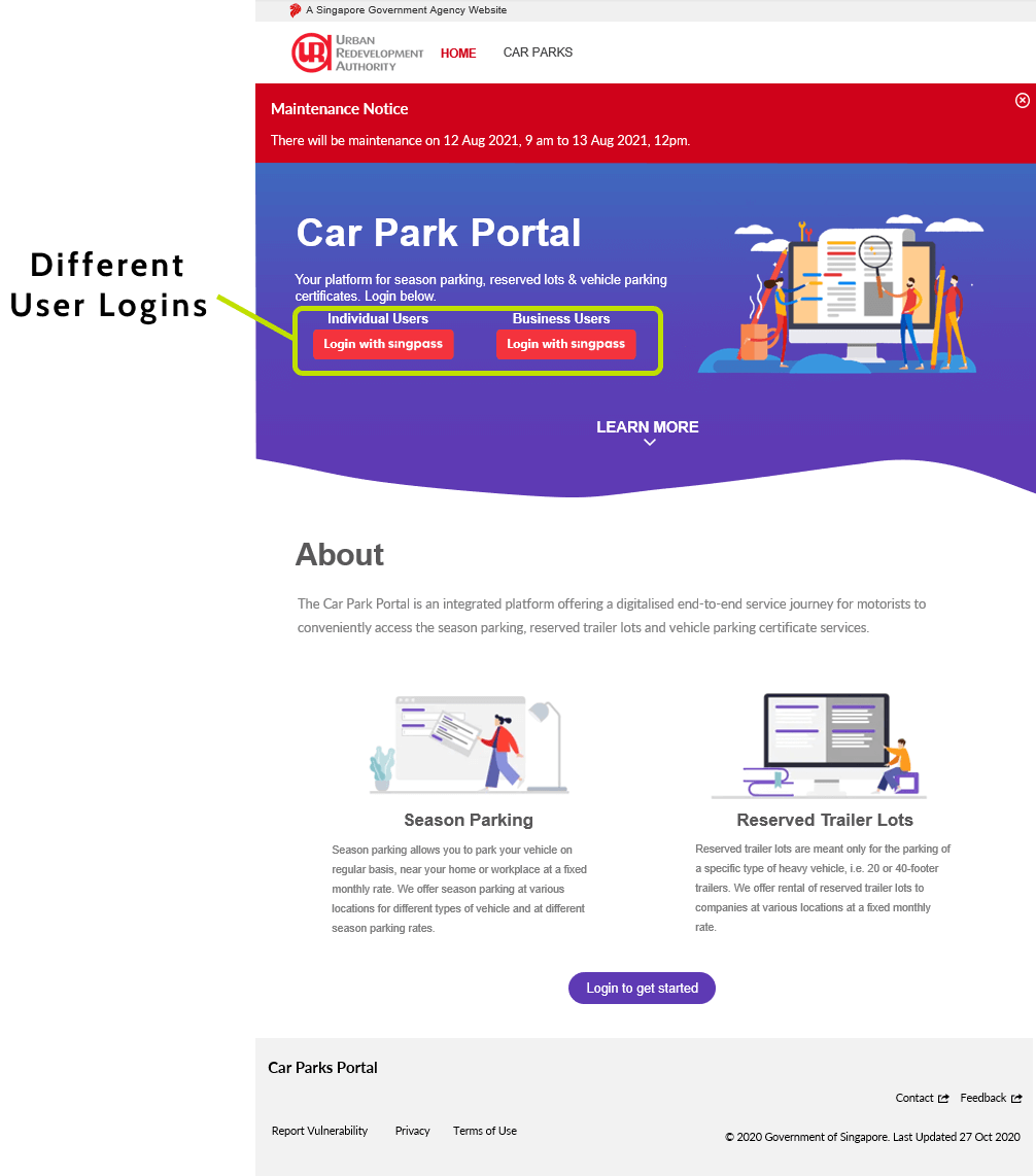
2 Types of Login: Individual and Business Users
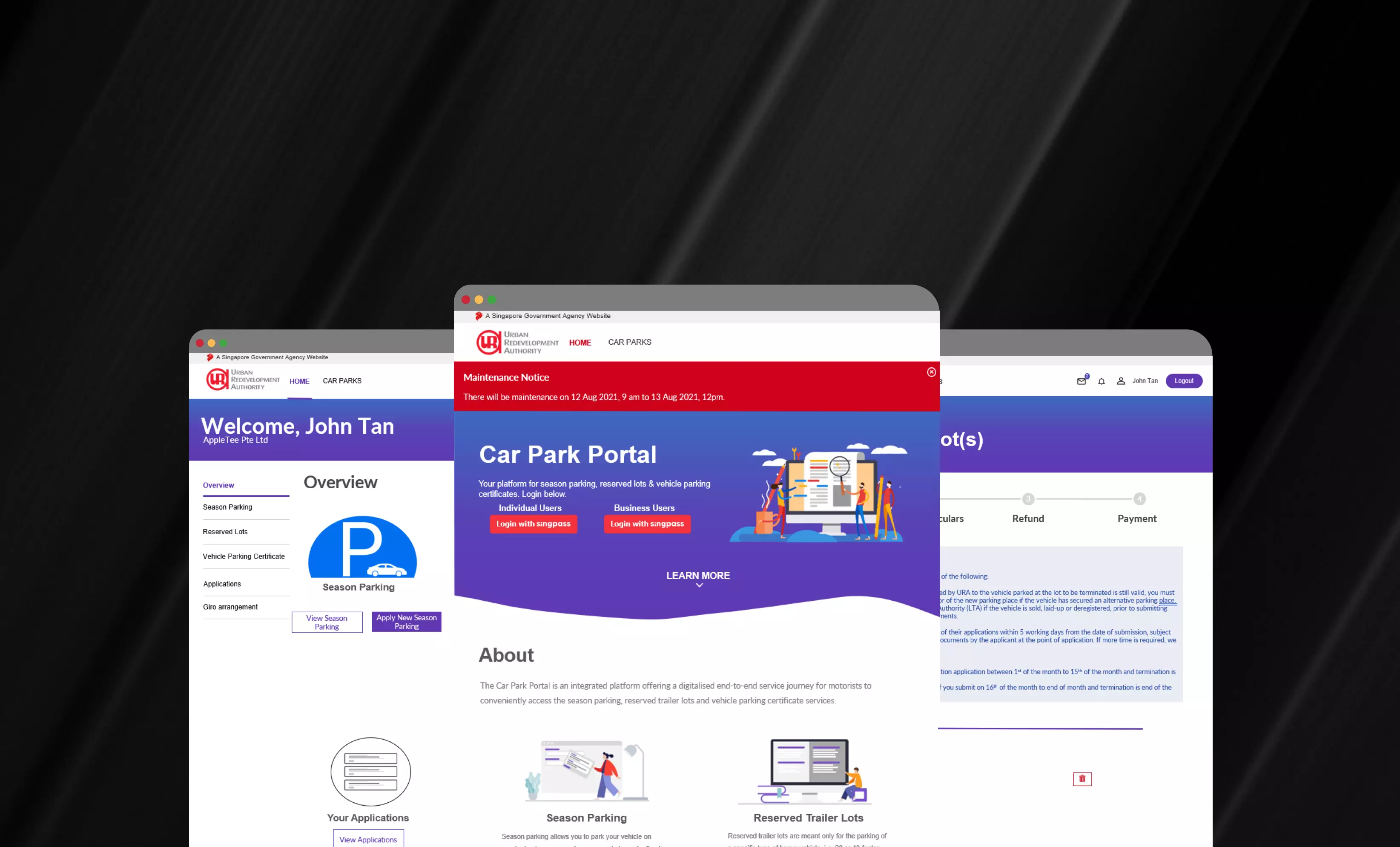
A user can easily check any of their parking place details, such as season parking, reserved lots, and vehicle parking certification, if they have any. The left panel has also been arranged according to the different purposes it serves and its users' needs. In the event that the user is a business that might own many parking places, the user can choose to search through the content using the search bar provided. The card content also provides an overview of the important information that the user might want to know (e.g. type of parking lot, the validity period, the parking place name, and the parking place code).
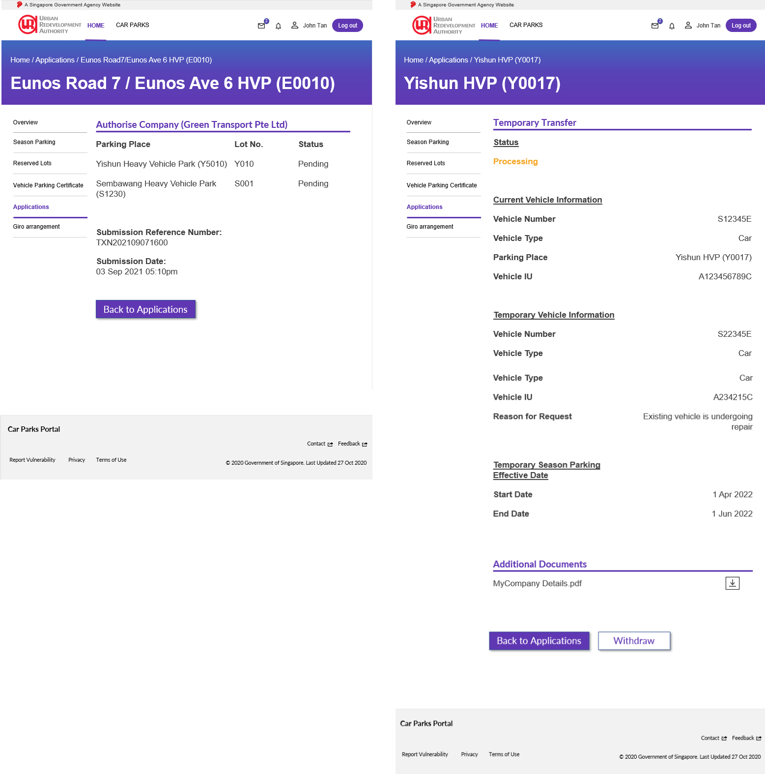
Checking of Parking Place Details
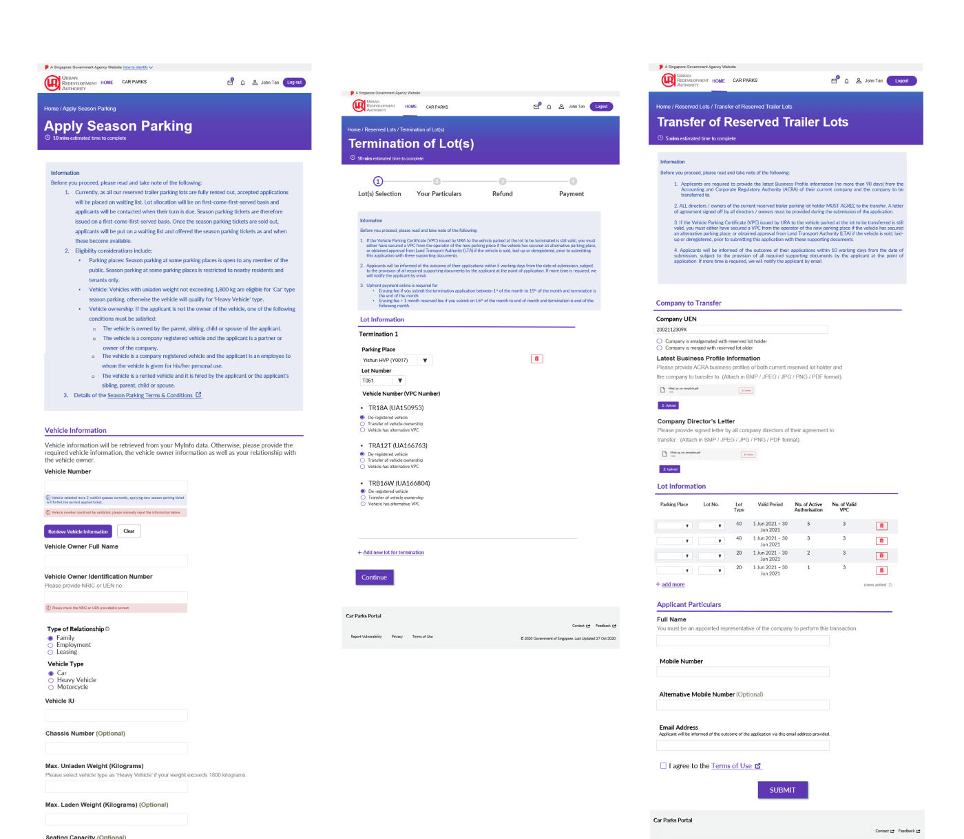
Users will be able to perform various applications on this one-stop portal.To prevent errors and reduce the need to remember things, some fields can be prefilled or retrieved, and most options are either dropdowns or radio buttons.
Checking Application Statuses
In the "Applications" page, users can now check the status of their application (check, accept, reject, follow-up).By applying Jakob's law and colour psychology principles, each application has a different colored status displayed on the card to allows the user to quickly know what is the status for that particular application. In order to make it even clearer, each status displayed is paired with the relevant word, e.g. allocated = green, withdrawn = red, pending = yellow.In most cases, only one status will be shown on the card. (*Image shows all the possible statuses)
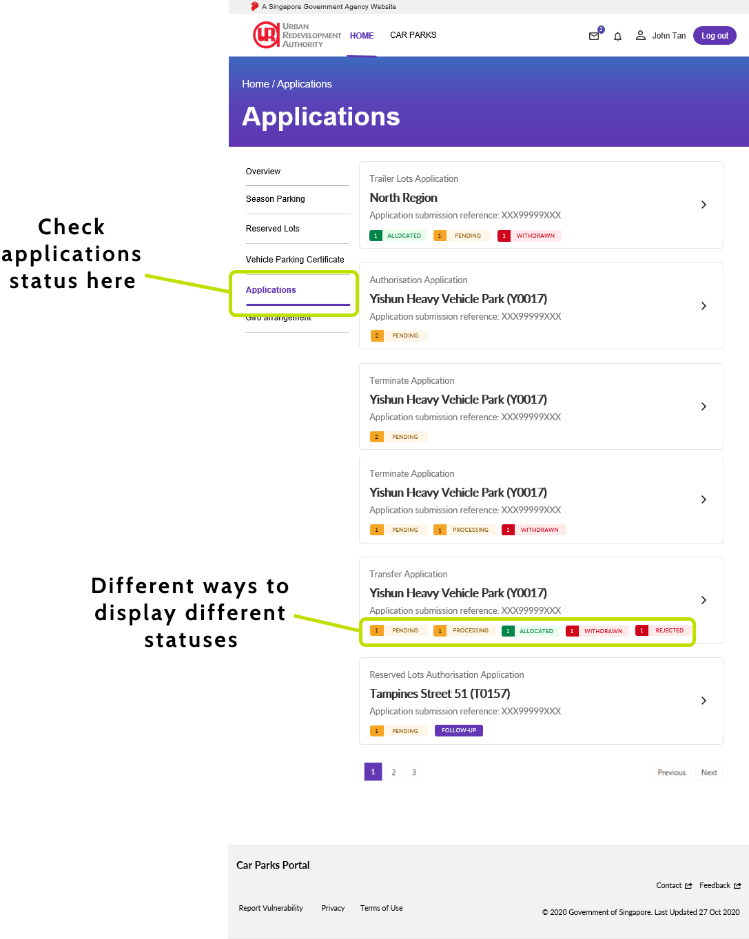
Checking Application Statuses
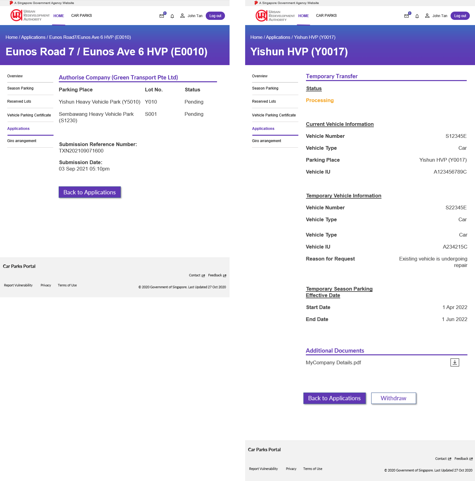
2 Different Type of Sample Application Details
Below is a user flow map of a user that will check the details and apply for a application.
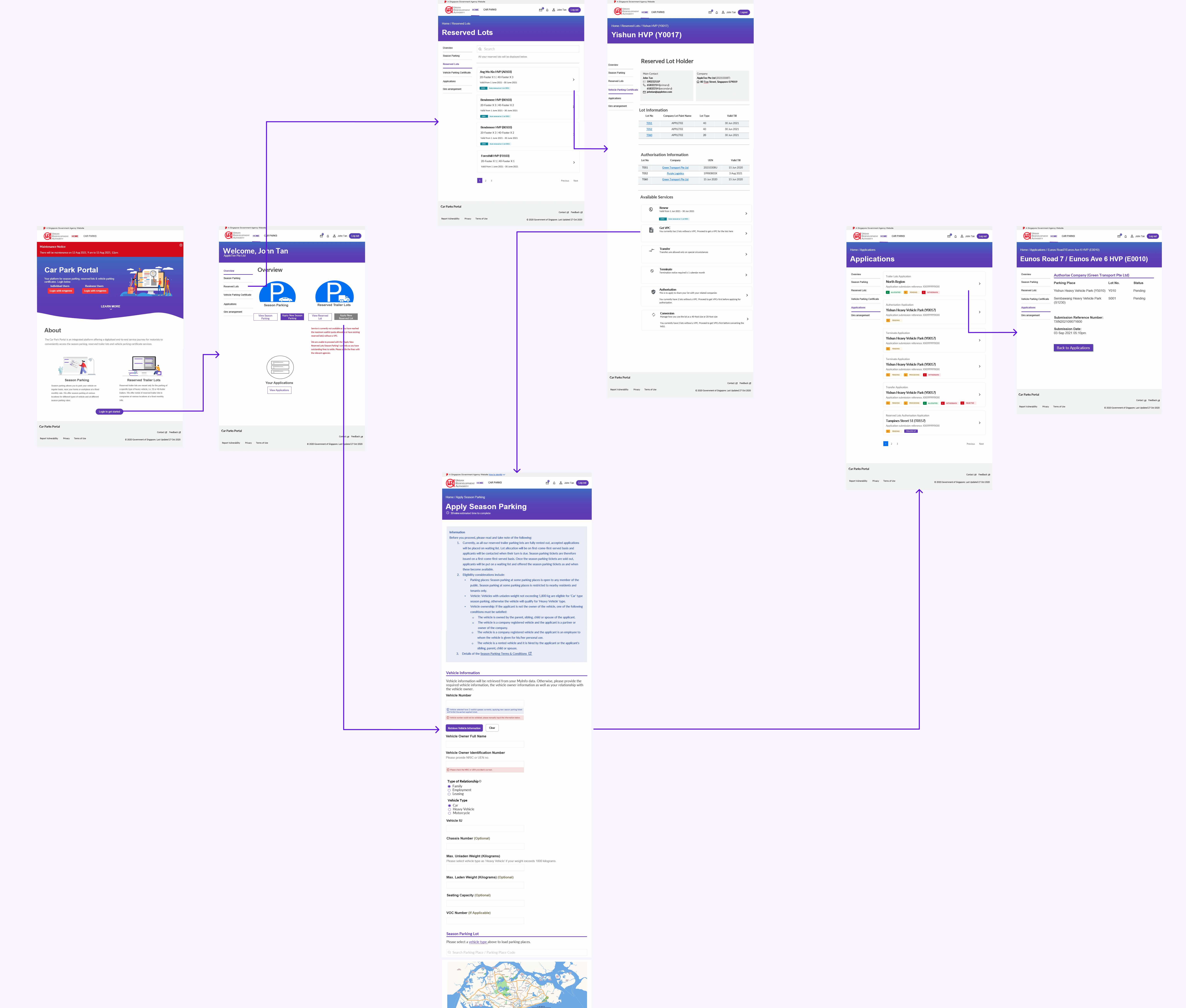
User Flow Map
Looking back at the project, I would have requested to get into the project in the earlier stages so that I could do the user testing while still meeting each sprint's deliverables. I would also want to set up a more general design system template before starting the project so that less time is used to ideate and test the components.